Portfolio State League Redesigns

Remove this Banner Ad

Subiaco have an odd jumper in my opinion. I've never liked jumpers that combine to elements to create one design. I removed the monogram and extended the stripes back to their original length. The away jumper was inspired by Subi's 1975-1979 gold home jumper.
These WAFL jumpers may change throughout the portfolio.
Subiaco jumpers.png
 
Last edited:
I assure this portfolio is not dead. (Yet).
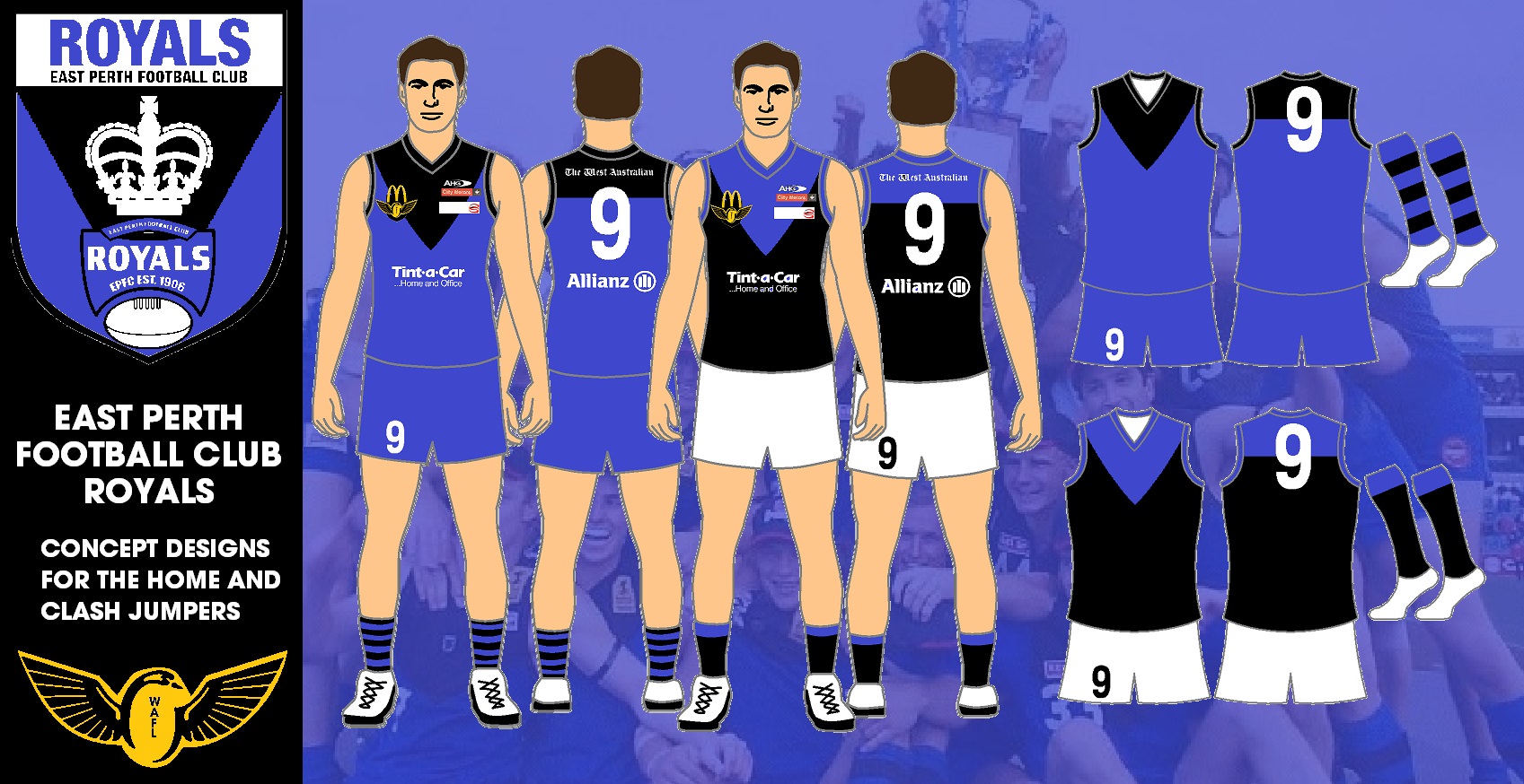
East Perth has a very iconic jumper, black and blue combo pulled off perfectly. The away jumper was based on wizardwaffle's Royals away jumper full credit for that goes to him.
View attachment 584479

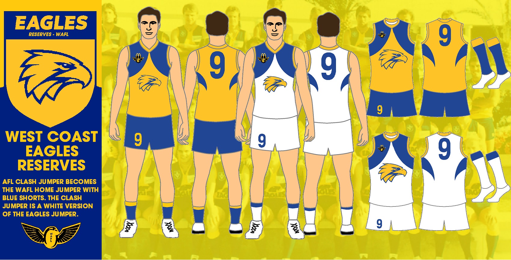
With my East Perth Royals Clash Jumper being mentioned here I decided to put my new designs here. The East Perth Clash design has changed since the West Coast left their partnership and entered their own reserves team in the WAFL. So here are the designs for East Perth and West Coast in the WAFL.

laDuzEq.jpg


fGcGuR0.jpg
 
Last edited:

Log in to remove this ad.

From the playing fields of rival clubs to our home at Lathlain Park, we are called the mighty Demons!
Perth retain their redlegs identity and old home jumper returns wreak havoc upon the Western Australian football landscape as an away jumper.
Perth Demons.png
 
Claremont's jumper has always annoyed me. Combining two designs two create one always bugs me and ripping off an old Carlton monogram makes it that bit worse. I moved the old monogram to the chest like Norwood's monogram in the SANFL part of this portfolio. The away jumper is an inverse of the jumper worn in the 90's I believe (I'm probably wrong).
Claremont.png
 
Swan Districts have always made a boring yet classic jumper somewhat interesting. Having an all black back makes them distinctive from Collingwood and Port Adelaide. The away jumper was inspired by a design by someone else on Bigfooty (I don't know who).
Swan Districts.png
 
I love the Falcons jumper. It's iconic and very unique. The modern take on it adding side panels really annoys me. They seem out of place and a poor job of making the jumper dark so I removed them. The away jumper is an inverse of the home with the Falcon in the bottom corner wrapping around the jumper. The logo features a modern version of their old monogram.
West Perth Jumpers.png
 
South Freo have a basic jumper with their own twist. I don't really like it but I saw no reason to change it. If I moved the vee higher it would be a South Melbourne/Sydney jumper. If I moved the vee too low it would be really close to an inverse of a North Adelaide jumper. The away is based on the old Footscray away jumpers of the 90s.
South Fremantle Jumpers.png
 
Has anyone figured out how to design West Torrens' old guernsey with the rampant eagle? I've been looking everywhere for it, but can't find it.. Can anyone help?
 
Claremont's jumper has always annoyed me. Combining two designs two create one always bugs me and ripping off an old Carlton monogram makes it that bit worse. I moved the old monogram to the chest like Norwood's monogram in the SANFL part of this portfolio. The away jumper is an inverse of the jumper worn in the 90's I believe (I'm probably wrong).
View attachment 592931
You're right, the latter guernsey is an inverse of Claremont's HOME guernsey from 1994-1998. However, a variant without the number on the front was in use from 1992-1993 and 1999-2005. See this link for more info: http://www.footyjumpers.com/Claremonthome.htm
 

Remove this Banner Ad

Back
Top