- Sep 19, 2007
- 19,078
- 17,644
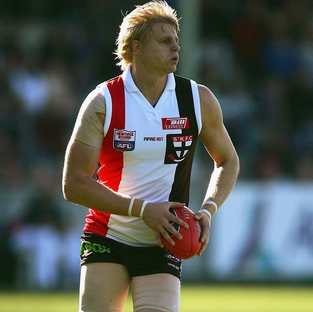
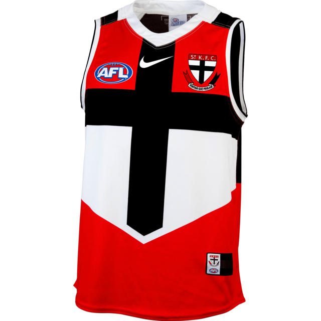
- AFL Club
- St Kilda
- Other Teams
- Anaheim Ducks, PSV Eindhoven
It's BL ******* K the colours will look s**t.I guess it might be what one grew up with but Saints jumpers for me will always need that bit of white coming from the collar and cuffs otherwise I think it looks way to unbalanced towards black. It also brings out the beautiful red colour more. We're lucky we have such a great jumper either way.
 !
!