

Fizzler
TAKE BACK PAFC
- Joined
- Dec 26, 2013
- Posts
- 13,798
- Reaction score
- 18,946
- Location
- Melbourne
- AFL Club
- Port Adelaide
- Other Teams
- OKC, Coburg, Werribee, Storm, QPR
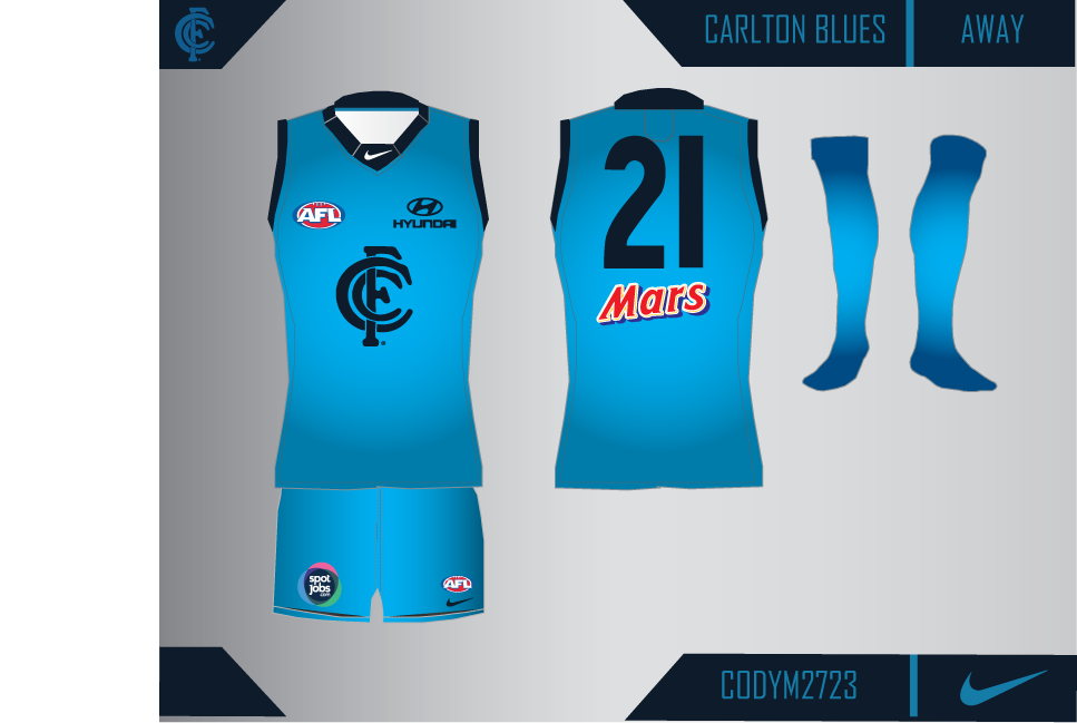
Thank you man. I will definitely take out that back but if I make shorts but yeah for now it looks good, really happy with how it turned out.Great job Fizzler!! I like the one with the curved sides rather than the sharp edges as well. I added a back part to the bottom of mine today but I didnt really like it and it didnt fit in visually with my shorts and socks so I scrapped it but yours is good!


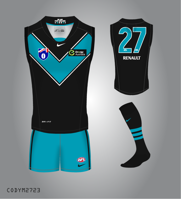


") This one here is gonna be my main template, the ISC one is just gonna be my side thing. I don't think I've made much progress since then though unfortunately.
This one here is gonna be my main template, the ISC one is just gonna be my side thing. I don't think I've made much progress since then though unfortunately.


