Contested Marx
Schrodinkley's Cat
- Jun 21, 2014
- 11,632
- 25,884
- AFL Club
- Port Adelaide
- Other Teams
- Maggies, Spurs, Raiders?
*PortsThank you chaps for the discussion surrounding rubber fists and their several uses.
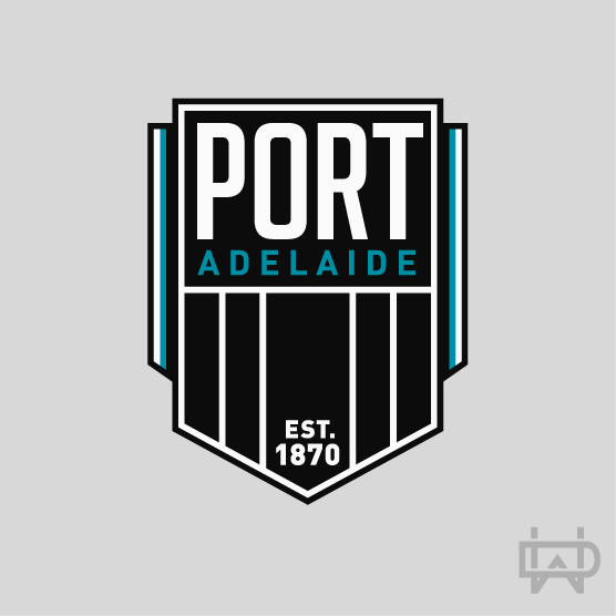
Going back to the topic being discussed, I wouldn't mind our next logo to feature PORT as the main message. Similar to what North Melbourne have done with NORTH but better executed. They've also had an identity crisis that they are now trying to fix. I am not saying to drop the Power nickname all together but use it less prominently. After all, we are one club with two teams. The lightning bolt/s, fist, etc can still be part of the logo as they are key components of our AFL identity but also could be secondary in the logo (like the kangaroo in the Norf logo). We are the only PORT in the AFL after all.