Remove this Banner Ad

The Jumper Thread

  • Thread starter Thread starter Monocle
  • Start date Start date
  • Tagged users Tagged users None

🥰 Love BigFooty? Join now for free.

Given we've ruined our 2018 onwards jumper with the historical atrocities committed in them since 2021, a new design wouldn't hurt for a new era.
Could you imagine a Collingwood supporter saying something like that?

Wings is West Coast, just like black and white stripes is Pies, and a Yellow sash is Tigers.

I'm all for clash jumper requirements (like inverted Tigers jumper), but embrace wings as part of WC's identity.
 
Agree the peril needs to come back, but I'm all for a limited time Ochre revival. People only want it back because it's an eye sore. Bit of fun. Club will make a killing from em, and I've always wanted one for my collection.
The peril is our clash jumper... it's been back for years.....
 
The peril is our clash jumper... it's been back for years.....
I mean the OG peril with the 90's logo and EAGLES written across the front. I do like our current clash kit, but it's not quite the same
 

Log in to remove this Banner Ad

I grew up only knowing the Tri panel (it's two variations) until it was changed in 2016. Is it universally hated because it replaced our successful and iconic 90s design?
Its very ugly and was introduced at the same time as our performances on field was declining (2000/2001).

Club was in one of its tone deaf we know what is best phases, same as when it changed the song to that tripe during covid.
 
Nailing the jumpers in 2018 was a very out of character off field W for the club so I have no doubt that one day we will **** it up badly again (eg, the fact we celebrated last year the song being changed back to only the second worst version in our history)
 
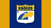
Best solution I think, moving forward, is keep the current home, but change the clash to the original yellow with eagle head and text. So we’ve got a clash, and it’s a nod to the past. The current yellow clash doesn’t really work with the yellow head on yellow background, and a fully inverted, solid blue of this current eagle head doesn’t work either
 
The tripanel was absolute dogshit but the best version of it by far was the BGC preseason one, purely because the white centre was so small and there was no T bar on the back.

I’d only ever support a jumper change in the future if we were razing it all and rebuilding a new identity with the ochre as our colour set.
 

Remove this Banner Ad

Best solution I think, moving forward, is keep the current home, but change the clash to the original yellow with eagle head and text. So we’ve got a clash, and it’s a nod to the past. The current yellow clash doesn’t really work with the yellow head on yellow background, and a fully inverted, solid blue of this current eagle head doesn’t work either
The current clash jumper just needs gold shorts and we're set for all eternity.
 
Best solution I think, moving forward, is keep the current home, but change the clash to the original yellow with eagle head and text. So we’ve got a clash, and it’s a nod to the past. The current yellow clash doesn’t really work with the yellow head on yellow background, and a fully inverted, solid blue of this current eagle head doesn’t work either

Agree with this but the AFL being what it is our away jumper clashes more with some teams than our home jumper.

I would just go royal blue with gold wings home + away vs Hawthorn and possibly Richmond and then inverted version for all other away games and leave it at that. Home we wear blue, away we wear blue or gold based on who we are playing.

But then the AFL think black and white vertical stripes vs blue and white vertical stripes or dark blue and white horizontal stripes looks good so...
 
Well we currently only wear the yellow clash against Roos (sometimes) Freo away, Lions away and Dogs away. All other away games were in Royal anyway, so I don’t think it’s that much of an issue. I just think it’d be nice to see the old style yellow a few times a year. Even once a year at home with blue shorts would be good.
 

🥰 Love BigFooty? Join now for free.

Well we currently only wear the yellow clash against Roos (sometimes) Freo away, Lions away and Dogs away. All other away games were in Royal anyway, so I don’t think it’s that much of an issue. I just think it’d be nice to see the old style yellow a few times a year. Even once a year at home with blue shorts would be good.
Feel like we could just do a Brisbane and have the OG eagle head on both our royal home and gold clash but still have the current club logo on everything else (merch wise). Brisbane’s Fitzroy lion is iconic, timeless and historic and I think the original eagle head carries the same vibe.
 
Feel like we could just do a Brisbane and have the OG eagle head on both our royal home and gold clash but still have the current club logo on everything else (merch wise). Brisbane’s Fitzroy lion is iconic, timeless and historic and I think the original eagle head carries the same vibe.
100%, I’d love to go back the early 90s design. Eagle head and Eagle text, but I just don’t think it’ll happen, outside of one offs, or best case, as a heritage clash. I doubt that will happen either though.
 
why did we move to navy in the first place
Because the gaudy merch of the 90s looked better in navy than royal.

I don’t understand why we couldn’t have just done a Footscray of the time and rocked navy merch without ****ing our jumpers at the same time, but whatever.
 

Remove this Banner Ad

Remove this Banner Ad

🥰 Love BigFooty? Join now for free.

Back
Top Bottom