

Contested Marx
FOR ENTERTAINMENT ONLY
- Joined
- Jun 21, 2014
- Posts
- 12,656
- Reaction score
- 28,537
- AFL Club
- Port Adelaide
- Other Teams
- Maggies, Spurs, Raiders?
Plain black w/ white Ports in 1722 cursive font please
Follow along with the video below to see how to install our site as a web app on your home screen.
Note: This feature may not be available in some browsers.

Champions League - FINAL - PSG v Arsenal ⚽ Europa Semis ⚽ 2026 FIFA Series A - Socceroos friendlies ⚽ The Matildas x 2026 Womens Asia Cup ⚽ Conference League - SEMIS! ⚽ Conference League - Rd of 16 ⚽ Socceroos Internat'l Friendlies ⚽ FA Cup - Man City Win
 Fantasy Footy Notice Image Round 11
SuperCoach Rd 11 Rd 11 Talk - Trades - VC/C - Pendlebury Comp – Win A Badge - Fight MND Comp Returns ,//, AFL Fantasy Rd 11 Rd 11 Talk - Trades - The VC/C Thread
Log in to remove this Banner Ad
I don't know if this was brought up already, but why does the renault logo have a black background on the clash?
I don't know if this was brought up already, but why does the renault logo have a black background on the clash?
You didn't even bother to google it, did you?Because it's part of their corporate branding to have a silver logo on a black background?
You didn't even bother to google it, did you?
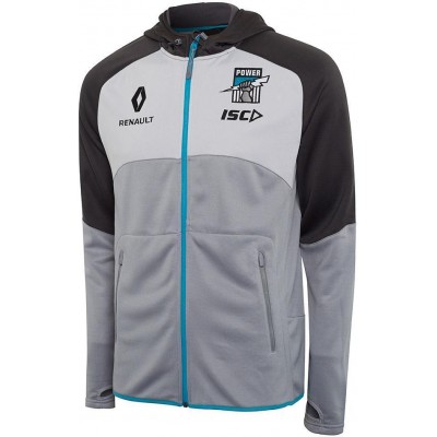
Can the Renault logo actually be our club logo?Want want want
Jokes aside, our current logo actually puts me off buying a lot of our merch. For this top in particular, which I quite like, it almost ruins it for me.Can the Renault logo actually be our club logo?
Jokes aside, our current logo actually puts me off buying a lot of our merch. For this top in particular, which I quite like, it almost ruins it for me.

It's on the polo's and guernseysWhere's oak milk on our merchandise?
Where's oak milk on our merchandise?


