

works very well for the swans - players come in knowing their roleHave a look at Adelaide crows.It maybe better for player development but doubt it will make for a better team.Not sour grapes but will face the same challenges of the crows in getting a competitive team.Will have to play all the rookies and on past experience you will have a team with a very uneven performances.I don't expect a wafl premiership for a long time.
Navigation
Install the app
How to install the app on iOS
Follow along with the video below to see how to install our site as a web app on your home screen.
Note: This feature may not be available in some browsers.
More options
You are using an out of date browser. It may not display this or other websites correctly.
You should upgrade or use an alternative browser.
You should upgrade or use an alternative browser.
2nds West Coast Eagles WAFL 2019
- Thread starter avishka5
- Start date
- Tagged users None
- Status
- Not open for further replies.
Considering mocking up some concept guernseys for the WAFL team, anyone who wants to throw some ideas my way feel free. Staying away from the wings and indigenous design if I can.
- Aug 22, 2009
- 24,448
- 28,163
- AFL Club
- West Coast
Considering mocking up some concept guernseys for the WAFL team, anyone who wants to throw some ideas my way feel free. Staying away from the wings and indigenous design if I can.
I’m not sure what to suggest if you aren’t considering wings.
I’m not sure what to suggest if you aren’t considering wings.
That’s purely because the club said we’re likely to wear an alternate strip. But yeah I see what you mean.
On iPhone using BigFooty.com mobile app
- Aug 22, 2009
- 24,448
- 28,163
- AFL Club
- West Coast
That’s purely because the club said we’re likely to wear an alternate strip. But yeah I see what you mean.
On iPhone using BigFooty.com mobile app
I think the peril works well. No clash with any teams.
kane249
Wibble
- Oct 27, 2006
- 52,228
- 69,088
- AFL Club
- West Coast
- Other Teams
- Sth Freo, Liverpool, Chicago Bulls
I think the peril works well. No clash with any teams.
Might have issues with Claremont

- Aug 22, 2009
- 24,448
- 28,163
- AFL Club
- West Coast
Might have issues with Claremont

Yeah fair call. Peril is better than royal but still not great. I suppose ochre is the only option.
The club said 'the' alternate strip - aka peril clash - or the maybe the indigenous. I never saw any suggestion of a completely new strip.That’s purely because the club said we’re likely to wear an alternate strip. But yeah I see what you mean.
Yellow with blue shorts would be great. I don't like the idea of using the indigenous strip every week.
Miguel Sanchez
(Unique injury) TBC
Yellow wings, with the blue indigenous strip from 2018 where there’s a clash (Claremont and possibly Subi).
Actually the indigenous strip would clash with Claremont even worse. Maybe the white indigenous strip from a few years ago?
Actually the indigenous strip would clash with Claremont even worse. Maybe the white indigenous strip from a few years ago?
kane249
Wibble
- Oct 27, 2006
- 52,228
- 69,088
- AFL Club
- West Coast
- Other Teams
- Sth Freo, Liverpool, Chicago Bulls
Yellow wings, with the blue indigenous strip from 2018 where there’s a clash (Claremont and possibly Subi).
Actually the indigenous strip would clash with Claremont even worse. Maybe the white indigenous strip from a few years ago?
It's time, only one solution makes sense
Miguel Sanchez
(Unique injury) TBC
It's time, only one solution makes sense
Ochre is an abomination.
Edit: not sure why that tag is there. Oh well.
Ochre
Stop the Steal!

- May 28, 2010
- 1,712
- 2,136
- AFL Club
- West Coast
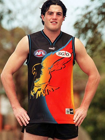
He's wearing a 1999 prototype, Puma made these on 1999 fabric so the old AFL logo is watermarked and actually embossed into the fabric, not sublimated.
Other differences are the jock tag, the Puma logo is the wordmark (not just the cat) and the AFL logo has some shading toward the outer edges of the ball. Also the SGIO logo is a stuck-on embroidered patch.
I have one of these which you can see: http://wceguernseys.weebly.com/2000-away-prototype.html
You can see the SGIO patch clearer on this liftout from The West in 1999. Something I only just noticed - the one used on the cover has the double-thick cuffs used on player issues of the time (the double thick cuffs carried over to Puma retails in 2000). My prototype only has the thin cuffs used on 1999 Puma retails.

- Sep 16, 2006
- 35,896
- 35,520
- AFL Club
- West Coast
Having to play away every week, having to pay high fees. I understand why. But are we really a team in this comp. Or just an entity the WAFC sees as simply a stop gap.
Abed
Cancelled
- Aug 17, 2009
- 1,309
- 1,661
- AFL Club
- West Coast
*vomit*It's time, only one solution makes sense
Take the overall design of the ochre but try it on a predominantly royal blue guernsey with a gold eagle. That would work.
Eastern Rangers
2015 Worsfold Medalist - Rowen Powell
Ochre Wings. Make it happen.
Sent from my iPhone using Tapatalk
Sent from my iPhone using Tapatalk
- Banned
- #144
Fixed...

#returnthewingsConsidering mocking up some concept guernseys for the WAFL team, anyone who wants to throw some ideas my way feel free. Staying away from the wings and indigenous design if I can.
How about - consider wingsI’m not sure what to suggest if you aren’t considering wings.
Ochre
Stop the Steal!
Yeah thats what I thoughtHe's wearing a 1999 prototype, Puma made these on 1999 fabric so the old AFL logo is watermarked and actually embossed into the fabric, not sublimated.
Other differences are the jock tag, the Puma logo is the wordmark (not just the cat) and the AFL logo has some shading toward the outer edges of the ball. Also the SGIO logo is a stuck-on embroidered patch.
I have one of these which you can see: http://wceguernseys.weebly.com/2000-away-prototype.html
You can see the SGIO patch clearer on this liftout from The West in 1999. Something I only just noticed - the one used on the cover has the double-thick cuffs used on player issues of the time (the double thick cuffs carried over to Puma retails in 2000). My prototype only has the thin cuffs used on 1999 Puma retails.
- Oct 9, 2009
- 11,383
- 12,190
- AFL Club
- West Coast
Didn't the other clubs or one of the clubs have an issue with the team promoting the Eagles brand or something like that?
So I wouldn't be surprised if they used a completely different guernsey or one without the wings or Eagles logo to appease them. Tbh I don't think it really matters what it looks like.
So I wouldn't be surprised if they used a completely different guernsey or one without the wings or Eagles logo to appease them. Tbh I don't think it really matters what it looks like.
Last edited:

- Jan 13, 2013
- 23,177
- 45,518
- AFL Club
- West Coast
I like the number on the back
- Status
- Not open for further replies.
Similar threads
- Replies
- 1K
- Views
- 20K
- Replies
- 1K
- Views
- 19K
- Replies
- 1K
- Views
- 21K
- Replies
- 941
- Views
- 17K
- Replies
- 1K
- Views
- 30K
