i find the bloke that runs the page to be pretty knowledgeable.Whoops forgot to mention that. No I do not. If I did I would've already sold out ages ago
Also he's one of the guys that posted asking for pm of the picture.
Follow along with the video below to see how to install our site as a web app on your home screen.
Note: This feature may not be available in some browsers.
 BigFooty Tipping Notice Img
Weekly Prize - Join Any Time - Tip Round 10
The Golden Ticket - MCG and Marvel Medallion Club tickets and Corporate Box tickets at the Gabba, MCG and Marvel.
i find the bloke that runs the page to be pretty knowledgeable.Whoops forgot to mention that. No I do not. If I did I would've already sold out ages ago
"Terrible! Leave it as it is for christ sake. How about we change our chief executive officer and our entire recruiting department!!!"
Didn't take long.
"don't know why the keep changing it no other club does""Why. Have only just taken to the new one."
Didn't realise 17 years can still be considered new.
It's ever so slightly better.BigFooty is no better for that s**t, haha.
Subjectivity is a thing.It's a pretty terrible logo so the FB idiots aren't all wrong.
The great unwashed have to be based somewhere on the internet. At least Facebook puts a real life name and face to the morons."don't know why the keep changing it no other club does"
"were blue and gold not black and gold"
i can't handle how stupid some of these people are
Subjectivity is a thing.
Think it looks grouse.
yeh i reckon that jumper is better as wellIt looks like it was designed without the thought of it being placed on the jumper. Way too busy.
Even the current logo isn't anywhere near as busy.
apparently thats not "our blue"The great unwashed have to be based somewhere on the internet. At least Facebook puts a real life name and face to the morons.
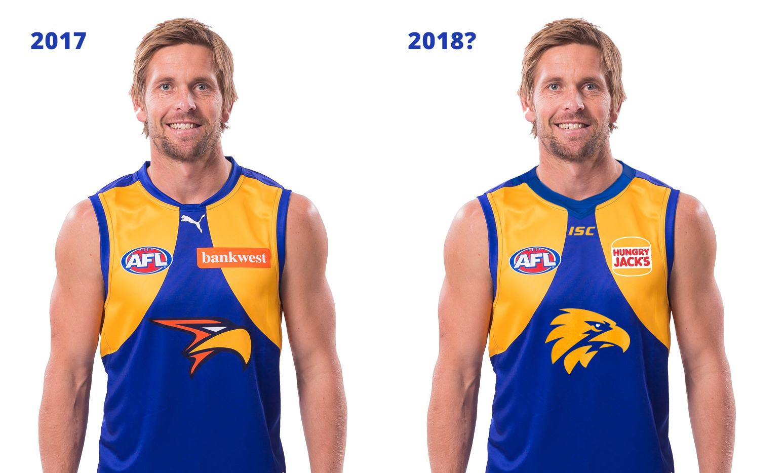
Did a quick trace of the logo, I don't mind it actually

The eye of the eagle seems off being white, needs to be yellow.Did a quick trace of the logo, I don't mind it actually
i dislike the current logo but that 2018 jumper looks like an ammo jumper.Did a quick trace of the logo, I don't mind it actually
The ISC logo makes the jumper look instantly cheap and nastierDid a quick trace of the logo, I don't mind it actually
can you do one with the eagles writing across the front
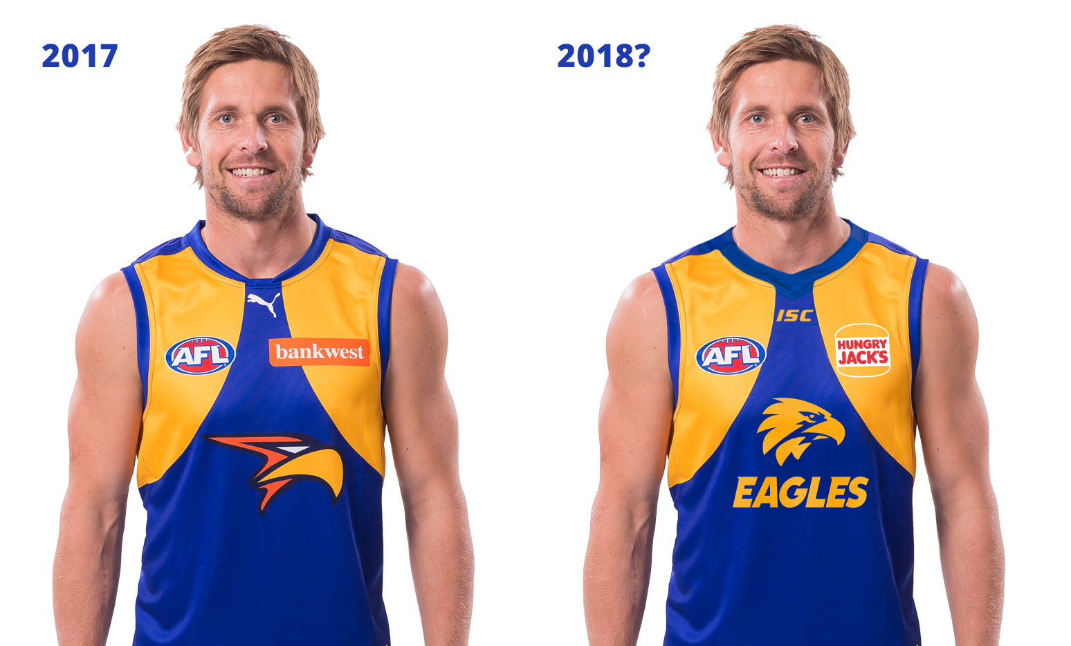
yeh thats it..that looks goodLike this? (Not sure what font they used but I've just butchered the old Dynamo Eagles font)
Surely it'd be bigger than that? Looks tiny in comparison to the current logo.Like this? (Not sure what font they used but I've just butchered the old Dynamo Eagles font)