Workshop 2015 AFL Jumper Ideas

Remove this Banner Ad

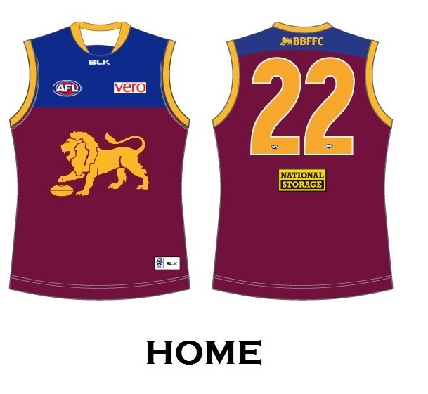
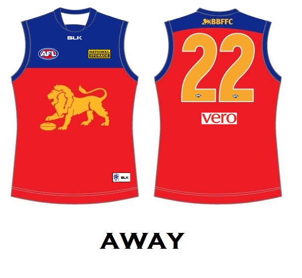
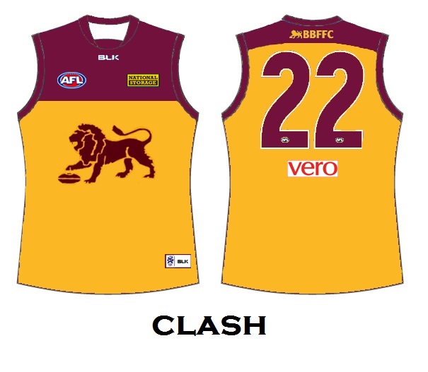
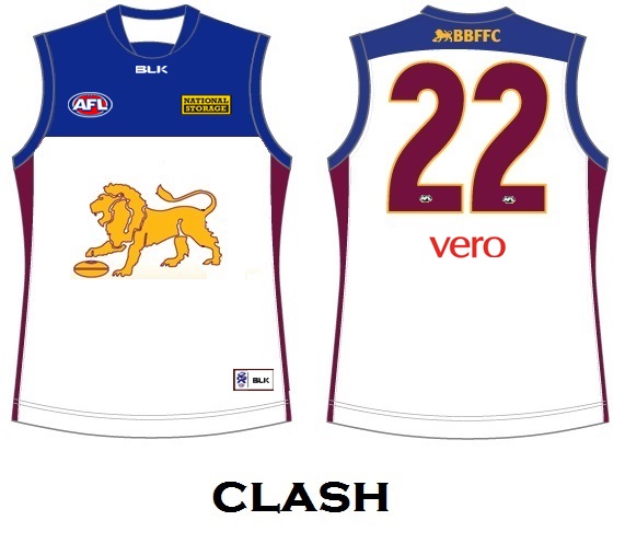
You need to show where the AFL and sponsor logos would sit.

BL has been a low yoke with sponsors above.. Fitzroy had the sponsors centred on the line for a time.

Here's my preference: below the line.

View attachment 59208

I like an even higher yoke with the logos below.
 
You need to show (or say) where the AFL and sponsor logos would sit.

BL has been a low yoke with sponsors above.. Fitzroy had the sponsors centred on the line for a time.

Here's my preference: below the line.

View attachment 59208

Here's my quick edits with sponsors

30agk5t.jpg

10i9c1e.jpg

28ltirl.jpg

2mzgxas.jpg
 

Log in to remove this ad.

Going out on a limb with this one, but bear with me:

Bring back the large St Kilda crest, but instead of putting it on a square in trying to replicate an old patch, put it on some kind of dynamic shape/device. This one maybe goes a bit far, but you will get the basic principle I am going for by looking at the crest:

STK-2015-home-crest-device.png
 
Last edited:
Going out on a limb with this one, but bear with me:

Bring back the large St Kilda crest, but instead of putting it on a square in trying to replicate an old patch, put it on some kind of dynamic shape/device. This one maybe goes a bit far, but you will get the basic principle I am going for by looking at the crest:

View attachment 59245
Very interesting.. I like it.
 
It's not a bad logo it's just a bit of a copy and it really doesn't suit some people as we don't want to be like a sister to "The Biggest Loser"
 
It's not a bad logo it's just a bit of a copy and it really doesn't suit some people as we don't want to be like a sister to "The Biggest Loser"
Do you feel the same about Melbourne's monogram? I do appreciate your input but I think some fans need to be educated that for a long time, all clubs had a monogram. It does not belong to Carlton at all.

Nathan+Jones+Melbourne+Demons+Training+Session+dAttCUph1Ycl.jpg
 

(Log in to remove this ad.)

I haven't actually seen any monograms apart from Carlton's lol. Just remembered Melbournes and it's alright I guess. Don't pay much attention tbh.
 
Geelong
Home
View attachment 59256
Clash

Not sure what took Geelong ages to figure out the perfect clash.
View attachment 59259
Personally, if reverse the socks. Have the white based socks with the white based guernsey and vice versa.
Gold Coast
Home
View attachment 59266
Clash
View attachment 59273
Third/Pre-Season

Credit to Cory for this idea.
View attachment 59283
As for these, I like the home and clash, but I don't think they need those side panels on the back. It's just as pointless as GWS's. Great work.
 
Rather than having a designated Heritage Round, here's some ideas for throwback jumpers for clubs to wear for specific games throughout the year to celebrate the anniversaries of certain events:


20th anniversary of Fremantle's first game, against Richmond in Round 1, 1995
Fremantle v Richmond.png
Fremantle in a replica of their inaugural away jumper. Although the first game was at the MCG and Fremantle wore white shorts, it makes more sense to celebrate milestones in front of their home crowd


20th anniversary of Fremantle's first home game, against Essendon in Round 2, 1995
Fremantle v Essendon.png
Fremantle in a replica of their inaugural home jumper.


25th anniversary of Collingwood defeating Essendon in the 1990 AFL Grand Final
Collingwood v Essendon.png
Collingwood in their clash jumper with black shorts. Essendon wears red shorts to eliminate white from their kit and reduce any potential clash.


50th anniversary of Essendon defeating St Kilda in the 1965 VFL Grand Final
Essendon v St Kilda.png
Essendon with a skinnier and curvier sash.


Celebrating 90 years since North Melbourne, Hawthorn and Footscray entered the VFL in 1925

Hawthorn v North.png

Bulldogs v Hawthorn.png

North v Hawthorn.png

Hawthorn v Bulldogs.png

North v Bulldogs.png

Bulldogs v North.png
In their games against each other, North, Hawthorn and Western Bulldogs wear replicas of 1925 jumpers, complete with black shorts for North and the Bulldogs. Due to the large amounts of royal blue, North and the Bulldogs wear clash jumpers (or in North's case, a fauxback clash heritage jumper) when playing away against each other.
 
90th anniversary of Geelong defeating Collingwood in the 1925 VFL Grand Final
Geelong v Collingwood.png
Geelong with fatter stripes. Not sure if Collingwood would look better in their home or clash jumper.


100th anniversary of Carlton defeating Collingwood in the 1915 VFL Grand Final
Carlton v Collingwood.png
Carlton with their curvier monogram (and Collingwood rightly in their clash jumper against Carlton).


110th anniversary of Richmond defeating North Melbourne to win the 1905 VFA premiership
Richmond v North.png
Richmond in their bumblebee jumper, with a number panel added to accommodate the numbers (since they weren't worn at the time).


120th anniversary of Fitzroy winning their first VFA premiership in 1895 ahead of Geelong
Brisbane v Geelong.png
Brisbane in a jumper inspired by Fitzroy's 1895 jumper. The chamois reinforcing has been replaced by Brisbane's gold colour and the back has been altered to accommodate the numbers.


110th anniversary of Fitzroy winning the 1905 VFL premiership over Collingwood
Brisbane v Collingwood.png
If the funnel jumpers were made for the Geelong game, Brisbane might as well just wear them twice.


125th anniversary of South Melbourne winning the 1890 VFA premiership ahead of Carlton
Sydney v Carlton.png
Sydney in horizontal stripes, with a number panel added.


125th anniversary of Port Adelaide defeating South Melbourne in 1890 to become the Champions of Australia
Port v Sydney.png
Port's magenta and blue jumper, as seen in the 2004 Heritage Round; I didn't bother with the fake laces.
 
West Coast 2015: If they do return the wings, the main question for me is which blue should the body be. I don't like the navy (late 90s) and I also don't like the (almost) electric blue (2005 & 06 GFs). I'd want something half way in between. Close to 1992-style, but a touch darker:

WCE-2015-02.png
WCE-2015-03b.png
 
My vision for Collingwood 2015. (Won't happen but it's what I would like. Also, template is wrong for Star Athletic but you get the idea.) Home and clash only (no away). Home functions like Geelong's home, (can be worn at home with either light or dark shorts).

COLL-2015.png
 

Remove this Banner Ad

Back
Top