- Sep 19, 2007
- 19,083
- 17,645
- AFL Club
- St Kilda
- Other Teams
- Anaheim Ducks, PSV Eindhoven
Black collar and cuffs are more aesthetically pleasing with the black backed jumper.
Follow along with the video below to see how to install our site as a web app on your home screen.
Note: This feature may not be available in some browsers.
Black collar and cuffs are more aesthetically pleasing with the black backed jumper.
With the current materials and general cut the black is far more aesthetically pleasing.Check out the earlier picture comparisons provided. Its more vibrant and balanced
Plus too much black makes it seem too close to a certain group of druggies
With the current materials and general cut the black is far more aesthetically pleasing.
 )
)Unless you try to incorporate yellow into it as well.Lots of different opinions it seems.
I love 'em all (even liked that white distressed look away jumper that 99% of my fellow supporters seem to despise
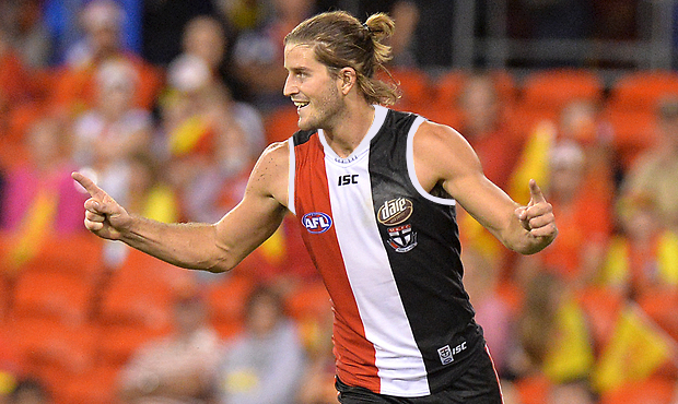
Bottom line is you just can’t make a bad St Kilda jumper. It’s that delicious combination of Black, White & Red.
Let's face it; the worst St Kilda jumper is still far, far better than the best jumper the other 17 clubs can come up with
I played around on Photoshop to see what a white collar and cuffs would look like on our current home guernsey... it looks ridiculously good!
Here's the original for comparison.
Lots of different opinions it seems.
I love 'em all (even liked that white distressed look away jumper that 99% of my fellow supporters seem to despise
Bottom line is you just can’t make a bad St Kilda jumper. It’s that delicious combination of Black, White & Red.
Let's face it; the worst St Kilda jumper is still far, far better than the best jumper the other 17 clubs can come up with
The Jack Pack do you have a mock with a white collar and black cuffs?To the posters above this is what it would look like on the new template and it looks like the best jumper we could have
Any jumper with the cross on it looked SH!THOUSE. It just reminds of the '97 GF. What a disgrace we wore that in a granny. No wonder we lost.
My last post to you was 'GOLD SNAKE, GOLD'. This is more like brown and gold snake, SH!THOUSE!im gonna cop some s**t here but i think this looked alright for a clash jumper
Just my opinion though so dont abuse Me too much
Looks much better in person, I have one in my cupboard, it's a good shade of yellowim gonna cop some s**t here but i think this looked alright for a clash jumper
Just my opinion though so dont abuse Me too much
Carlton, Richmond, port, Freo?I love our current clash guernsey but I wouldn't mind having a predominately red one in our rotation.
I'm not sure who we'd wear it against (besides Collingwood) since the white one gets the job done nicely.
Should be our away strip with the stripes being the official clashI liked the 140th anniversary with the hoops. No white, but tres classy.
Disagree. Looking like Essindin clash jumper is not a good idea. We have so many great design options with our 3 colours, that one doesn't make the finals.I liked the 140th anniversary with the hoops. No white, but tres classy.
I like your idea about the R,W&B tri panel being a constantI'm not too fussed about whether our cuffs are black or white or if they are white with a black stripe. My main beef is our clash jumper. None of them inspire me much at all. I reckon the best solution with our clash jumper is simple.....
The front should be the traditional tri panel and the back should be white instead of black. This worn with white shorts would be perfect IMHO. There would also be scope to have a second clash jumper (if needed) with the back being red and worn with red shorts. As long as the front is the traditional RWB tri panel then all is good IMHO.

I'm not too fussed about whether our cuffs are black or white or if they are white with a black stripe. My main beef is our clash jumper. None of them inspire me much at all. I reckon the best solution with our clash jumper is simple.....
The front should be the traditional tri panel and the back should be white instead of black. This worn with white shorts would be perfect IMHO. There would also be scope to have a second clash jumper (if needed) with the back being red and worn with red shorts. As long as the front is the traditional RWB tri panel then all is good IMHO.
Why is Collingwood's clash jumper allowed then? That has even less white in it!! I don't think that rule was ever really applied anyway. Traditional tri panel front should always be a constant. As I said, we can then tinker with the back of the jumper...either all white or all red depending on which team we are clashing against. The hot cross bun jumper and the candy stripe jumper should be put away and only brought back once every 5 years IMHO. And that is only for marketing purposes otherwise I would get rid of them for good.I'm pretty sure our tri panel with a white back and shorts isn't allowed as it doesn't have enough white on it.
Because it's Collingwood.Why is Collingwood's clash jumper allowed then? That has even less white in it!! I don't think that rule was ever really applied anyway. Traditional tri panel front should always be a constant. As I said, we can then tinker with the back of the jumper...either all white or all red depending on which team we are clashing against. The hot cross bun jumper and the candy stripe jumper should be put away and only brought back once every 5 years IMHO. And that is only for marketing purposes otherwise I would get rid of them for good.
FWIW, I like the traditional jumper with the white trimmings for home and the narrow stripes for clash jumper. Scrap the rest....
AND BRING BACK THE TRI COLOUR SOCKS FROM THE 80's!!!!
Not always beautiful Doc...Lots of different opinions it seems.
I love 'em all (even liked that white distressed look away jumper that 99% of my fellow supporters seem to despise
Bottom line is you just can’t make a bad St Kilda jumper. It’s that delicious combination of Black, White & Red.
Let's face it; the worst St Kilda jumper is still far, far better than the best jumper the other 17 clubs can come up with