Navigation
Install the app
How to install the app on iOS
Follow along with the video below to see how to install our site as a web app on your home screen.
Note: This feature may not be available in some browsers.
More options

You are using an out of date browser. It may not display this or other websites correctly.
You should upgrade or use an alternative browser.
You should upgrade or use an alternative browser.
News New Jumpers for 2015
- Thread starter Gibbsy
- Start date
- Tagged users None
- Status
- Not open for further replies.
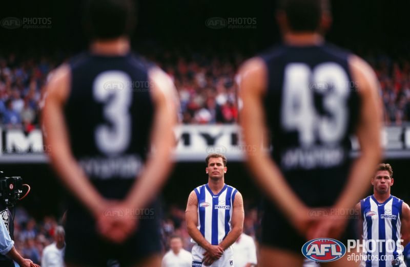
no it doesn't it should go further up, but the lowered stripe has become a part of norths kit of recent times, i for one would be a little disappointed to see it go.The middle stripe. It needs to go all the way up.
pretty sure Spitta2Azza is with me on that.
So you're wearing brown and gold yet again this year? Feel your pain. When we had reebok were wore silver, teal, brown & white.The material is a huge step down from last years 'clash' that I have and the yellow is really a creamy beige and not a yellow at all probably due to the new cheaper retail material that they're using.
Faded looking cheap rubbish.
- Aug 25, 2014
- 7,718
- 11,772
- AFL Club
- Richmond
arrr reebok, they where the days....So you're wearing brown and gold yet again this year? Feel your pain. When we had reebok were wore silver, teal, brown & white.
simba_
sucking a lemon

Christ that is ******* ugly

I would think someone new to the game and/or unfamiliar to the teams might think this is the Gold Coast, if they knew the colours, looks like theirs colours splashed on a default dark kit. If Adelaide are supposed to have Gold that is not it. Maybe they are complying with some AFL bullshit about being majority dark, ie. the sides.
Groupie_
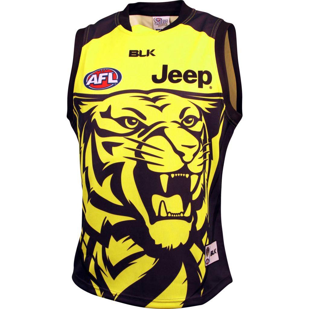
time to return the traditional Richmond yellow
BLK's black is more grey than brownSo you're wearing brown and gold yet again this year? Feel your pain. When we had reebok were wore silver, teal, brown & white.
so we're wearing grey and basket beige
hitthepost
Norm Smith Medallist
I would think someone new to the game and/or unfamiliar to the teams might think this is the Gold Coast, if they knew the colours, looks like theirs colours splashed on a default dark kit. If Adelaide are supposed to have Gold that is not it. Maybe they are complying with some AFL bullshit about being majority dark, ie. the sides.
Nahh it's just been a long line of templates with side-panels, and then BLK/the Crows not realising that without actual side-panels, the colours are meant to go all the way around.
Will be fixed next year:
It'll return to full hoops in 2016, the guy at the club store said the CAD drawing has already been amended for next year.
Pretty much what HTP said, it's been so long since full hoops that I'm assuming someone at BLK designed it based on previous designs, and the Crows ticked it off without realising how stupid it's going to look.
Even the shop manager admitted he didn't really notice it until people brought it up and he saw the jumper in person.
Next year will be the year BLK introduces side panels.Nahh it's just been a long line of templates with side-panels, and then BLK/the Crows not realising that without actual side-panels, the colours are meant to go all the way around.
Will be fixed next year:
Groupie_
time to return the traditional Richmond yellow
Lol, the stitching would be all over the shopNext year will be the year BLK introduces side panels.
no it doesn't it should go further up, but the lowered stripe has become a part of norths kit of recent times, i for one would be a little disappointed to see it go.
pretty sure Spitta2Azza is with me on that.
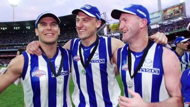
The middle stripe cut-off (introduced in 2012) reminds me of Jack Ziebell and Ben Cunnington in their prime. It reminds me of Todd Goldstein at his best, it reminds me of our exciting young players in Kayne Turner, Luke McDonald, Taylor Garner and Ben Brown.
The full middle stripe reminds me of our nadir 2001-2011 period. Players such as Matt Riggio, Jesse Smith, Brad Moran, Daniel McConnell, Sam Power, Jade Rawlings and Jonathan Hay come to mind.
Mero
Norm Smith Medallist
There was this guy Carey, he played for North. His jumper always had the full stripe.The middle stripe cut-off (introduced in 2012) reminds me of Jack Ziebell and Ben Cunnington in their prime. It reminds me of Todd Goldstein at his best, it reminds me of our exciting young players in Kayne Turner, Luke McDonald, Taylor Garner and Ben Brown.
The full middle stripe reminds me of our nadir 2001-2011 period. Players such as Matt Riggio, Jesse Smith, Brad Moran, Daniel McConnell, Sam Power, Jade Rawlings and Jonathan Hay come to mind.
And then there was another guy Archer. When I picture him, same jumper.
And Schimmelbusch. And Greig. And Dempsey. And Glendinning. And just about every North player I'd rate as one of their best.
There was this guy Carey, he played for North. His jumper always had the full stripe.
And then there was another guy Archer. When I picture him, same jumper.
And Schimmelbusch. And Greig. And Dempsey. And Glendinning. And just about every North player I'd rate as one of their best.
Get what you mean but I never saw them play growing up.
Groupie_
time to return the traditional Richmond yellow
You're jokin bruddaThe middle stripe cut-off (introduced in 2012) reminds me of Jack Ziebell and Ben Cunnington in their prime. It reminds me of Todd Goldstein at his best, it reminds me of our exciting young players in Kayne Turner, Luke McDonald, Taylor Garner and Ben Brown.
Riccardo11
Cancelled
So they should change their home colors because you simply don't want to?I prefer the dark jumper over the light jumper and I think it would work better clash wise if Norf and Geelong went to mostly coloured jumpers.
Jones2ByrneJones
Hour of Pessimism
- Jul 27, 2012
- 15,820
- 27,995
- AFL Club
- Port Adelaide
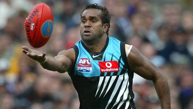
When generations collide
Riccardo11
Cancelled
I want to marry it.Ahh no worries, didn't see it in the OP. Thoughts?
Jones2ByrneJones
Hour of Pessimism
- Jul 27, 2012
- 15,820
- 27,995
- AFL Club
- Port Adelaide
there's this bird in my economics class that is the cutest s**t ever. Like, bright smile, always cheerful, great fashion sense and has a great butt. Can hold a conversation too. I want to marry her.I want to marry it.
#schoolboycrushes
Groupie_
time to return the traditional Richmond yellow
#whiskereturned
But.........
Now comes with a super miniature sponsor
Oh BLK ..
But.........
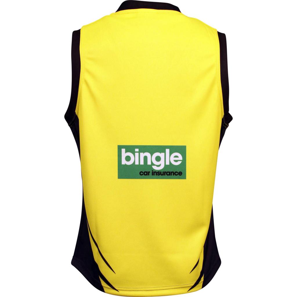
Now comes with a super miniature sponsor
Oh BLK ..
I'm trying to work out what's happening with that collar tab#whiskereturned
But.........
Now comes with a super miniature sponsor
Oh BLK ..
- Aug 21, 2007
- 31,685
- 99,068
- AFL Club
- Port Adelaide
- Other Teams
- Aston Villa, San Antonio Spurs
The middle stripe cut-off (introduced in 2012) reminds me of Jack Ziebell and Ben Cunnington in their prime. It reminds me of Todd Goldstein at his best, it reminds me of our exciting young players in Kayne Turner, Luke McDonald, Taylor Garner and Ben Brown.
The full middle stripe reminds me of our nadir 2001-2011 period. Players such as Matt Riggio, Jesse Smith, Brad Moran, Daniel McConnell, Sam Power, Jade Rawlings and Jonathan Hay come to mind.
Yeah look, as Mero said, that's all well and good if you're <18 and have only vague memories of the 90s or earlier, but for me the cut off stripe reminds me that blades felt that it would be okay if they infringed on your design to make their logo more obvious, and Canterbury decided that since Blades were doing it, nobody would care if they did it as well.
I mean
- Aug 21, 2007
- 31,685
- 99,068
- AFL Club
- Port Adelaide
- Other Teams
- Aston Villa, San Antonio Spurs
there's this bird in my economics class that is the cutest s**t ever. Like, bright smile, always cheerful, great fashion sense and has a great butt. Can hold a conversation too. I want to marry her.
#schoolboycrushes
this is the dream
Groupie_
time to return the traditional Richmond yellow
BLK's collars are a lucky dip.... You don't know what you're gonna get. Every jumper is different lolI'm trying to work out what's happening with that collar tab
These guys always find a new way to stuff up a guernsey
I'm trying to work out what's happening with that collar tab
It gives them something to fix next time.
Javelin
All Australian
- Jun 6, 2013
- 849
- 1,116
- AFL Club
- West Coast
It just looks like it's folded over (read: limp) to me.I'm trying to work out what's happening with that collar tab
- Status
- Not open for further replies.
Similar threads
- Replies
- 175
- Views
- 14K
