


Cheers for the heads up.
Was more or less suggesting that they are not alike and that you are a moron.
Follow along with the video below to see how to install our site as a web app on your home screen.
Note: This feature may not be available in some browsers.
Cheers for the heads up.
Just found this on the Saints shop - it's listed as our 2016 NAB Challenge guernsey.

Agreed, the new collar works so well with the clash. Big thumbs up on this one.The clash looks even better with the thick collar, and Pepper Money is near on the perfect sponsor logo for us. I'm starting to think that the design should continue on the lower half of the back, however, and that Dare should consider a rebrand.
RIP Dare bottle logo presentation
2015-2015
You will be missed
I got that muchWas more or less suggesting that they are not alike and that you are a moron.
very niceJust found this on the Saints shop - it's listed as our 2016 NAB Challenge guernsey.
Oh! I just noticed that the 2016 away guernsey is now up on the store as well.
WANT.
Not sure why the difference in presentation of the pepper money sponsor logo between the front of away and back of pre-season. To be honest, I'd just assumed it was only ever a placeholder since the sponsor announcement, as the actual pepper logo font is different to what we're using, not to mention their website never even makes any mention of 'pepper money' as a brand.
As for the jumpers themselves, the pre-season is obviously meant as a throwback to the old hot cross bun / crusader (side note: that was 20 years ago?!) but just doesn't quite pull it off.
The away, I loved it last year, but this year... really not liking the new ISC collar, the aforementioned pepper money logo and I know it's only one picture so far, but something about it just looks off.
Just found this on the Saints shop - it's listed as our 2016 NAB Challenge guernsey.
Huh, I just had a look on my phone and it's gone... I think they uploaded it too early and pulled it down.I'm assuming I've missed something obvious but I can't see them on the club shop?
Wish the Tiges stopped stuffing around with giant cartoon heads and went down the traditional path for pre seasonLets be honest, that Saints NAB jumper is exactly what a pre-season jumper should be. Screams St. Kilda, will appeal to the kiddies who want something new every couple of years, the can see their heroes actually wear the jumpers, but its also something you wouldn't want to see them wear in any big, important games - and it won't be.
If the "murder of crows" or "claws" jumpers had been pre-season jumpers, I wouldn't have given a s**t. Abstract logos, swirly animal heads, artistic paint splotches - these jumpers belong in the pre-season. Saints have got it right.
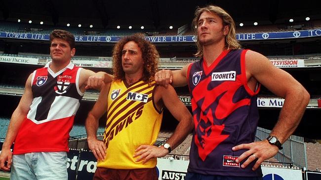
These ******* arseholes sum up all the wrong things about footy and Australia. No doubt bet they reckon they're full of banter when I'd be surprised if the fat prick on the left didn't think he was the funniest prick ever, and the two other deadshits have been playing sixths their whole lives but won't admit they're actually rubbish footballers.
I just hate them. Man.
Incorrect, you seem to be forgetting about Steven JohnsonHe'll be laughing now, but he won't be later on. Geelong don't like one man shows, not since Ablett left anyway.
he hates the look of them, and the vibe they put out. the essendon one is your typical fat essendon supporter who bandwagoned on after the 2000 grand final (used to support pokemon on game boy colour and thats it) , the carlton guy is your typical aussie carlton supporter who smells really bad if you sit next to him at the footy, and has dandruff but claims it is just dried up hair creme, and the adelaide dude is just your regular crows supporting sa bogan who has devoured about a million 'parmies' in his life and thinks that a pie floater is a traditional nutritious australian dishThey're actually exceptionally decent blokes. Very, very good people.
How would you describe yourself?he hates the look of them, and the vibe they put out. the essendon one is your typical fat essendon supporter who bandwagoned on after the 2000 grand final (used to support pokemon on game boy colour and thats it) , the carlton guy is your typical aussie carlton supporter who smells really bad if you sit next to him at the footy, and has dandruff but claims it is just dried up hair creme, and the adelaide dude is just your regular crows supporting sa bogan who has devoured about a million 'parmies' in his life and thinks that a pie floater is a traditional nutritious australian dish
A Richmond supporting dero who is on centrelink and is addicted to pokies and wants BLK to stop stuffing up our coloursHow would you describe yourself?
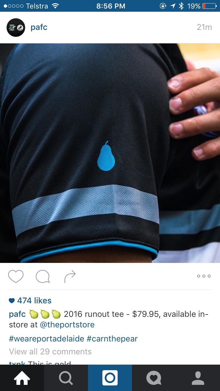
So awesome. Just waiting on those pear shirts they teased like 2 years ago then never mentioned ever again.Sent from my iPhone using Tapatalk


