


Heardy_101
LET'S GO BRANDON
LOL, watched this episode the other day.
"That's it, back to the pile!"
Follow along with the video below to see how to install our site as a web app on your home screen.
Note: This feature may not be available in some browsers.
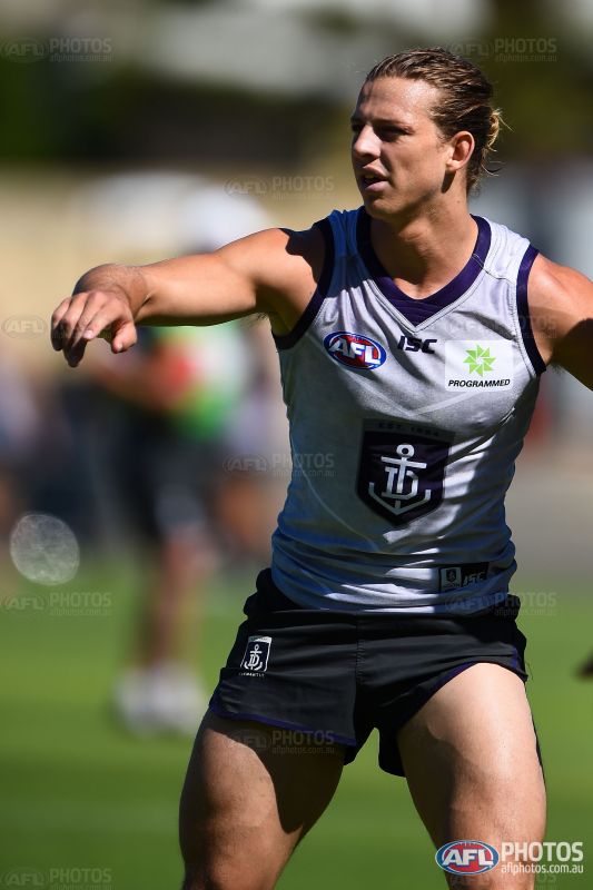
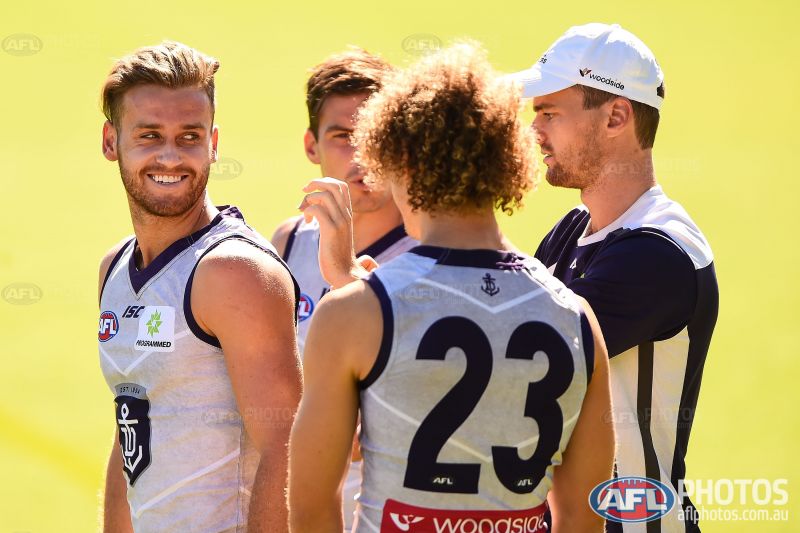

Good spot, it looks like it (middle three are different to the end two). The far left and far right ones seem in line with the 2016 version which was shown online ages ago, it's got:Is it just me or are the players wearing two different collars in this photo?

What's the deal with this? Fremantle's training strip has a slightly different version of the 2016 ISC collar, except it's the version that actually looks finished and not like a half baked idea. No faux collar flaps, no disjoint back. Looks fantastic.
When someone says "Carn the Power" it almost sounds like "Carn da pear!"
Do North Melbourne fans embrace Norf affectionately?That's like North Melbourne releasing some "Norf" merchandise. That would be great.
Do North Melbourne fans embrace Norf affectionately?
The average footy fan in Melbourne doesn't seem to heap it on them at all.Yeah, Port Adelaide supporters totally don't have that stereotype attached to them still
????????
The important thing is: Why are they floating?Is it just me or are the players wearing two different collars in this photo?
Yeah, while I certainly view Port as 'bogan', it's certainly not the first club that comes to mind.The average footy fan in Melbourne doesn't seem to heap it on them at all.
Your average punter in Melbourne doesn't heap s**t on any one but other Vic teams.The average footy fan in Melbourne doesn't seem to heap it on them at all.
I thought Surprisingly Good Insurance was like a motto for SGIO. They use it on their website.Latest news from WA: the SGI rebrand is still going ahead... eventually.
I thought Surprisingly Good Insurance was like a motto for SGIO. They use it on their website.
Still on cloud 9 after making the Prelim twice in a row?The important thing is: Why are they floating?
