

Just a thought, but what if our official documentation (letterheads etc) used our original logo, then we use this one for all for our merchandise? For our away guernsey we have a white top with a blue yellow and red horizontal band across the middle and then this image (without the lettering) sitting over the top of the horizontal bands in the middle of the guernsey? That way it isn't too big, it's black so it stands out as well. Anyone able to do a mock up? Could look pretty good.
Edit: Obviously not my design. From the message to Fagan thread.
Navigation
Install the app
How to install the app on iOS
Follow along with the video below to see how to install our site as a web app on your home screen.
Note: This feature may not be available in some browsers.
More options
You are using an out of date browser. It may not display this or other websites correctly.
You should upgrade or use an alternative browser.
You should upgrade or use an alternative browser.
The Crows Logo Thread
- Thread starter Kerleys Ghost
- Start date
- Tagged users None

Smoooothy
SACK THE LOT OF THEM!
- Jan 12, 2005
- 24,314
- 22,293
- AFL Club
- Adelaide
- Other Teams
- North Adelaide; ConeyIslandWarriors
I LOVE this!Very quick mock up (the lettering could do with some work haha) but is this what you had in mind?
View attachment 87810
This or plain hoops in my opinion.Just a thought, but what if our official documentation (letterheads etc) used our original logo, then we use this one for all for our merchandise? For our away guernsey we have a white top with a blue yellow and red horizontal band across the middle and then this image (without the lettering) sitting over the top of the horizontal bands in the middle of the guernsey? That way it isn't too big, it's black so it stands out as well. Anyone able to do a mock up? Could look pretty good.

Looks better without the crow.This or plain hoops in my opinion.
View attachment 87967

Disagree, imo it looks too robotic, reminds me of a Chinese junkship.

I think this is a German junk ...
Chinese - German, Tomato - Tomato.I think this is a German junk ...
I actually love that! Looks really good. Hell I haven't bought a single away guernsey ever and I would buy that one. Would have to get rid of the old logo on the back, but otherwise I like it.This or plain hoops in my opinion.
View attachment 87967
DD#23
Norm Smith Medallist
- Dec 31, 2013
- 9,127
- 12,400
- AFL Club
- Adelaide
the best one I've seen by MILES! Twitters pump it around! Get fages on board.Tried my hand at a side on logo. Attempted to add some elements of the old logo but the yellow beak was about the only thing that looked ok haha
View attachment 87977
exceptional work mate, the splodgy front-on ones weren't doing it for me but that is ace and kind of a modern throwback to our original logo.

- Banned
- #86
But if you update it, it then becomes a new logoI actually don't mind the new logo but the old one brings back so many great memories. Should update it a bit to make it more modern, but keep the core design
We should revert to our original logo otherwise we will never be satisfied and we'll be having this conversation again when we need a new thread because we can't think of anything else to whinge about during the off season
I was a massive fan of the front on logos to start, but now I think a side on logo would look better, especially if some elements of the original logo can be captured.the best one I've seen by MILES! Twitters pump it around! Get fages on board.
exceptional work mate, the splodgy front-on ones weren't doing it for me but that is ace and kind of a modern throwback to our original logo.
CIDA
Team Captain
- Jun 6, 2014
- 304
- 353
- AFL Club
- Adelaide
I don't really think much of any of the logos put forward in this thread...
sure, they're better than the one currently used, but that isn't saying anything...
I'm finding that these are just as gimmicky as our current logo.
Crows are elegant creatures. They're jet black and statuesque with an iridescence to their feathers. I feel like our logo should capture that and then turn that elegance into a professional brand that projects us as a club. Not a kids club showbag design.
DD#23
Norm Smith Medallist
- Dec 31, 2013
- 9,127
- 12,400
- AFL Club
- Adelaide
thing is you lose the form of the head from front on and you have eyes stuck on a big glob.I was a massive fan of the front on logos to start, but now I think a side on logo would look better, especially if some elements of the original logo can be captured.
side on makes it easier to capture the shape of a crow.
Marketing need to get the a$$ into gear and give us fans some better choices for merchandise. The current stuff out there is ruined by our current logo, looks terrible.
MonkeyMagik
Senior List
- Oct 1, 2005
- 296
- 233
- Other Teams
- Adelaide Crows
I see we've quite correctly made the top 10 worst AFL jumpers of all time in the Herald Sun
http://www.theage.com.au/afl/afl-ne...lafl-jumpers-of-all-time-20141021-119bdw.html
But would say the GWS jumper that makes them look and play like witches hats was lucky to miss out on that illustrious list... you could also probably slot quite a few of the Powers efforts in there as well.
http://www.theage.com.au/afl/afl-ne...lafl-jumpers-of-all-time-20141021-119bdw.html
But would say the GWS jumper that makes them look and play like witches hats was lucky to miss out on that illustrious list... you could also probably slot quite a few of the Powers efforts in there as well.
- Jul 13, 2012
- 43,603
- 21,025
- AFL Club
- Adelaide
- Other Teams
- Charlotte Hornets, Chelsea, Striker
I see we've quite correctly made the top 10 worst AFL jumpers of all time in the Herald Sun
http://www.theage.com.au/afl/afl-ne...lafl-jumpers-of-all-time-20141021-119bdw.html
But would say the GWS jumper that makes them look and play like witches hats was lucky to miss out on that illustrious list... you could also probably slot quite a few of the Powers efforts in there as well.
I like the GWS guernsey.
Orange and Charcoal is a good combo.
im glad we made the top 10.. i hope this gets back to the club so they get rid of the rubbish.
has anyone got pics of every guernsey we have ever had/used?
ive got a few at home. i have the original sekeem one from 1991 , 96 centenary one, 98 traning red guernsey, 2000 guernsey with new AFL logo, 2000 away guernsey, 2007 guernsey (with navy blue down the sides). havent bought one since... i will buy a new one before the 2015 season.
i regret not buying the 2009 away guernsey (re-birth of the 90s pre season one) and regret not buying the red clash jumper we wore in 2007.
Kerleys Ghost
Club Legend
- May 23, 2013
- 2,175
- 3,359
- AFL Club
- Adelaide
- Thread starter
- #95
im glad we made the top 10.. i hope this gets back to the club so they get rid of the rubbish.
has anyone got pics of every guernsey we have ever had/used?
ive got a few at home. i have the original sekeem one from 1991 , 96 centenary one, 98 traning red guernsey, 2000 guernsey with new AFL logo, 2000 away guernsey, 2007 guernsey (with navy blue down the sides). havent bought one since... i will buy a new one before the 2015 season.
i regret not buying the 2009 away guernsey (re-birth of the 90s pre season one) and regret not buying the red clash jumper we wore in 2007.
Whaa? It's absolutely hideous.
I urge you not to buy a new one before 2015 unless they improve things dramatically (ie. logo, quality). Lack of sales is the strongest message supporters can send the club.
I also liked liked 2007 red clash guernsey, but I understand why it was so unpopular.
You can normally find most guernseys on ebay if you look regularly.
Tha Main Man
Rookie
- Sep 1, 2012
- 30
- 12
- AFL Club
- Collingwood

True, people just keep coming up with cartoon logos I just don't find the appeal in them, Adelaide needs a shield instead.I don't really think much of any of the logos put forward in this thread...
sure, they're better than the one currently used, but that isn't saying anything...
SugarShane
C12 H22 O11
i regret not buying the 2009 away guernsey (re-birth of the 90s pre season one) and regret not buying the red clash jumper we wore in 2007.
I got a 2008 away one (the one before they added the stupid yellow bib on the front). It's still my all time favourite and is my standard game day attire.
GROTTO
TheBrownDog
- Jul 5, 2013
- 66,745
- 89,556
- AFL Club
- Adelaide
- Other Teams
- ¯\_(ツ)_/¯
Edit: Obviously not my design. From the message to Fagan thread.
30 Likes, thats enough for me to say we should go with this logo. Absolutely love it, it represents the steely determination of Roo, Fages and Walshy to place the Crows back on the map in the AFL.
What would the logo look like if it was all symmetrical (font included)?30 Likes, thats enough for me to say we should go with this logo. Absolutely love it, it represents the steely determination of Roo, Fages and Walshy to place the Crows back on the map in the AFL.
- Apr 12, 2012
- 4,266
- 7,036
- AFL Club
- Adelaide
- Other Teams
- Ricciardo, Red Sox
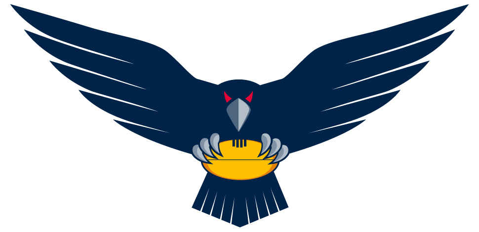
I love this. I think the wings could be slightly scaled down to retain the detail in the centre of the image when it's a smaller version.
Similar threads
- Replies
- 2K
- Views
- 29K
- Replies
- 430
- Views
- 22K
