Workshop Gold Coast Concepts

Remove this Banner Ad

2dvqszd.png


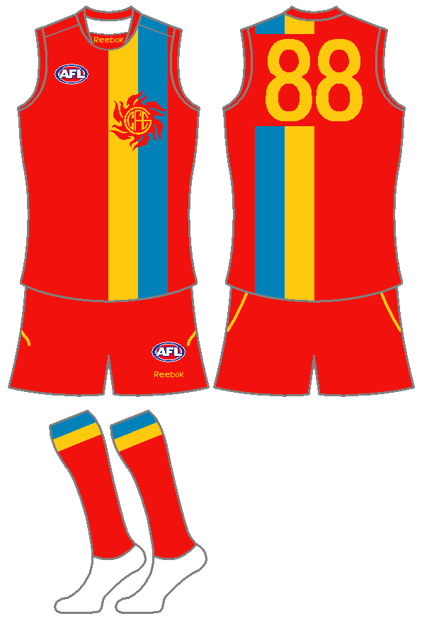
I think they should have some blue on their home jumper considering that they mention it in their song. The "GT" stripes are supposed to be the Gold Coast beach and ocean from an aerial view, and I've made the Sun logo more like a traditional monogram (I dispise the current logo!). I think overall it looks Gold Coasty and still looks traditional at the same time.
Really,really like this. Especially the logo. Top work Heyzeus :thumbsu:
 
Thanks Willo. I got the idea from the old SA state of origin top (the one before the current double V design) but moved the yellow/blue to the other side and got rid of the white.

I think a white clash version works well too, but its a bit late now. I think we'll be stuck with the wave for a while!

b63jti.png

Definately a winner if the gold coast went for a more traditional look
 

Log in to remove this ad.

I know that it's too late and all, but I think the following design would have better tied the guernsey in with the Suns name and logo. Rather than a wave for the alternate guernsey, surely a sun would make more sense. Admittedly, it looks a bit much like the Japanese imperial flag, but then again, there are lots of Japanese on the Gold Coast so maybe that's a good thing.

gold_coast.png
 
Okay sorry GANTY,maybe it was me who was confused. I didn't realise you were replying to him. I shouldn't jumptoconclusions so quickly :eek:
 
Did the AFL really say "Red is dark from 2011?" Was it light for the previous 2 billion years or whatever? :p

Or is this just what you guys think
 

(Log in to remove this ad.)

2/3 panels plus numbers are "light", its the shorts and socks that make it dark.

The back is mostly dark though... to further complicate matters. I don't think it really matters though as the new clash is the real light jumper.
 
I know that it's too late and all, but I think the following design would have better tied the guernsey in with the Suns name and logo. Rather than a wave for the alternate guernsey, surely a sun would make more sense. Admittedly, it looks a bit much like the Japanese imperial flag, but then again, there are lots of Japanese on the Gold Coast so maybe that's a good thing.

gold_coast.png

Pretty good, but don't forget to credit me (that's my #79) ;)
 
No probs. You have shown how easy it is to take GC17's basic design and just make it better without doing much extra work at all :thumbsu: The rays are not a huge diversion but they stop it looking so plain!

A few people have commented on the GC logo in the middle. I can understand that - it wasn't until 1987 that we got a team's branding that was in-your-face on the guernsey, with the BB triangle and the "EAGLES" head and name. Then we got Sydney's Opera House, Footscray's bulldog, and a whole series of clash strips now. (I left out Freo's anchor because it was a more subtle element at first, but it was a branding nonetheless.)
 
Carlton would like to have a word with you.

Yes. Yes they would. But it isn't like they had "BLUES" printed underneath it. You get what I'm saying though, right? Carlton and Fitzroy's monograms aside, jumper designs were basic elements.

Maybe I could make the point differently... if Essendon were formed as a brand new club this year, their jumper would definitely feature a fighter jet on it. It wouldn't have a sash at all.

It's not a criticism, just a point about where jumper design is at.
 

Remove this Banner Ad

Back
Top