Groupie_
time to return the traditional Richmond yellow
The Tiger head looks funny as!
The old logo would be better for this IMO
The old logo would be better for this IMO
Follow along with the video below to see how to install our site as a web app on your home screen.
Note: This feature may not be available in some browsers.
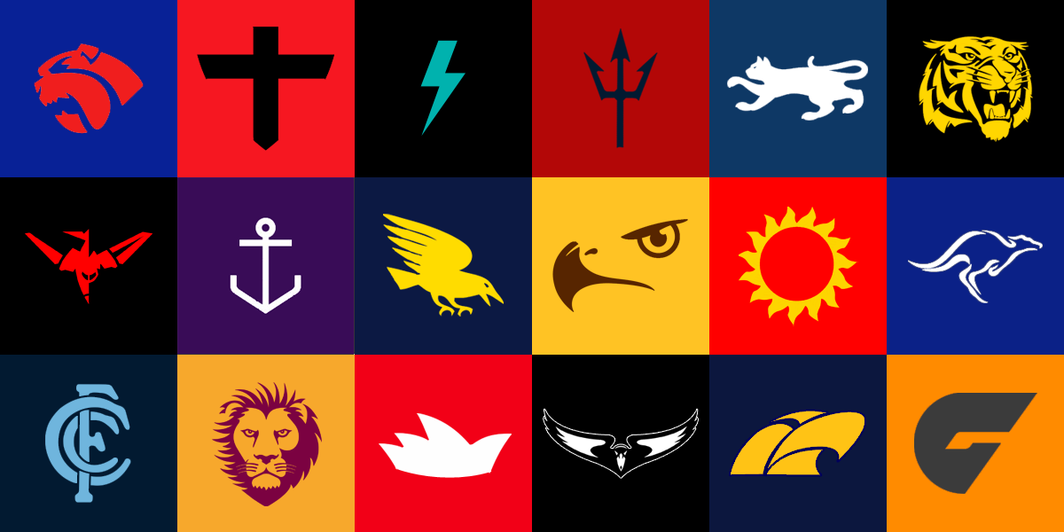
I'll give it ago tonight. I'll do all the AFL clubs and maybe a few more.
Also, http://bigbashboard.com/ has some great examples of simplified logos
")
The Geelong and Melbourne ones are freakin awesome.minimAFList. More of the same, two colour, minimising only current primary logos.
Some more awkward than others, a couple just reproductions of what's already been seen.

minimAFList. More of the same, two colour, minimising only current primary logos.
Some more awkward than others, a couple just reproductions of what's already been seen.
All the colours are good, just the designs:My crack at a-league minimalist logos
Only using parts from their official logos. Definitely can be better.
Thoughts? Changes?
View attachment 17477
 They all look great though.


Added Adelaide stars, tweaked a few others
View attachment 17602
With team strips
View attachment 17603
Furys current strip, andonis' idea
View attachment 17604
True, I reckon they're more for avatarsWith team strips is probably getting too complicated...
Basically you start with the team logo, and then just delete all the minor detail from the logo, though making sure you keep the identity of the club.How do you actually make these coz I really want to make some???
Please
How do you actually make these coz I really want to make some???
Please
And make sure you put them in equal sized squares. You can use almost any design programBasically you start with the team logo, and then just delete all the minor detail from the logo, though making sure you keep the identity of the club.
Are you looking for some specific clubs?
These are all being used by an Instagram page called afl_fantasy_fixture just to let you know.Here's what I've whipped up.
Minimalist AFL logos.

West, Centrals, South, North, Norwood
Waves = WaterWest, Centrals, South, North, Norwood
SANFL, Glenelg, WWT, Port, Sturt
How?
You'd think that a Glenelg supporter would be able to figure that out.Waves = Water
Water = Beach
Beach = Glenelg
He just had to think outside the box and he would have gotten the answer he wanted.You'd think that a Glenelg supporter would be able to figure that out.
They are called the bays...He just had to think outside the box and he would have gotten the answer he wanted.
They are called the bays...
You'd think that a Glenelg supporter would be able to figure that out.
It doesn't have to be a directly obvious logo. It's a representation of the area. Sydney doesn't always use the Swan, sometimes they use the Opera House.No s**t, but who puts waves into a 'logo'
No need for that, as who puts waves into a 'logo'
We're the Tigers, not the waves, we are the bays but not WAVES