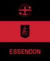
Agreed, just changing the colours and maybe making the bomber look a little sleeker would suffice.Hot take:
Essendon's logo isn't iconic
BUT
its shape, the upside down triangle is.
Follow along with the video below to see how to install our site as a web app on your home screen.
Note: This feature may not be available in some browsers.
Due to a number of factors, support for the current BigFooty mobile app has been discontinued. Your BigFooty login will no longer work on the Tapatalk or the BigFooty App - which is based on Tapatalk.
Apologies for any inconvenience. We will try to find a replacement.
LIVE: Sydney v Carlton - 7:40PM Fri
Squiggle tips Swans at 60% chance -- What's your tip? -- Injury Lists »
Supercoach Round 10 SC Gameday Talk - SC Trades ,//, AFL Fantasy Round 10 AF Gameday Talk - AF Trades
Due to a number of factors, support for the current BigFooty mobile app has been discontinued. Your BigFooty login will no longer work on the Tapatalk or the BigFooty App - which is based on Tapatalk.
Apologies for any inconvenience. We will try to find a replacement.
LIVE: Sydney v Carlton - 7:40PM Fri
Squiggle tips Swans at 60% chance -- What's your tip? -- Injury Lists »
Agreed, just changing the colours and maybe making the bomber look a little sleeker would suffice.Hot take:
Essendon's logo isn't iconic
BUT
its shape, the upside down triangle is.
How many times does it need to be said that that’s not the reason they’re thinking of changing their logo?Hard to think of a better emblem for a sporting team than a bomber lol, the world has gone nuts
Log in to remove this Banner Ad
I remember you made a similar point around North's 2003 heritage jumper. A throwback to a compromised design that was highly unsuccessful and if it is supposed to celebrate history, why celebrate an era best forgotten?I made a thread about something similar a while ago, guernseys that became associated with failure because of when they were worn during a down period, and the opposite, guernseys that become mainstays because the club played well in them. An example of the former would be North's Argentina strip, worn against Geelong and Collingwood during a period where they won all premierships between them, and the latter would be richmond's black sash on yellow clash strip, because it was worn for the 2017 flag.
It fits on with the militaristic theme, for me at least it looks like the downward chevron of the Corp/Sgt airmen ranks.Hot take:
Essendon's logo isn't iconic
BUT
its shape, the upside down triangle is.
Literally no one is offended by the word bomber it's entirely a right wing media concoction developed to attract clicksHard to think of a better emblem for a sporting team than a bomber lol, the world has gone nuts
That's even worse than a war machine. Malaria kills more than half a million people every year.The reason behind it being some of their supporters might find the current one's wartime reference offensive. Wow.
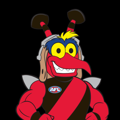
I say they embrace the skeeter
![]()
That's even worse than a war machine. Malaria kills more than half a million people every year.
And why are his eyebrows blue?
I like this.The new logo just needs to be a refresh of the current one in my opinion. Just like characters in cartoons, logos should be almost instantly identifiable by silhouette alone (which was why I think Port should have kept a rectangular emblem but that's a different story).
Just a colour and font update, a bit rough but you get the idea.
View attachment 1722504 View attachment 1722528
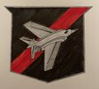
I like the plane, I'm not big on the text sitting underneath or how the 1872 is incorporated. What if you put the plane in a circle with the text wrapped around it?Had a crack at this. Noticed the plane on their logo aligned with the bomber/strike aircraft the Air Force operates at the time of the logo was released (the mirage in the 1970s logo and the F-111 in the current logo). Following that, I decided to base it on the F-35 which currently plays the role of a bomber for the RAAF.
View attachment 2123568
Do you have a version of the new one but with the plane still grey?The new logo just needs to be a refresh of the current one in my opinion. Just like characters in cartoons, logos should be almost instantly identifiable by silhouette alone (which was why I think Port should have kept a rectangular emblem but that's a different story).
Just a colour and font update, a bit rough but you get the idea.
View attachment 1722504 View attachment 1722528
These always rip the soul and quirks of these logos out and leave them looking like an emblem any team could use.Just need a modern update like the Saints when they had their 150th anniversary logo. A refresh, just remove the grey inner border and make it entirely red and black except for the plane.
I had something like this.Do you have a version of the new one but with the plane still grey?
Thanks, that's brilliant work. This one with the updated font of your other piece would be my ideal design.I had something like this.
Looks a lot closer in spirit to the original but I think the other version would be better from a branding point of view. I think my only gripe with the current logo is the 'Essendon' wordmark looks quite dated. But otherwise if this is what the club dished up I wouldn't hate it either. I just hope they stick with the Bomber and general shape of the current logo.
View attachment 2138408
The top logo is quality, I don’t like the tall monogram one in the middle but tradition and allMade this a while back
View attachment 2138990
The above logo create a historical looking logo. However, by colouring the plane the colours used in other logos could create a better logo. The plane in the logo has been greys since the 1990's and white since the 1970's.Made this a while back