News Essendon exploring logo change

Remove this Banner Ad

TimothyJ23

Club Legend
Oct 24, 2015
1,144
1,266
Melbourne
AFL Club
Collingwood

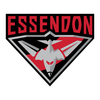
ESSENDON is giving strong consideration to changing its logo.

The Bombers have one of the oldest unchanged emblems in the AFL, with its current jet image unveiled in 1997.

But the club has embarked on a long process towards a logo revamp. While there are no guarantees a change will be made, there are also no guarantees the plane remains central to Essendon’s brand.

Essendon became the Bombers in 1940. There is no suggestion the club’s nickname will be changed.

But the club is conducting a preliminary research project with an eye to changing its emblem. That projects includes feedback from various stakeholder, supporter and member groups.

The project is seeking to determine how Essendon members and stakeholders view their club, with a number of consultations held over the past four months.

----------

Very interesting - and some might say long overdue.
 
5k1na7.png
 

Log in to remove this ad.

Thought the best time for this was probably around 2017 after the whole ordeal the club went through. I don't really think they need a new one now.

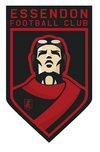
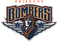
I can't find it but someone here years ago made one that had the image of an old timey fighter pilot with the goggles and a red scarf placed to look like the sash. That's probably the only direction worth going in, better than going again with a piece of violent machinery. What they'll actually do is the most boring thing: sticking a monogram in a shield like Fremantle or Port even though they have cool imagery to play with.
 
The reason behind it being some of their supporters might find the current one's wartime reference offensive. Wow.

I say they embrace the skeeter

84d022d16e8e2e2e944a550750db043d67c49a15.png
 
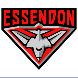
I've always found it really weird and kind of funny that they're still holding on to that 90s ass logo. Of all the eras in footy, or just eras in general where you wouldn't want a design to stick around seemingly forever, it would have to be the 1990s. Port and Freo, the two teams who joined the AFL around that time have completely revamped their look and only revisit that era's designs as a funny novelty. It's all sharp edges and shiny highlights, for some reason it's all silver and it doesn't even have a red sash on it, totally incongruous to Essendon's entrenched onfield identity. Compare it to Carlton or Collingwood's logos that look like coats of arms, symbols of grand old institutions that carry a weight of prestige and power. I'm obviously no fan of Essendon but it seems obvious that their history is the thing they should be trying to emphasise if they want to project a strong identity as an institution. It's why Port threw away their 1990s look and now have the prison bars and est. 1870 in their logo.

The "are bomber planes not PC enough" thing just reads as culture war bait to me, I doubt that's even a real consideration they're making. It's more likely they're just weighing up whether you need your club's mascot/nickname to be on the logo at all.
 
I can't find it but someone here years ago made one that had the image of an old timey fighter pilot with the goggles and a red scarf placed to look like the sash.
IMG_4731.png

Genuinely saved this years ago, I found it that cool. Should be bumped again now we know AFL suits are tapping the Bigfooty talent pool. ScottFreo


(Log in to remove this ad.)

View attachment 1717232

Genuinely saved this years ago, I found it that cool. Should be bumped again now we know AFL suits are tapping the Bigfooty talent pool. ScottFreo

Perfect. SF was a great contributor here years ago.
 
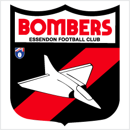
Notwithstanding some tweeks to the crest design, Essendon has really only had the two logos.. Essendon logos (credit Mero)

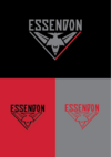
It's being reported that the red sash may be part of any revamp so might see something like the 150th monogram logo from last year.

The colours of the current logo - which includes a lot of grey - have also been flagged so another option could be an updated plane design with more red and black.


Essendon-logo-1995.gif

Essendon-logo-1997.gif

Essendon's new logo for 150th anniversary : r/AFL


[Failed NRL bid Brisbane Bombers logo just for kicks]

Brisbane Bombers.png
 
Last edited:
I absolutely loathe that when this stuff makes its way into the public sphere that we get clickbaity rubbish articles on outlets like Fox that make the issue so binary - attempts from "greats of the game" etc to stifle discusion saying they're disappointed the club. Absolute positions, binary positions that create 'sides'.

Why can't clubs have discussions about their identity going forward? It doesn't tie them to making a change but if the majority agree that it would be beneficial and an agreeable logo can be settled on - current or new - then that's a good thing?

Funnily enough I don't remember Collingwood doing much consultation before the 2017-18 updates. And even then I love our current logo.
 
View attachment 1717232

Genuinely saved this years ago, I found it that cool. Should be bumped again now we know AFL suits are tapping the Bigfooty talent pool. ScottFreo

1687236093327.png

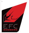
This this one from that poll is a little underrated in concept, including the sash in the logo for is just an unnegotiable if I was an Essendon fan. Definitely rather sticking to just "EFC" or "Essendon" rather than include the bombers tag line.

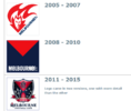
Reminds me of what an update to the Essendon logo around ~07-09 could've looked like, similar to what Melbourne played around with at a similar time.
1687236318853.png
 
As a side note and don't mean to open up a huge can of worms, but what is the actual contention regarding this is offensive for reasons that it relates to war? I feel we already "celebrate" war with ANZAC Day, which Essendon already play a huge part of that occasion. The Bombers moniker to me was always an adjective(?), referring to the actual veterans who piloted bombers during WW2 for which the RAAF training schools and airbases around the Essendon area are greatly connected by and for the most part celebrate today as war heroes.

I do feel like dropping the bomber is a move akin to Apple's changing of the gun emoji to a water pistol in an effect to "combat gun violence" despite having no effect on gun violence. A bomber can certainly be a harsh reminder of the brutality of war, but we already have an entire national public holiday based around that.
 
View attachment 1717450

This this one from that poll is a little underrated in concept, including the sash in the logo for is just an unnegotiable if I was an Essendon fan. Definitely rather sticking to just "EFC" or "Essendon" rather than include the bombers tag line.

Reminds me of what an update to the Essendon logo around ~07-09 could've looked like, similar to what Melbourne played around with at a similar time.
View attachment 1717458
IIRC the 08-10 logo was hastily thrown together as the club felt pressured by chinese sponsors to ditch the Demon logo, was never really supposed to be permanent.

Then we got the Homer car from the Simpsons of logos, truly beffitting that period of our clubs history.
 
IIRC the 08-10 logo was hastily thrown together as the club felt pressured by chinese sponsors to ditch the Demon logo, was never really supposed to be permanent.

Then we got the Homer car from the Simpsons of logos, truly beffitting that period of our clubs history.
1687237463254.png

Gotta admit, they thought of everything possible to cram into that 2011-15 one. Always loved this little touch to the M of the wordmark.
 

Remove this Banner Ad

Back
Top