The Crows Logo Thread

What should be done regarding our logo?


  • Total voters
    235

Remove this Banner Ad

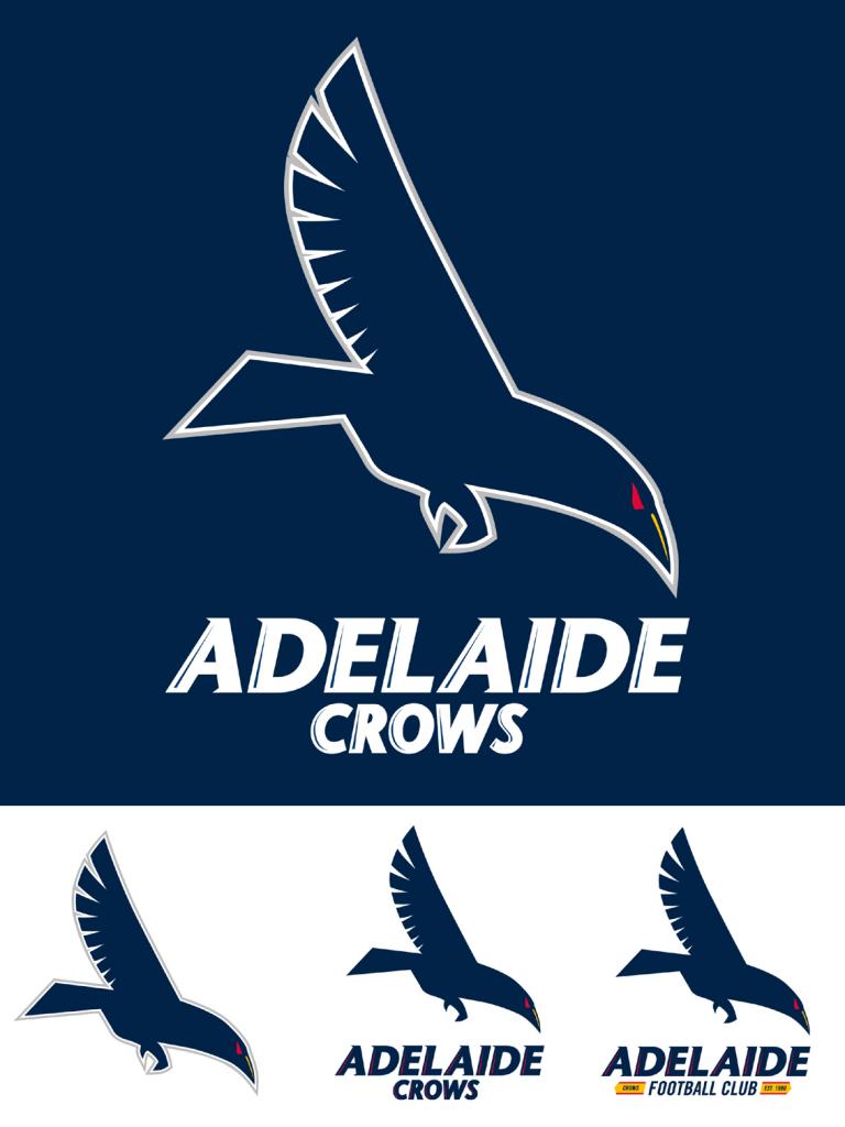
This one is the winner for me, also made by 23_fan
Strong, intimidating, swooping like the old logo, modern and classy, would look fantastic on merchandise.

AFCLogo_zps1efafc71.jpg

Disagree, imo it looks too robotic, reminds me of a Chinese junkship.

junkship.jpg
 
Last edited:
This one so much, we need to push this one, it's awesome. Red eyes though.

I made a red-eyed version already. It's over in the Fagan thread.

And the front on one with the red footy is from the Austin Crows so we can't use it as is I don't think. Though I would be a lot more comfortable ripping off a USAFL side that is based on us ("We're the pride of Austin Texas, we're the mighty Austin Crows") rather than an NFL side

Yeah sorry I don't have the graphic design skills or the time to create a completely original logo. I just wanted to make a version of the Austin logo to show people much better our logo would look with a front-on swooping Crow. I think it's a hell of a lot better than our current logo.
 
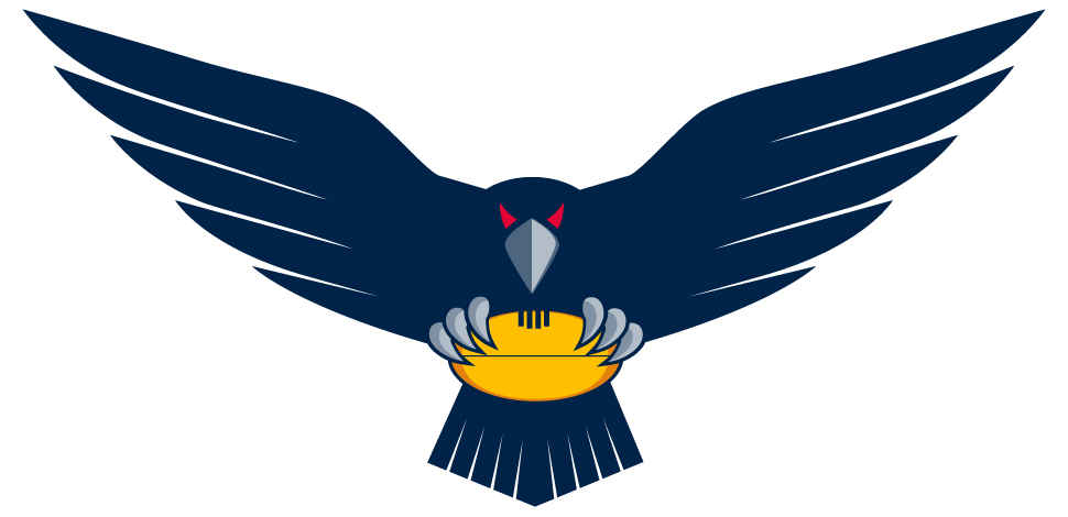
Crows.png Ok, I pinched this design from the Austin Crows (a footy team in the US) and cleaned it up a fair bit. For example, originally the crow was blue, lots of white highlighting, it had a stupid angular ball design and the shield was uglier. (edit: I see someone posted it on page 2)

I like this design because it has symmetry, is aggressive and clearly identifies our club colours.

I'll leave the name and other touches to those with more skill than I have.
 

Log in to remove this ad.

View attachment 87788 Ok, I pinched this design from the Austin Crows (a footy team in the US) and cleaned it up a fair bit. For example, originally the crow was blue, lots of white highlighting, it had a stupid angular ball design and the shield was uglier. I like this design because it has symmetry, is aggressive and clearly identifies our club colours.

I'll leave the name and other touches to those with more skill than I have.

When I get home from work I'll take a shot at combining this with my version. I think the black looks awesome even though it's not technically part of our colour scheme.
 
The logo is not as bad as you're making it out to be. Maybe it's not the right fit for our club, and that's fine, but the Baltimore Ravens do not have a horrible design.

I just hate it. Hated it as soon as it was first shown. Never felt that way about the previous logo / logos, never felt that way about the logos of any other clubs I follow. So it is just my opinion, but it seems to be a very popular one.

Must say I also don't like that the Redlegs logo changed, that seemed absolutely pointless, think the old one was better but the new one isn't something I have really thought about since it changed.
 
I would also have the red and yellow panels horizontal like our hoops than vertical like that.
Yes, I agree with that, but the skills required to do that are beyond me.

To make the blue shield look like a variant of our tri hooped jumper, you'd make the stripes horzontal, thinner and add blue ones. The shield being blue then is keeping with our jumper as well. The crow remains black, because crows are always black, just like Claude the crow our mascot.
 
View attachment 87788 Ok, I pinched this design from the Austin Crows (a footy team in the US) and cleaned it up a fair bit. For example, originally the crow was blue, lots of white highlighting, it had a stupid angular ball design and the shield was uglier. (edit: I see someone posted it on page 2)

I like this design because it has symmetry, is aggressive and clearly identifies our club colours.

I'll leave the name and other touches to those with more skill than I have.
Very quick mock up (the lettering could do with some work haha) but is this what you had in mind?
Trial.jpg
 
Even if they didn't adopt this, it'd be cool if they used it as an "alt" logo for stuff.

Stuff it, since it isn't actually the offical logo (so arguably no copyright issues) we should just use it ourselves and create a custom t-shirt/jumper on teespring or whatever website makes things like that. Would wear this logo over the current one any day of the week.
 

(Log in to remove this ad.)

Not bad at all. Pretty darn good actually. Stomps all over our current one.

I made it ages ago for another thread.

I just copied the text and stripes from the old logo, then slapped some crow on it. Took 30 minutes tops.

That's how easy it is. How the club cocked it up so badly I'll never know.
 
On a side note a friend of a friend (yep one of those) knows the bloke who effectively designed the original cartoon crows logo. He submitted the design work, was told he was unsuccessful and then a few weeks later they basically announced his logo with enough alterations to it that he didn't score any royalties. Can confirm I've seen his original design and the cartoon is very very similar in appearance.

Ah the good old days.
 
Back
Top