The Crows Logo Thread

What should be done regarding our logo?


  • Total voters
    235

Remove this Banner Ad

I'm not a fan of the logo or the guernsey TBH

The Crest makes no sense for us as a logo as one of the newer clubs, and still a relatively young club. I think Melbourne is the only other club that has a traditional crest for a logo (Collingwood and Saints maybe counts). Would come across as a club that is not sure who it is and is trying to create a heritage thats not there, save the identity crisis for Port.
 
that crest makes sense in association with the colors of all the SANFL clubs as it was once presented. I love it in that form. but yeah on its own it lacks context
 

Log in to remove this ad.

that crest makes sense in association with the colors of all the SANFL clubs as it was once presented. I love it in that form. but yeah on its own it lacks context
Yeah the one with the SANFL colours is better, but I just grabbed one from Google to make a point that its not that hard to improve on what we currently have.

I don't believe we have to be a club that's been around for 100 years before we can use a crest as our logo, and definitely wouldn't be an identity crisis. What was the point of us creating one in the first place if we never use it for anything?

Having said that, it doesn't bother me if we go for the crest, or a logo similar to what we used to have as long as it sees us move away from the rubbish one that is there at the moment!

Yeah I have no problem with the crest whatsoever, in fact when it has the SANFL colours with it it says a lot about who we are and where we come from and I like it a lot
 
Yeah I have no problem with the crest whatsoever, in fact when it has the SANFL colours with it it says a lot about who we are and where we come from and I like it a lot
Yeah I loved when we used that Guernsey (Was it for Roo's 300th?).
Would love to see something like that one used for our away strip.

I see no need for us to change it every year and go from one terrible design to another....

Edit: Yeah it was. This but a white strip:

url
 
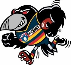
Nobody should have to have a cartoon logo to pander to kids. I don't actually think kids care that much what the logo looks like that they need a cartoon one. But if we have to, bring this one back:

AdelaideCrowsLogo.jpg

love this logo, miles better than the current bland logo
 
I've got an idea let's get a logo that actually looks like a crow, unlike the crap we have now which is embarrassing.
 
For those that like shields, i wonder what something in the vein of this would look like

manchester_city_logo.jpg

The new crow with the head above and wings coming our from the sides. Don't worry about using the tail.

The shield we currently use could then be used as the shield, or having Adelaide Crows written as 2 lines (adelaide top then crows in larger letters underneath so same width) and then blue, red and gold hoops underneath would also look good.

If i had the skills id mock it up as I reckon it could be effective
 
The SANFL website is using the crest type logo as a link to our club website on its main page. Not the floating sonic the hedgehog head.

http://sanfl.com.au/
I'll have to disagree with that last bit, sonic the hedgehog brings back fond childhood memories whereas the only thing our current logo has the potential to bring back is what I'd like to keep in my stomach.;)
 
For those that like shields, i wonder what something in the vein of this would look like

manchester_city_logo.jpg

The new crow with the head above and wings coming our from the sides. Don't worry about using the tail.

The shield we currently use could then be used as the shield, or having Adelaide Crows written as 2 lines (adelaide top then crows in larger letters underneath so same width) and then blue, red and gold hoops underneath would also look good.

If i had the skills id mock it up as I reckon it could be effective

eww not that logo
 

(Log in to remove this ad.)

How is the crest so popular? Besides the fact it's inappropriate for a club that wasn't built 100 years ago, it's just too crowded and ugly.

Why is my purely subjective preference not the same as everyone else's is what I'm saying, basically.
 
How is the crest so popular? Besides the fact it's inappropriate for a club that wasn't built 100 years ago, it's just too crowded and ugly.

Why is my purely subjective preference not the same as everyone else's is what I'm saying, basically.

I've said this the whole time, just doesn't make sense to me that one of the youngest teams in the competition would be the only team along side Melbourne to have such a traditional crest as a logo. Same with us being the newest club in the SANFL having the most traditional logo.

I don't know if its just because they believe anything is better than the current one or is the stuff from Port Est. 1870 supporters about us not having a history getting to people.

Then you have most people saying the club caters too much to older supporters... I don't get it. Want a new logo fine but its not like we have some old logo from 18whenever to draw upon so if we want to acknowledge our history update the original one, otherwise just come up with something better.

Young club with conservative leadership = Crest. Same combination gives us the floating head as they think it is young and hip.
 
Nobody should have to have a cartoon logo to pander to kids. I don't actually think kids care that much what the logo looks like that they need a cartoon one. But if we have to, bring this one back:

AdelaideCrowsLogo.jpg


One of the best mascots ever in the AFL.
I never understood why you dropped it.
 
But it's not a Crow

Crows (Corvidae) are a family of birds, we could have a magpie as a logo and it would be accurate. It looks more like a crow than the suns logo looks like the sun,more than the bombers logo looks like a bomber aircraft and port's logo is a horrible representation of electricity.
 
Crows (Corvidae) are a family of birds, we could have a magpie as a logo and it would be accurate. It looks more like a crow than the suns logo looks like the sun,more than the bombers logo looks like a bomber aircraft and port's logo is a horrible representation of electricity.
Tell me, are you employed by the club?
 
Back
Top