Navigation
Install the app
How to install the app on iOS
Follow along with the video below to see how to install our site as a web app on your home screen.
Note: This feature may not be available in some browsers.
More options

You are using an out of date browser. It may not display this or other websites correctly.
You should upgrade or use an alternative browser.
You should upgrade or use an alternative browser.
Workshop Template Feedback Thread
- Thread starter NM_Mitchell
- Start date
- Tagged users None
- Aug 21, 2007
- 31,682
- 99,061
- AFL Club
- Port Adelaide
- Other Teams
- Aston Villa, San Antonio Spurs
Some of the YI templates are great but the footy guernsey isn't really one of them. It's a bit of an odd shape, the collar is very 2005 and I haven't seen someone using it pair it with a pair of actual footy shorts.
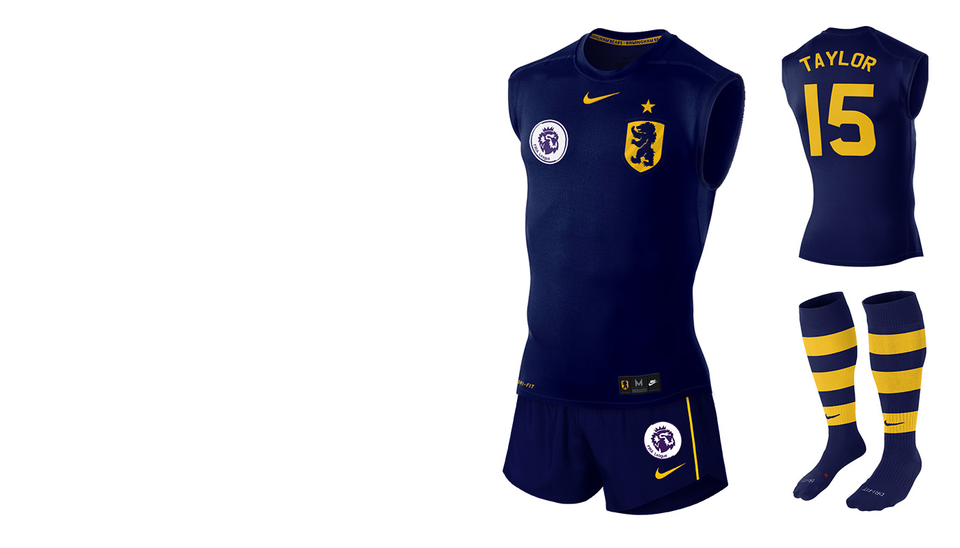
My current template is based off of a Nike sleeveless compression shirt that i've edited fairly heavily.
My current template is based off of a Nike sleeveless compression shirt that i've edited fairly heavily.
Some of the YI templates are great but the footy guernsey isn't really one of them. It's a bit of an odd shape, the collar is very 2005 and I haven't seen someone using it pair it with a pair of actual footy shorts.
My current template is based off of a Nike sleeveless compression shirt that i've edited fairly heavily.
I felt like it was closest to Adidas' Hawthorn jumpers from 2015/16 or Nike's replica jumpers than anything from 2005.
What does your template look like at the moment?
Freight Train
Once hit the sign at the Mercantile Mutual Cup
- Moderator
- #1,104
The Yellow Images footy guernsey is pretty shite IMO.
You are better off getting one of the form fitting soccer ones and editing that down to be a footy guernsey.
You are better off getting one of the form fitting soccer ones and editing that down to be a footy guernsey.
You mean just cutting the sleeves off?The Yellow Images footy guernsey is pretty shite IMO.
You are better off getting one of the form fitting soccer ones and editing that down to be a footy guernsey.
- Aug 21, 2007
- 31,682
- 99,061
- AFL Club
- Port Adelaide
- Other Teams
- Aston Villa, San Antonio Spurs
I felt like it was closest to Adidas' Hawthorn jumpers from 2015/16 or Nike's replica jumpers than anything from 2005.
What does your template look like at the moment?
It's constantly evolving but here is the most recent iteration as I work on my entry for the next FIRA season.
Freight Train
Once hit the sign at the Mercantile Mutual Cup
- Moderator
- #1,107
You mean just cutting the sleeves off?
It's a bit more than that... but basically yes, that and cutting down the shorts.
It's constantly evolving but here is the most recent iteration as I work on my entry for the next FIRA season.

That better not be the new FIRA logo and is just a placeholder, because wow that looks horrible (not counting it being a complete rip-off).
Freight Train
Once hit the sign at the Mercantile Mutual Cup
- Moderator
- #1,109
That better not be the new FIRA logo and is just a placeholder, because wow that looks horrible (not counting it being a complete rip-off).
I think it's mint, tbh.
Mostly because it's supposed to be a rip-off.
- Aug 21, 2007
- 31,682
- 99,061
- AFL Club
- Port Adelaide
- Other Teams
- Aston Villa, San Antonio Spurs
That better not be the new FIRA logo and is just a placeholder, because wow that looks horrible (not counting it being a complete rip-off).
FIRA isn't really my comp anymore so it's not my call, but obviously it's intended to be a rip off given the old FIRA koala was a rip off of the old Premier League logo.
I'm really happy with it. Dylan8 gave me a brief to update it based on the new EPL logo and I think I executed it really well.
- Aug 21, 2007
- 31,682
- 99,061
- AFL Club
- Port Adelaide
- Other Teams
- Aston Villa, San Antonio Spurs
Just for clarity

- Jun 18, 2016
- 51,751
- 99,131
- AFL Club
- West Coast
- Other Teams
- Perth Scorchers
I love your work Scorch but I see a monkey. Or a monkoala.
That's the point(not counting it being a complete rip-off).
Klim
Brownlow Medallist
- Sep 17, 2013
- 12,532
- 10,363
- AFL Club
- Sydney
Shouldn't it be the Champions League logo then? As other European teams are competing?
Nah, Scorcho's original heavily aped the old Prem logo, it's a 'natural evolution' in that sense.Shouldn't it be the Champions League logo then? As other European teams are competing?
- May 29, 2017
- 520
- 1,127
- AFL Club
- Geelong
- Other Teams
- Port Adelaide Magpies
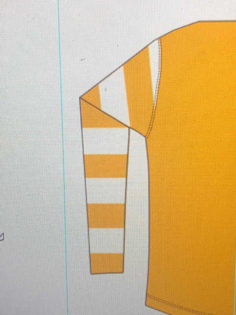
My long-sleeve template.
Also comes in sleeveless with the same shape.
The stripes don't seem right though. Any feedback?

Also comes in sleeveless with the same shape.
The stripes don't seem right though. Any feedback?

fancyscum
Radical Crommunist
Is it because you can see the fold on both sides?
- May 29, 2017
- 520
- 1,127
- AFL Club
- Geelong
- Other Teams
- Port Adelaide Magpies
Is it because you can see the fold on both sides?
THANK YOU! Haha I knew something was off. Good eye
- May 29, 2017
- 520
- 1,127
- AFL Club
- Geelong
- Other Teams
- Port Adelaide Magpies
Is it because you can see the fold on both sides?
Is this right? I can’t really figure it out. Seems like a huge gap between second and third stripe from top
On iPhone using BigFooty.com mobile app
- Aug 21, 2007
- 31,682
- 99,061
- AFL Club
- Port Adelaide
- Other Teams
- Aston Villa, San Antonio Spurs
I reckon it's just a bit of an optical illusion because of the white. Swap the colours and see if it still looks bigger
- May 29, 2017
- 520
- 1,127
- AFL Club
- Geelong
- Other Teams
- Port Adelaide Magpies
Ok will do. Do the stripes themselves look positioned properly at the fold?
On iPhone using BigFooty.com mobile app
On iPhone using BigFooty.com mobile app
- May 29, 2017
- 520
- 1,127
- AFL Club
- Geelong
- Other Teams
- Port Adelaide Magpies
Nah it seems alright. Cheers boys

fancyscum
Radical Crommunist
Completely OT, but the limpness of the sleeves reminds me of my year 9 science teacher, shout out to Ivo if he's reading this.
- May 29, 2017
- 520
- 1,127
- AFL Club
- Geelong
- Other Teams
- Port Adelaide Magpies

Similar threads
- Replies
- 10
- Views
- 914
- Replies
- 29
- Views
- 4K
- Replies
- 48
- Views
- 2K
- Replies
- 27
- Views
- 1K
