fancyscum
Radical Crommunist
I believe it was actually referred to as “#thefurnace” which is even worse.The Furnace
Follow along with the video below to see how to install our site as a web app on your home screen.
Note: This feature may not be available in some browsers.
I believe it was actually referred to as “#thefurnace” which is even worse.The Furnace
maybe, they might go more of a QLD state of origin jersey.I wonder if that means their kit will get rid of the gold/yellow?
Outline on BULLS but not FIRE? That's annoying.
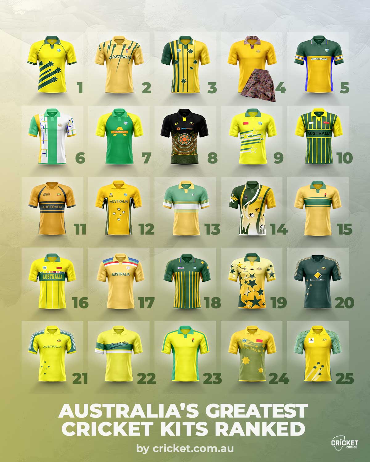
Not looking forward to the "new era". Likely to be as plain as the last few."...the Big Bash League to begin a new era next Monday, September 20, when the new Nike brand kits are officially launched ahead of the 2021-22 season"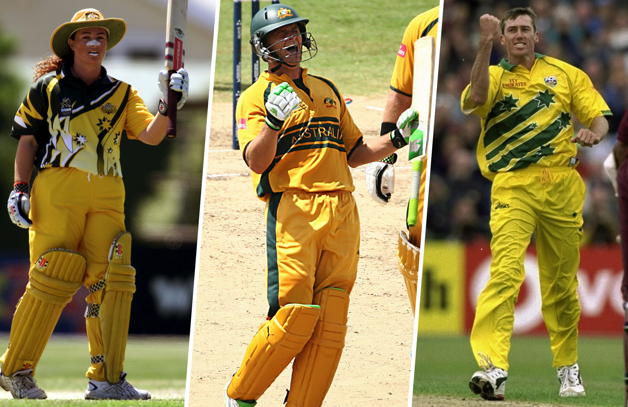
Kit Week: The top 25 Australian kits of all time | cricket.com.au
Ahead of the launch of Nike's new Big Bash kits, we rank the best 25 Australian kits of all timewww.cricket.com.au
Not sure why commbank would be happy with the test kit.
Not sure why commbank would be happy with the test kit.
They've completely changed the colours. The yellow I can kind of understand to match the new commbank logo, but they have gone back to the lime green as well presumably because it is more 't20'. Would have been less garish in the gold and bottle green.looked better as an illustration, and even then... ehh haha
View attachment 1234971
Well they were half right...looked better as an illustration, and even then... ehh haha
View attachment 1234971
I think I saw somewhere that the gold piping is used only for the Ashes now.The green and gold piping on the test shirt must be on rotation
Could just be the lighting?Tbf their logo redesign sucked so it's on them for it looking completely washed out on the kit
It will be seen outdoors in bright sunlight though given it is a cricket shirt so they really should have considered it. Surprised they didn't give it a black box.Could just be the lighting?

Oh no.View attachment 1235133

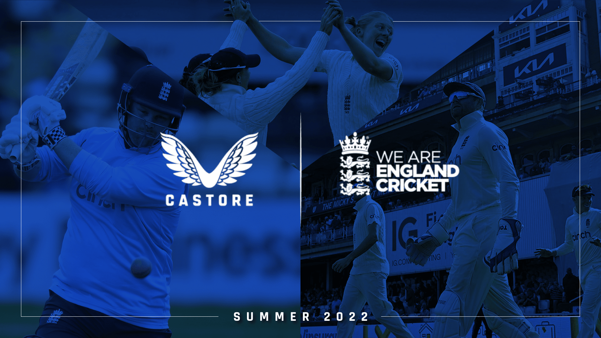
Castore confirmed as Official Kit Supplier to England Cricket
British clothing manufacturer Castore will supply bespoke men's and women's teamwear to all England Cricket teams from April 2022.www.ecb.co.uk
I'll get Burley Sekem on the line...View attachment 1235133

Castore confirmed as Official Kit Supplier to England Cricket
British clothing manufacturer Castore will supply bespoke men's and women's teamwear to all England Cricket teams from April 2022.www.ecb.co.uk
