Unpopular AFL Opinions

Remove this Banner Ad

I would like to see teams get more creative with their second jumpers. Move away from their design and colourways and change them more often in the same way European soccer clubs do.

Carlton with a yellow/green/orange jumper, navy monogram, would sell a heap more jumpers year on year and more importantly actually solve the issue of a clash. Currently it’s just half assed where we try to keep as much navy on the jumper as possible. Almost at the point where you just wear white shorts and save the hassle.
For some clubs it's easy. A green Carlton guernsey with the black logo would look awesome. I like the idea.

There is universal love for the Tigers reverse clash guernsey. It looks cool and is a reminder of the 2017 GF, aka best day of my life :cool:
 
For some clubs it's easy. A green Carlton guernsey with the black logo would look awesome. I like the idea.

There is universal love for the Tigers reverse clash guernsey. It looks cool and is a reminder of the 2017 GF, aka best day of my life :cool:
Have a team down my way who had this as their main jumper due to having 2 Tigger teams in the League called them the yellabellies
 

Log in to remove this ad.

I would like to see teams get more creative with their second jumpers. Move away from their design and colourways and change them more often in the same way European soccer clubs do.

Carlton with a yellow/green/orange jumper, navy monogram, would sell a heap more jumpers year on year and more importantly actually solve the issue of a clash. Currently it’s just half assed where we try to keep as much navy on the jumper as possible. Almost at the point where you just wear white shorts and save the hassle.
I'm exactly the opposite. There are too many jumpers as it is, turn the TV on and its harder to tell who's playing than in the days of no clash and away jumpers (other than the scores always being on screen).
What we do need is less white away and clash jumpers. They're fine if white is a normal secondary/tertiary colour, e.g. Carlton, but for GC and the like, why?
In many cases just reverse the colours is enough, in some others a change of pattern and/or colour is needed. But, once the jumper is decided, stick to it rather than using four or five jumpers a year and 2-3 of those being new ones the following year.
 
Clash jumpers should be simple and also try and show a bit of history like Brisbane with the Fitzroy jumper.

Eagles with their original predominantly yellow jumper
Dockers with their green jumper
 
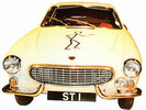
I wonder if they paid a fee to the TV production company that designed it for The Saint TV show.
Isn't it the same as an old early 80s logo? They might have rights for reproduction in perpetuity
 

Looks like the saints have used it as early as 1976.
I can’t see how the the Author or Illustrator could have failed to take out copywrite on it?

“Created by the books author Leslie Charteris (1907-1993) it was Templar's calling card as well as an integral part of virtually every book cover published.”

“The logo proper was developed by Charteris’ friend, the illustrator Eugene Hastain, examples of his work can be found here at the wonderful Detective-Fiction.Com website.”
 

(Log in to remove this ad.)

If there is a review and the ball comes off above the knee for an attempted kick it should not be a point but a free kick for incorrect disposal.
 
I could quote many that had us btm 2 but it would take to long
They'd be idiots then.

We've got two historically bad sides anchored to the bottom 2 at the moment.

Freo have talent. Maybe not enough talent to contend, but they'll be good enough to win a few games at home, and even last year have proven they can beat the Cats & Dees on the road.

It would take a disaster for the Dockers to finish bottom 2.
 

Remove this Banner Ad

Back
Top