Remove this Banner Ad

Media TiFmedia Presents... Random Sweet FA stuff I like - Ep 1: Kits

🥰 Love BigFooty? Join now for free.

oEiwpbp.png

Las Vegas Bears
Season 18 Clash Kit


PsDO9Ip.png


TiF's two cents...

I have no real clue about the actual backstory to this one, but this is one of the more random official Sweet FA kits in league history and I'm here for it. The Bears set the stylistic tone for what was to come out of Vegas in their return to the league in Season 18 after a 10 season hiatus having gone into Sweet FA hibernation after Season 7. Whilst sticking pretty closely to their stock and trade branding since S18, one thing the Bears have done exceptionally well over the journey has been their clash/special kits.

This particular kit was the clash kit for the successful return of the Bears franchise in the same expansion intake as the Warriors. Skippers pantskyle and DemonJim led the newly re-formed Bears with a set of striking kits to match with a quality crop of recruits including a raft of hall of famers - brahj, Dingster and both skippers, decorated veterans like The Half Back & Quivorir, and club legends kane249 & Matera92 just to name a few.

The regular kits paid homage to the OG Bears in retaining the 'V' chested design, but made a shift away from their navy and orange look to their traditional orange, maroon and black palette we know them by today. This kit, while retaining the maroon and orange colours, features the large baby bear motif secured by a baby sling, which I can only assume was a nod to their return to the league representing the squad of baby Bears they'd assembled. It's got a collar which is rare, it's got a weird baby body with the Bear from their logo on top, and it's bright orange. What more can I say?

The Bears S29 Finals Kit was very, very stiff here but I just couldn't walk past this bad boy and already had it up my sleeve from a previous Heritage Round so it was a no brainer.
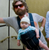
This kit was inspired by the Hangover movie, which took place at the Stadium in the Sky.
 
oEiwpbp.png

Las Vegas Bears
Season 18 Clash Kit


PsDO9Ip.png


TiF's two cents...

I have no real clue about the actual backstory to this one, but this is one of the more random official Sweet FA kits in league history and I'm here for it. The Bears set the stylistic tone for what was to come out of Vegas in their return to the league in Season 18 after a 10 season hiatus having gone into Sweet FA hibernation after Season 7. Whilst sticking pretty closely to their stock and trade branding since S18, one thing the Bears have done exceptionally well over the journey has been their clash/special kits.

This particular kit was the clash kit for the successful return of the Bears franchise in the same expansion intake as the Warriors. Skippers pantskyle and DemonJim led the newly re-formed Bears with a set of striking kits to match with a quality crop of recruits including a raft of hall of famers - brahj, Dingster and both skippers, decorated veterans like The Half Back & Quivorir, and club legends kane249 & Matera92 just to name a few.

The regular kits paid homage to the OG Bears in retaining the 'V' chested design, but made a shift away from their navy and orange look to their traditional orange, maroon and black palette we know them by today. This kit, while retaining the maroon and orange colours, features the large baby bear motif secured by a baby sling, which I can only assume was a nod to their return to the league representing the squad of baby Bears they'd assembled. It's got a collar which is rare, it's got a weird baby body with the Bear from their logo on top, and it's bright orange. What more can I say?

The Bears S29 Finals Kit was very, very stiff here but I just couldn't walk past this bad boy and already had it up my sleeve from a previous Heritage Round so it was a no brainer.

It's from the world famous Las Vegas movie the Hangover you idoit.

1761772183800.png
 
Last edited:

Log in to remove this Banner Ad

Get some culture you swine.

Back atcha, Chief:

1761775944537.jpeg

I took the future Mrs. Brak to that flick back in college, the fact she didn't run screaming out of the theater meant I knew she was a keeper!

Now that flick would provide inspiration for a club jumper that would REALLY be memorable...
 
Last edited:
Back atcha, Chief:

View attachment 2467126

I took the future Mrs. Brak to that flick back in college, the fact she didn't run screaming out of the theater meant I knew she was a keeper!

Now that flick would provide inspiration for a club jumper that would REALLY be memorable...
The Bears do have a logo with a tit on it, doesn't get shown a lot around these parts anymore :(
 
The Bears do have a logo with a tit on it, doesn't get shown a lot around these parts anymore :(
It gets a run every Heritage round in our match thread. I can't post it in the Team Sheets thread anymore, I learnt that lesson a few seasons back.
 
It gets a run every Heritage round in our match thread. I can't post it in the Team Sheets thread anymore, I learnt that lesson a few seasons back.
It's definitely worth the week off.
 
i81VsLa.png

Ophidian Old Boys
Season 34 Clash Kit


XjaAfiD.png


TiF's two cents...

I really quite like this one. The Old Boys only have the one set of official kits to my knowledge, although who knows with the literal thousands of different variations sported in match threads and media threads in their plethora of AI images, most coming from the club's players/leaders themselves. In fact there's been so many variations of their club kits/colours over the past 6 and a bit seasons, that I was almost taken aback when I actually reviewed their kits because I don't think I've actually seen the OG set since S34.

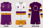
The Old Boys as we know are the league upstarts and most recent expansion club, having successfully earned a license and path into the league during the S33 season. Tigerturbulance, Mobbs and a handful of well known and very mercenary vets and their wives/girlfriends/brothers in law joined the league officially in S34, with a unique and very sharp set of club branding which included this beauty we see before us. The club's official colour palette included a soft purple with orange and white rounding out the look which they retain to this day, and the OG kits incorporated these into a very smart set of a home, away and clash.

In recreating the clash kit here, I couldn't quite source the same snake motif as the original, so it's not quite a replica but more of an homage. I do appreciate a bit of a high transparency overlay to give a kit some additional depth where clubs can incorporate a mascot/iconography of the club into a basic kit design, and I think it works with the two bold mid section bands. I think the purple dominant kit is a more striking contrast personally, and I'd probably have preferred to see it as the home kit over the white, with the orange version as the clash. But that's just my two cents.
agree with you TIF about the purple kit being a better home kit which we have actually done, here is our S40 line up with the purple our home outfit

1761780772503.png
 
agree with you TIF about the purple kit being a better home kit which we have actually done, here is our S40 line up with the purple our home outfit

I did see these last night actually Turbo, quite the set you've got there! Especially the heritage longy :thumbsu:
 

Remove this Banner Ad

For those who might not know, and to be honest I'm hardly an expert on the topic myself, the Bombers rebranded to the Bandits from S18 - S21 under the leadership of Gee Dub and his successor Shermy who assumed the reigns and retained the Bandits moniker. In fact surprisingly it was our old mate beez who returned Baghdad to their Bombers roots in S22, so I guess we probably have him to blame for everything since.

In the interests of ensuring the accuracy of the history of the Baghdad Bombers, I will let you in on an honest account from the very person responsible for the return to being the Bombers - HaroLad

As the person who actually rebranded the club back to the Bombers from the Bandits a few years ago and went through this process, I have a few points to make.
We've always been the Bombers, until the doping saga, and then we changed to the Bandits. When I joined the club, when it was the Bandits, I did so because it was completely obscure and the worst posting side in the league ripe for someone to take charge. When I got enough authority the first thing I did was suggest we change back - changing your brand and image to appease other people and avoid dislike is stupid. I spearheaded the change, designing the logo, jumpers etc.

… and the rest is history

It was around that time the club culture took off and completely changed, and I can see much of that culture in the team today. That culture does not exist without that rebrand; it marked a fundamental shift in the direction of the club and without that shift the 'Bandits' would be just another club or would have folded.
Who gives a **** if its offensive or people don't like it. There's no new reason to change and go flip-flopping, changing the decision the club made six years ago. If we have to change at all, as TL said, it should be to something even more offensive and unlikable.
 
In the interests of ensuring the accuracy of the history of the Baghdad Bombers, I will let you in on an honest account from the very person responsible for the return to being the Bombers - HaroLad


… and the rest is history
I believe beez was the skipper at the time though yeah?
 
Yes, but on July the 1st of Season 22 (at the start of his second season in Baghdad) HaroLad posted this ….


… announcing the re-branding!

Yes that's all wonderful, but beez was the captain.
 
Yes that's all wonderful, but beez was the captain.

Obviously it depends who you ask, and whether the leader was a consultative one or an assertive one?

Whether he (or she) led from behind or in front and whether he/she had formal power or informal power?

I’d be curious to know what Dennis Trumpet thinks too as he won the B&F that season then left, narrowly missing out on the back-to-back flags?
 
Obviously it depends who you ask, and whether the leader was a consultative one or an assertive one?

Whether he (or she) led from behind or in front and whether he/she had formal power or informal power?

I’d be curious to know what Dennis crumpet thinks too as he won the B&F that season then left, narrowly missing out on the back-to-back flags?
Yeah look, great context for those interested and was definitely a transformative moment for the club.

I still blame beez tho.
 

🥰 Love BigFooty? Join now for free.

Sin City Swamprats - Season 17 Home Kit New
c3gq3Qo.png

Sin City Swamprats
Season 17 Home Kit

Designed by TBC

jLPZlaX.png


TiF's two cents...

Yeah I know it's a total rip off, but I'm real a big fan of the prison bars. The Swamprats haven't strayed much from their Alberton roots since joining the league all the way back in Season 4, and despite a couple of fits and spurts (They only competed in one Sweet FA Season between S8-S15) their overall look has remained consistent variations of the prison bars elements with varying designs employing a 'v' across the chest above the bars themselves, or utilising their bold red mostly for clash and away kits.

This particularly beauty is probably the most faithful to the OG prison bar kit and was commissioned by then skipper MP_ as part of a kit refresh in their second season back in the competition after a hiatus between S9 & S16. Whilst the Swampies endured a horror 5-13 ledger that season, at least they looked very handsome while doing it. Whilst short-lived the first time around as it was superseded with a departure from the design in S19 which doesn't really grab me like this one does, but thankfully since it has made a reappearance in both S30 and again in S35 as a Heritage Round kit.

I like that they upgraded the bars/pylons from the OG Swampies kit which only utilised a 4 bar design for this version, I LOVE the Coopers sponsor in the deep Swampies red and as such an iconic kit spanning several leagues from other sports that shall rename nameless here, it was a such a pleasure to recreate. I actually knocked this one up as part of the S35 Heritage kit rewind for the Rats, but this is far and away my favourite kit from their back catalogue. Do yourselves a favour damicky and slap this one on next week, for old time's sake.
 
Last edited:
Wonders FFC - Season 24 Home Kit New
g82PY84.png
Wonders FFC
Season 24 Home Kit

Designed by fancyscum

X1LselF.png


TiF's two cents...

This is a busy one, but I think that's what I like most about it. The newly renamed Wonders FFC, as a foundation club of the competition have a surprisingly limited back catalogue of kits for their 40 seasons in the league, but what they have had is a lot of variety between each kit they've commissioned over the stretch, largely employing their trademark royal blue and gold since their first rebrand way back in Season 7 to the West Coast Wonders, when they added their golden yellow hue to their palette. No Wonders kit has clearly linked to the next as each iteration of their kit has come with a different approach and addition of a variety of stylistic elements over their journey.

This kit was part of an S24 rebrand under then skipper haydo, and given the work that went into it and the gravitas of it, the Wonders would keep this one as their home kit until another kit refresh in S30. This was the Wonders' kit when I debuted in the comp, and I came to associate this one with the brash arrogance that was the West Coast outfit of the day, #firsttosix and #lolWonders and all that. Big names like Dingster, Elton Johns Wig, okeydoke7, ClarkeM, croweater 41 & TRUMAN#1 all ran through their at the time and this was the absolute peak of their powers over my time in the league, and they packed all of that swagger into this absolute ripper.

This was a tricky one to recreate, and I hope I've done it justice, because I really rate this kit. I love the two tone blue stripes that are subtle yet striking, and the angled gold banding at the top of the chest is just really unique and I think it gives this kit a big part of it's pizzazz with the big bold, American college-style W motif the hero in the guts. I feel like the shift away from this coincided with their whole last dance stuff at the time, and it kind of signposts an era at the Wonders for me.
 
Last edited:
Wrap up New
8l0K55Q.png

CW0wBo9.png


Best Damn Sweet FA Kits of All Time.

So there you have it folks, some stuff I like. These are in my opinion, the best damn kits these clubs have worn over their journey and I wanted to take the opportunity to showcase them as a lead up to the S40 Heritage celebrations next week.

It would be remiss of me not to pay credit to the OG designers of these kits, admittedly some I'm not 100% sure who actually designed them but a shoutout to lmach, fancyscum, Klim, Cody_ and of course Barrybran. I hope you don't mind me bastardising your designs! Apologies to any I've missed, and if I have missed someone and someone and you know who was responsible for your club's kit please give them a shoutout here and I'll update the posts with credits for the designers.

Also have to give a big shout out to The Half Back, your thread on the archive board is unreal Halfy, while I didn't leverage it for this thread, I'd be lying if I said I didn't double check the odd fact here and there as I was putting this together on the fly. Also Broken, I remember him doing something similar like 15 seasons ago or something too and that stuck with me.

I've always loved the design side of this competition. While I'm not fit to tie the shoelaces of half the designers of these kits, I always found that to be one of the most important elements to this league from a legitimacy/immersion perspective when I arrived, and I encourage all clubs to be mindful of keeping your kits current & present, up to date and refreshed often or conversely champion a timeless kit because that's what gives our clubs their individual character and heritage.

👏
 
Last edited:
g82PY84.png
Wonders FFC
Season 24 Home Kit

Designed by fancyscum

X1LselF.png


TiF's two cents...

This is a busy one, but I think that's what I like most about it. The newly renamed Wonders FFC, as a foundation club of the competition have a surprisingly limited back catalogue of kits for their 40 seasons in the league, but what they have had is a lot of variety between each kit they've commissioned over the stretch, largely employing their trademark royal blue and gold since their first rebrand way back in Season 7 to the West Coast Wonders, when they added their golden yellow hue to their palette. No Wonders kit has clearly linked to the next as each iteration of their kit has come with a different approach and addition of a variety of stylistic elements over their journey.

This kit was part of an S24 rebrand under then skipper haydo, and given the work that went into it and the gravitas of it, the Wonders would keep this one as their home kit until another kit refresh in S30. This was the Wonders' kit when I debuted in the comp, and I came to associate this one with the brash arrogance that was the West Coast outfit of the day, #firsttosix and #lolWonders and all that. Big names like Dingster, Elton Johns Wig, okeydoke7, ClarkeM, croweater 41 & TRUMAN#1 all ran through their at the time and this was the absolute peak of their powers over my time in the league, and they packed all of that swagger into this absolute ripper.

This was a tricky one to recreate, and I hope I've done it justice, because I really rate this kit. I love the two tone blue stripes that are subtle yet striking, and the angled gold banding at the top of the chest is just really unique and I think it gives this kit a big part of it's pizzazz with the big bold, American college-style W motif the hero in the guts. I feel like the shift away from this coincided with their whole last dance stuff at the time, and it kind of signposts an era at the Wonders for me.
Admittedly I don't even remember this being our kit, ever.
 

Remove this Banner Ad

Media TiFmedia Presents... Random Sweet FA stuff I like - Ep 1: Kits

🥰 Love BigFooty? Join now for free.

Back
Top