might print it and put on fridge next to kids kindy painting
Navigation
Install the app
How to install the app on iOS
Follow along with the video below to see how to install our site as a web app on your home screen.
Note: This feature may not be available in some browsers.
More options
Style variation
-

-
System Upgrade - Search is back! - Post feedback.
-
Guest - BigFooty Tipping 2026 - Get on! - $500 first prize - Weekly Prizes - Click to Join
PLUS Your club board comp is now up!
You are using an out of date browser. It may not display this or other websites correctly.
You should upgrade or use an alternative browser.
You should upgrade or use an alternative browser.
Analysis ‘FEARLESS’ Gold Coast SUNS guernsey and branding discussions
🥰 Love BigFooty? Join now for free.

- Joined
- Jul 21, 2010
- Posts
- 7,783
- Reaction score
- 11,494
- Location
- Gold Coast
- AFL Club
- Gold Coast
- Other Teams
- Philadelphia 76ers
don't mind it but the last two look a bit too titans-y for me. maybe replace the blue with red on the last one?
don't mind it but the last two look a bit too titans-y for me. maybe replace the blue with red on the last one?


Log in to remove this Banner Ad
- Joined
- Oct 24, 2008
- Posts
- 16,418
- Reaction score
- 23,385
- Location
- Mermaid Beach
- AFL Club
- Gold Coast
- Other Teams
- GWS, Celtics, 76ers
 The full red looks the bomb
- Joined
- Dec 3, 2013
- Posts
- 3,742
- Reaction score
- 4,266
- AFL Club
- Gold Coast
Premiership merch surely
- Joined
- Dec 3, 2013
- Posts
- 3,742
- Reaction score
- 4,266
- AFL Club
- Gold Coast

- Joined
- Nov 4, 2019
- Posts
- 9,801
- Reaction score
- 12,872
- AFL Club
- Gold Coast
- Other Teams
- Liverpool, Bills, Pacers, Max Verstappen
happy to go broke for vfl premiers merch
- Joined
- Nov 10, 2013
- Posts
- 28,706
- Reaction score
- 44,361
- AFL Club
- Gold Coast
- Other Teams
- Hell no
howdy
over on the Gold Coast Suns Rebrand thread caloschwaby has prepared what i think is a nice surfboard design for the SUNS.
his post is here Resource - Gold Coast Suns Rebrand
This was based on a post by magpienato prior to that on the Tasmanian jumper thread here Discussion - Tasmania AFL Jumper Design
thanks to both of you guys
i have added the sponsors below
what do you guys think?
Home

Clash

over on the Gold Coast Suns Rebrand thread caloschwaby has prepared what i think is a nice surfboard design for the SUNS.
his post is here Resource - Gold Coast Suns Rebrand
This was based on a post by magpienato prior to that on the Tasmanian jumper thread here Discussion - Tasmania AFL Jumper Design
thanks to both of you guys
i have added the sponsors below
what do you guys think?
Home
Clash
- Joined
- Oct 27, 2016
- Posts
- 6,129
- Reaction score
- 11,289
- AFL Club
- Collingwood
- Other Teams
- Packers, Raptors, Renegades
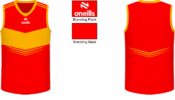
Here it is with just a red/yellow scheme for good measure. Feel like the red based (right) variant doesn't work quite as well and the yellow (left) but I think both are an upgrade over the current design, linking it more closely the Gold Coast/Surfers Paradise location


Last edited:
I like the design but if we're "the team in the red gold and blue" then we need blue on there somewhere....Here it is with just a red/yellow scheme for good measure. Feel like the red based (right) variant doesn't work quite as well and the yellow (left) but I think both are an upgrade over the current design, linking it more closely the Gold Coast/Surfers Paradise location
View attachment 1828291View attachment 1828292 View attachment 1828300View attachment 1828301
- Joined
- Dec 3, 2013
- Posts
- 3,742
- Reaction score
- 4,266
- AFL Club
- Gold Coast
Poo logo, poo song, 2023 VFL Premiers.I like the design but if we're "the team in the red gold and blue" then we need blue on there somewhere....
- Joined
- Oct 27, 2016
- Posts
- 6,129
- Reaction score
- 11,289
- AFL Club
- Collingwood
- Other Teams
- Packers, Raptors, Renegades
Not a fan of the blue personally, just doesn't really work with the red and yellowI like the design but if we're "the team in the red gold and blue" then we need blue on there somewhere....
We seriously should be sponsored by McDonald’s
- Joined
- May 15, 2016
- Posts
- 725
- Reaction score
- 1,254
- AFL Club
- Gold Coast
Nice nod to the old TAC cup guernsey.Here it is with just a red/yellow scheme for good measure. Feel like the red based (right) variant doesn't work quite as well and the yellow (left) but I think both are an upgrade over the current design, linking it more closely the Gold Coast/Surfers Paradise location
View attachment 1828291View attachment 1828292 View attachment 1828300View attachment 1828301
But the logo just sticks out like a sore thumb.
We desperately need a new logo.
On SM-G996B using BigFooty.com mobile app
- Joined
- Oct 24, 2008
- Posts
- 16,418
- Reaction score
- 23,385
- Location
- Mermaid Beach
- AFL Club
- Gold Coast
- Other Teams
- GWS, Celtics, 76ers
Anybody got there’s yet?
- Joined
- Jul 21, 2010
- Posts
- 7,783
- Reaction score
- 11,494
- Location
- Gold Coast
- AFL Club
- Gold Coast
- Other Teams
- Philadelphia 76ers


I hate this thread.
The jumpers hurt my eyes
The jumpers hurt my eyes
🥰 Love BigFooty? Join now for free.
- Joined
- Jan 3, 2017
- Posts
- 5,294
- Reaction score
- 7,406
- AFL Club
- Collingwood
- Other Teams
- Celtics, Packers
I don't think y'all need a new logo tbh, looks fine as it. Just need to get rid of it from the guernsey and set up a design that speaks for itself (that you can then try incorporate into a logo update with the current GC wordmark)We desperately need a new logo.
- Joined
- Jan 3, 2017
- Posts
- 5,294
- Reaction score
- 7,406
- AFL Club
- Collingwood
- Other Teams
- Celtics, Packers
I so desperately wish I'd seen this before pre-orders closed
- Joined
- Dec 3, 2013
- Posts
- 3,742
- Reaction score
- 4,266
- AFL Club
- Gold Coast
I bought 2, $200 and one's yoursI so desperately wish I'd seen this before pre-orders closed
- Joined
- Jan 3, 2017
- Posts
- 5,294
- Reaction score
- 7,406
- AFL Club
- Collingwood
- Other Teams
- Celtics, Packers
Gee maybe I'll get back to you in 10 years when it officially becomes retro merch!I bought 2, $200 and one's yours
Out of curiosity how much were they going for?
- Joined
- Dec 3, 2013
- Posts
- 3,742
- Reaction score
- 4,266
- AFL Club
- Gold Coast
Goes up with inflation though, $50 originallyGee maybe I'll get back to you in 10 years when it officially becomes retro merch!
Out of curiosity how much were they going for?


