cryptor
Brownlow Medallist
- Joined
- May 11, 2008
- Posts
- 27,200
- Reaction score
- 76,093
- AFL Club
- Hawthorn
I reckon if the club was planning on a logo replacement then it would have been done ahead of plastering it all over the new facility.Interesting that our current logo is now our most longest standing logo. It means we're probably due for a refresh.
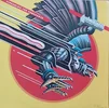
I really like the variations of the 50s-70s outstretched hawk as an icon.
I think we’ll continue to stick with it long term now. Not because someone dropped the ball on the right time to make a change, but because it continues to be fit for purpose.
It’s clean and professional, doesn’t look dated, and has a broad appeal to kids and adults alike. It’s also got a close association with a very successful era.