Navigation
Install the app
How to install the app on iOS
Follow along with the video below to see how to install our site as a web app on your home screen.
Note: This feature may not be available in some browsers.
More options

You are using an out of date browser. It may not display this or other websites correctly.
You should upgrade or use an alternative browser.
You should upgrade or use an alternative browser.
Discussion 2011 Jumper Suggestion
- Thread starter 23Legend
- Start date
- Tagged users None
The Half Back
BC Approved
To be honest I'm not a big fan of that Hawk's clash, just doesn't work for me. Wouldn't mind seeing it without the Hawks head though..
How is this boys

The Half Back
BC Approved
I actually reckon if you turn the hawks head around the right way and put it in the middle of the jumper it would look nice.
Ill see what i can do

Cory
Brownlow Medallist
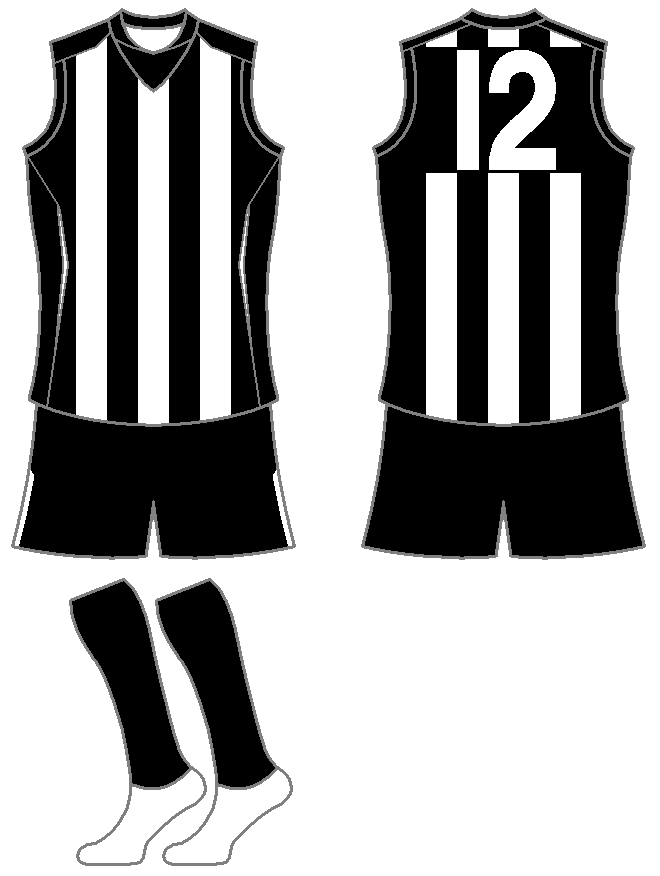
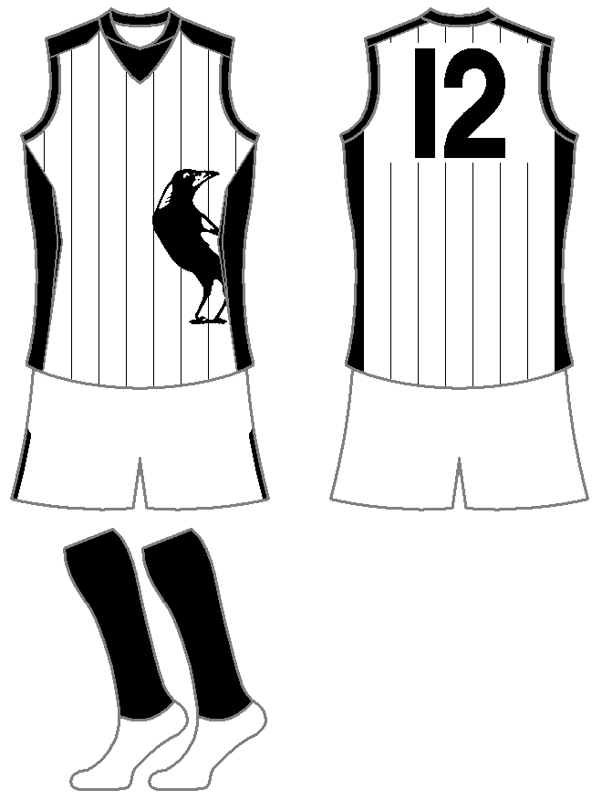
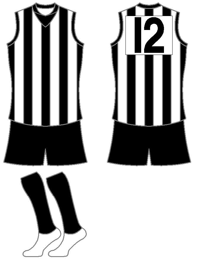
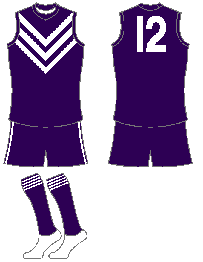
Collingwood Magpies
Home
Same as 2010

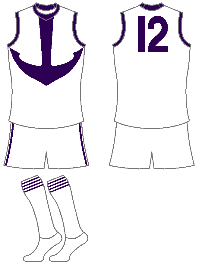
Away
Pinstripe design featuring logo
(looked better in my head)
Retro
Based on the 1953-75
The first one is not the same as the 2010 Guernsey the 2010 Guernsey did not have 3 Stripes on top of the Numbers
The Half Back
BC Approved
As 23Legend requested with the straight head

- Sep 14, 2010
- 4,198
- 1,374
- AFL Club
- Adelaide
- Other Teams
- LA Lakers
I'd guess that'd it would just be from the templates.
- Moderator
- #36
I'd guess that'd it would just be from the templates.
Wouldn't be intentional either.
stmookeyj
Brownlow Medallist
WESTERN BULLDOGS
HOME: Slight alteration to current home jumper. The Bulldog head is now fully encased in the red band rather than what it is now (half way up red band through 2nd White band and into blue of jumper. As a result red band is now wider to enable whole head to fit in, and also allows current sponsor to blend in on rear with their logo. Rear top white band on back is re-introduced having been dropped from 1997. Socks now altered to reflect 70's era.
AWAY: Rather than a simple inversion, we have based this in part on the Central District SANFL strip of the 1980's (as well as the Footscray jumper in the night series in 1979). But to combat the plain affects of that jumper that had just the solitary red and blue vertical stripe down the right of the jumper (left for the player's perspective), we have replicated that on the left hand side (right for PP). White on gurensey ever so slightly towards very light grey on scale save for the white strip between red and blue stripes to give impression of a red, white and blue stripe. Small concern over blue numbering given close proximity of red stripes but figured that was most suitable colour choice amongst the three for identification. Socks also white to match strip.
RETRO: Based on 1954 Premiership jumper. Note for the full retro look we've gone for the Black shorts as teams wore before the Colour TV age when home teams wore Black and away teams wore White. Not saying it's a good thing, but it feels more authentic as a retro strip. Socks as per home strip as they were also part of the kit at the time.
HOME: Slight alteration to current home jumper. The Bulldog head is now fully encased in the red band rather than what it is now (half way up red band through 2nd White band and into blue of jumper. As a result red band is now wider to enable whole head to fit in, and also allows current sponsor to blend in on rear with their logo. Rear top white band on back is re-introduced having been dropped from 1997. Socks now altered to reflect 70's era.

AWAY: Rather than a simple inversion, we have based this in part on the Central District SANFL strip of the 1980's (as well as the Footscray jumper in the night series in 1979). But to combat the plain affects of that jumper that had just the solitary red and blue vertical stripe down the right of the jumper (left for the player's perspective), we have replicated that on the left hand side (right for PP). White on gurensey ever so slightly towards very light grey on scale save for the white strip between red and blue stripes to give impression of a red, white and blue stripe. Small concern over blue numbering given close proximity of red stripes but figured that was most suitable colour choice amongst the three for identification. Socks also white to match strip.

RETRO: Based on 1954 Premiership jumper. Note for the full retro look we've gone for the Black shorts as teams wore before the Colour TV age when home teams wore Black and away teams wore White. Not saying it's a good thing, but it feels more authentic as a retro strip. Socks as per home strip as they were also part of the kit at the time.

Sepul
Club Legend
The away and retro look great. Not a fan of the big fat red hoop on the home though, but I get that you were trying to do.
- Moderator
- #39
Echoing Sepul's thoughts here too. On the retro, love the black shorts, adds a bit of history. As for the away, the number problem could be fixed with a white outline. As for the home, I understand what you were trying to do but IMO the bulldog is too far down and the red is pretty overpowering. Also I prefer the current stretched out bulldog to the older, "squished" bulldog.
The Half Back
BC Approved
Echoing Sepul's thoughts here too. On the retro, love the black shorts, adds a bit of history. As for the away, the number problem could be fixed with a white outline. As for the home, I understand what you were trying to do but IMO the bulldog is too far down and the red is pretty overpowering. Also I prefer the current stretched out bulldog to the older, "squished" bulldog.
I agree with both these guys and also, the away looks like the Hawks heritage jumper they had a few gets back IMO.
This one:

- Aug 27, 2007
- 13,163
- 11,326
- AFL Club
- Fremantle
- Other Teams
- Everton_East Freo_Atalanta_Tranmere
Don't need one
Hawthorn need another clash jumper though - it has to be white on the back as well
Hawthorn need another clash jumper though - it has to be white on the back as well
Ochre
Stop the Steal!
my first thought aswellI agree with both these guys and also, the away looks like the Hawks heritage jumper they had a few gets back IMO.
This one:
- Sep 14, 2010
- 4,198
- 1,374
- AFL Club
- Adelaide
- Other Teams
- LA Lakers

There you go.
I really like that Collingwood away too btw.
23Legend
All Australian
- Thread starter
- #45
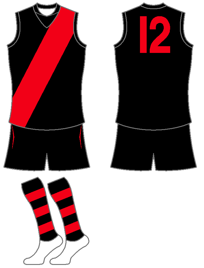
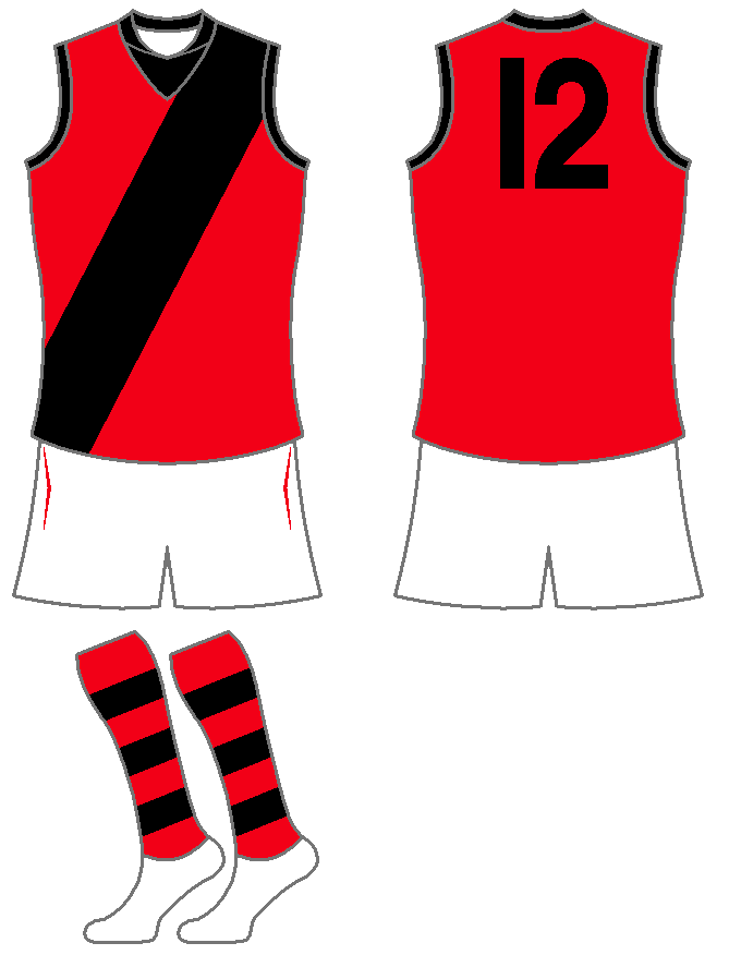
Essendon Bombers
Home
have removed the sash from back, I personally hate the sashes on the back of the jumper, In my opinion it makes it look too cluttered.
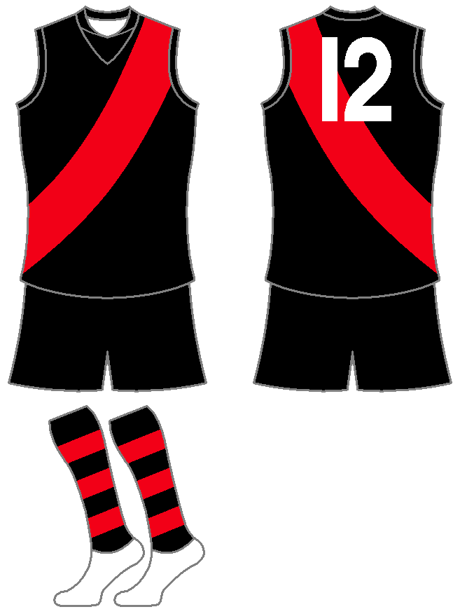
Away
Inversion of home strip, thought about adding the logo but decided that this is simple, efictive and I think it looks very good.
Retro
Based on the 1975-99 jumper. This one was tough because there aern't a lot of differences between guernseys, tried the previous home with thinner sash but this proved to difficult.
Home
have removed the sash from back, I personally hate the sashes on the back of the jumper, In my opinion it makes it look too cluttered.
Away
Inversion of home strip, thought about adding the logo but decided that this is simple, efictive and I think it looks very good.
Retro
Based on the 1975-99 jumper. This one was tough because there aern't a lot of differences between guernseys, tried the previous home with thinner sash but this proved to difficult.
WESTERN BULLDOGS
HOME: Slight alteration to current home jumper. The Bulldog head is now fully encased in the red band rather than what it is now (half way up red band through 2nd White band and into blue of jumper. As a result red band is now wider to enable whole head to fit in, and also allows current sponsor to blend in on rear with their logo. Rear top white band on back is re-introduced having been dropped from 1997. Socks now altered to reflect 70's era.
AWAY: Rather than a simple inversion, we have based this in part on the Central District SANFL strip of the 1980's (as well as the Footscray jumper in the night series in 1979). But to combat the plain affects of that jumper that had just the solitary red and blue vertical stripe down the right of the jumper (left for the player's perspective), we have replicated that on the left hand side (right for PP). White on gurensey ever so slightly towards very light grey on scale save for the white strip between red and blue stripes to give impression of a red, white and blue stripe. Small concern over blue numbering given close proximity of red stripes but figured that was most suitable colour choice amongst the three for identification. Socks also white to match strip.
RETRO: Based on 1954 Premiership jumper. Note for the full retro look we've gone for the Black shorts as teams wore before the Colour TV age when home teams wore Black and away teams wore White. Not saying it's a good thing, but it feels more authentic as a retro strip. Socks as per home strip as they were also part of the kit at the time.
I honestly prefer the original 1979 night series jumper.
Should be our clash IMHO.
