


- Aug 30, 2021
- 15,174
- 27,704
- AFL Club
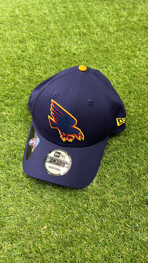
- Adelaide
I like it, better than our crap logoNot a hat wearer myself, but this updated logo looks very nice. The sharoer angle of the wing gives it more of a swooping look, older version was a bit flatter.
Thoughts? Feelings?
View attachment 1941185


")
