- Oct 16, 2010
- 2,160
- 938
- AFL Club
- Collingwood

Last reply was over two years ago. Mega bump.
Nice design though Dardy
Nice design though Dardy
Follow along with the video below to see how to install our site as a web app on your home screen.
Note: This feature may not be available in some browsers.

The Tassie Convicts, it has been posted in the 'Random Designs' thread.

If they make a tassie team I doubt it would be called Tasmania something just in case they ever want to have a second team down there.
They don't need to bring in a 2nd team in the next 20 years... I just don't think they'll name a team after a state.
Couldn't agree more. I don't know why people thinks the AFL will introduce a team named after a State/ Territory. It annoys me even that there is the NT Thunder in the NEAFL let alone if there were an 'NT Thunder' type team in the AFL!They don't need to bring in a 2nd team in the next 20 years... I just don't think they'll name a team after a state.
I don't know... I think the logo is as good as the other two Tasmanian teamsIt's not a bad logo, a bit 2000s Hawks/Cats/Kangaroos with the layout but it's not bad.
There's so much potential for them though, the colours but the idea of using the map as a vague shield has so much potential. Why they don't integrate that is probably just pure laziness. Tried it once or twice, looked weird, 'eh let's not worry.'
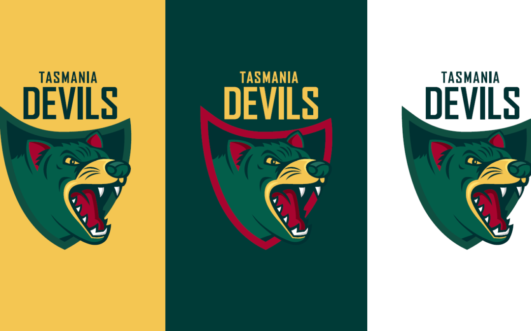
Hopefully they do not carry this into the AFL.Tassie has released Devils branding, which will now be used for all men’s and women’s Tassie teams - incl future TAC and VFL clubs.
http://www.afltas.com.au/the-devils-are-back/
Perhaps the triangle devil logo could be on the jumper, as an updated take on the old tassie map style.
Reckon green, yellow and red is a pretty unique combo that works well.
The final name options were voted on -
Devils 74.4%
Mariners 12.29%
Storm 7.51%
Mavericks 3.41%
Warriors 2.39%
Hopefully they do not carry this into the AFL.
Hopefully they do not carry this into the AFL.

Hopefully they do not carry this into the AFL.
That would be bad. Already have the Demons so having Devils would just be jarring.If they ever get an AFL club I think they will, they’re branding every team that’s named “Tasmania” like this, boys girls women and men, so fair chance they’re already trying to build a brand.
Already a team with a very similar moniker. Would be like if Port entered with the magpies moniker.Why? I reckon it looks pretty good. Clear and easy to read wordmark, a shield that represents the whole state, and a mascot that is not by any means horrendous and because its a likeable design it will appeal to the target audience, who ultimately are primary school aged kids.
The colours also represent the whole state, and allow for a complete set of jumpers using each of the three colours. A simple 'V' design with the colours swapped around for home, away and clash is an ideal set-up