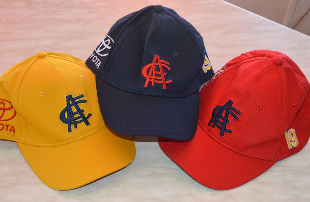
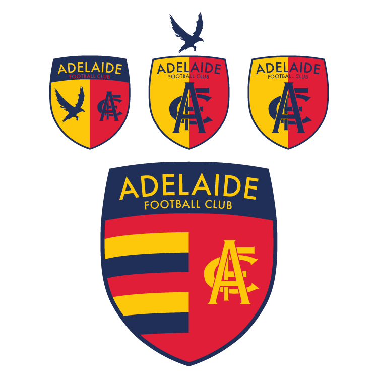
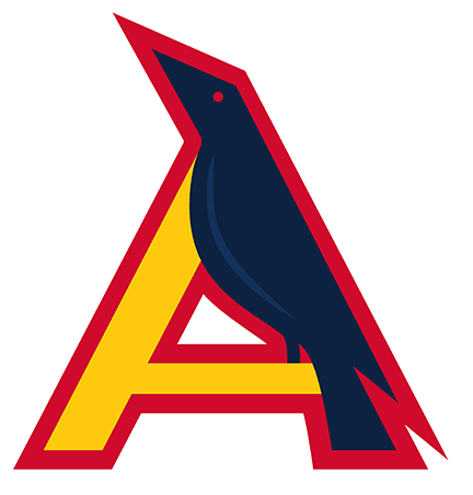
To be fair, it was made to smacked on a faux heritage jumper. I can see why you'd use it, but I'm sure most Adelaide fans would either not even notice if it was changed or would be happy with it, it's just such a poor monogram.
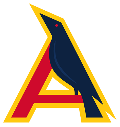
But hey, it's your club, and if that's what you feel they should go with then power to you.
But hey, it's your club, and if that's what you feel they should go with then power to you.