


Mero
Norm Smith Medallist
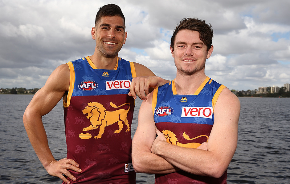
The Lions jumper seems to be getting worse.
By that, I mean the distracting watermarks are more noticeable than ever.
I thought the watermark was supposed to signify a legit jumper.
But then they just go and print them on anyway.
Last edited:


")
