- Jul 1, 2014
- 1,139
- 1,842
- AFL Club
- Carlton
That's a ripper. Great workBulldogs 150th next year so I whipped up a design that that could wear as a once off to honour on their 1935 home jersey
View attachment 1667521View attachment 1667523
Follow along with the video below to see how to install our site as a web app on your home screen.
Note: This feature may not be available in some browsers.
That's a ripper. Great workBulldogs 150th next year so I whipped up a design that that could wear as a once off to honour on their 1935 home jersey
View attachment 1667521View attachment 1667523
Am I misremembering but did Footscray in the 90s have a darker blue in their jumper?
I wouldn't mind seeing that make a return if it's a real thing.

i love this.
i am very much expecting us to pull on the 2001-05 jumper later this year.One idea I'd propose is a limit on unique designs. It's really getting out of hand. For someone like myself (Freo guernsey collector) this year they will have:
Stealth - didn't like that idea tbh
Starlight charity - idea great but... no
Indigenous purple
Indigenous white (if they do what they usually do)
Home
Away
It's not outside realms of possibility for them to do something else (probably a retro one now I think of it!) but surely 6 is too much... thoughts?
is there a story behind you having a swooping magpie as a Richmond supporter?One of my biggest regrets is selling my swooping magpie jumper and my Sav Rocca 97 preseason.
Why was I so dumb back then.


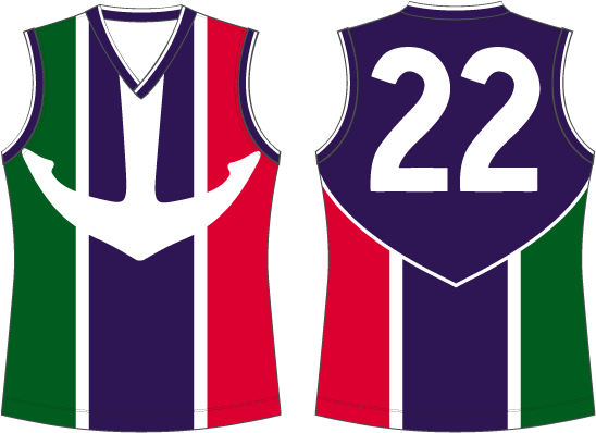
I love Freos old colours, but there is a reason they got rid of the extra twoView attachment 1670719View attachment 1670720View attachment 1670721
my idea for a new freo kit and remastered logo
I just really liked it and used to be a pretty big collector of jumpers. I just lost interest in collecting for a while back there and sold a lot of extra stuff. Now looking back I regret it because it is still such a cool jumper.is there a story behind you having a swooping magpie as a Richmond supporter?
probably wanted to give the team a darker vibe (also less of a clash with the dees) and they couldn't find a way to implement the colours in, which is sad because it was meant to represent the Italian culture of freo, the kit I made brings that back while keeping the kit dark and returning the anchor, this would be the best kit in the league, and bring back the italin fanbase and more fans inI love Freos old colours, but there is a reason they got rid of the extra two
I appreciate the idea behind it, but a better solution (in my opinion) would be to go back to the 2010-era kit, or just go a white anchor on purple - the anchor itself was so uniquely Freo, I wish they had just kept it.probably wanted to give the team a darker vibe (also less of a clash with the dees) and they couldn't find a way to implement the colours in, which is sad because it was meant to represent the Italian culture of freo, the kit I made brings that back while keeping the kit dark and returning the anchor, this would be the best kit in the league, and bring back the italin fanbase and more fans in


I would still love the anchor back, but agree the more purple the betterI think red and green can be resigned to the club's heritage, they're iconic yes but it's not exactly a matured look for a club coming up on it's 30th anniversary. The only alteration I'd like to see is the shade of purple toned up a touch. Such a minor change makes such a big difference in my opinion, it's a lot more warmer than the current purple (left) that at times looks almost navy with how dark it is. It's time for Freo to truly embrace the purple.
View attachment 1671814 View attachment 1671815
Yesssssssssssss purple with a white anchor!I would still love the anchor back, but agree the more purple the better

The chevrons have a ton of character, in fact it's one of the first jumpers the original Fremantle Unions (representing the blue-collar dock workers) ever wore. It's a design that, in my opinion, more aptly represents the 'Dockers' moniker and the history of the club.the darker the purple the better, and anchor getting sick of the chevrons no identity need to bring back the anchor unique and gives them a identity and red and green in some capacity I think I did it well
") )
)


I've always felt like that anchor was one that forgot to go the gym and just sat on the couch eating cheezels for a few weeksThe chevrons have a ton of character, in fact it's one of the first jumpers the original Fremantle Unions (representing the blue-collar dock workers) ever wore. It's a design that, in my opinion, more aptly represents the 'Dockers' moniker and the history of the club.
It's probably more on the part of the club that they haven't really communicated this history/meaning since they brought in the new design (they really dropped the anchor on that one
View attachment 1672286
The only anchor design that works for me personally is the original one, the anchor the used into the 2000s might look more realistic but it never came off as strong design for me, iconic sure. Having said that if they moved to a design like on the right I would actually be on board but I just don't think they'd be able to execute it properly even in this day and age.
View attachment 1672299View attachment 1672300
yep.