Zoops
Club Legend
- Joined
- Apr 20, 2017
- Posts
- 1,461
- Reaction score
- 5,641
- AFL Club
- Melbourne
- Other Teams
- Canucks, Knights, Southampton
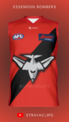
I'd like to think it would look something like Port's SBS minus their sidepanels, ala their '07 jumper.Just curious, how does the start of the G and the number panel work together?