


A better idea, maybe Elon Musk could buy the club and send Hinkley, Bassett & Koch on a one way rocket trip to the edge of space.I guess Fanta is back training and Rocky got too close to the bone on occasion.
Perhaps Elon Musk could buy the Club and reintroduce free speech...
Navigation
Install the app
How to install the app on iOS
Follow along with the video below to see how to install our site as a web app on your home screen.
Note: This feature may not be available in some browsers.
More options
You are using an out of date browser. It may not display this or other websites correctly.
You should upgrade or use an alternative browser.
You should upgrade or use an alternative browser.
Let's talk Ports! Part 3
- Thread starter bomberclifford
- Start date
- Tagged users None
RussellEbertHandball
Flick pass expert
Expecting a flurry of activity in the coming weeks in relation to AFLW team signings, so will keep up with a thread here.
Erin Phillips
Ange Foley
interesting how the graphics around our AFLW team has turned from teal blue, to blue skies blue.

- Mar 10, 2014
- 9,271
- 10,865
- AFL Club
- Port Adelaide
- Other Teams
- Man Utd, Celtic, Tanunda
Or fire them into the sun.A better idea, maybe Elon Musk could buy the club and send Hinkley, Bassett & Koch on a one way rocket trip to the edge of space.
What happened to the Rockliff and Fantasia podcast?
Back on tonight - an excellent session with Erin. They're blaming Norts being in Covid iso for the hiatus.
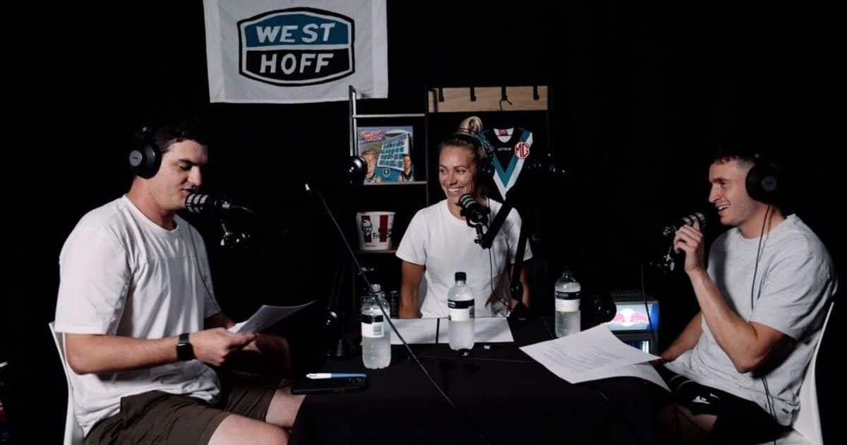
Rock the Razbah | Royalty comes to town (ft. Erin Phillips) | PTV
Inaugural AFL player signing and sporting royalty Erin Phillips joins Rock and Raz on this week's podcast.
GremioPower
Taking notes of policy re: bikini/lingerie images
- May 26, 2017
- 20,965
- 43,213
- AFL Club
- Port Adelaide
- Other Teams
- Grêmio, DC United, Pistons
interesting how the graphics around our AFLW team has turned from teal blue, to blue skies blue.
View attachment 1386805
I call it “improvement”!

- Jun 7, 2015
- 7,085
- 13,860
- AFL Club
- Port Adelaide
Sonnet, soliloquy, song or just the musings of a punch drunk skald?Everyone seems to know the score, they've seen it all before
They just know, they're so sure
That Port is gonna throw it away, gonna blow it away
And I have nothing to say, 'cause I remember
Three goals scored by Port
2004 still gleaming
I can't recognise the sport
But it never stopped me dreaming
So many jokes, so many sneers
But all those "Oh, so nears" wear you down through the years
But I still see that missed goal by Moore and when we couldn't score
Hartlett's deliberate call, and Shuey ducking
Three goals scored by Port
2004 still gleaming
I can't recognise the sport
But it never stopped me dreaming
It's coming home, it's coming
Football's coming home
It's coming home, it's coming home, it's coming
Football's coming home
(England have done it)
It's coming home, it's coming home, it's coming
Football's coming home
It's coming home, it's coming home, it's coming
Football's coming home
bomberclifford
Importer/Exporter
- Thread starter
- #5,858
interesting how the graphics around our AFLW team has turned from teal blue, to blue skies blue.
View attachment 1386805
"Don't ascribe to strategy that which can be easily explained by lack of experience in colour management across different mediums"
Bomber's Third Law of Incompetence.
RussellEbertHandball
Flick pass expert
Laws of science dont get broken, laws of man do, and are often changed."Don't ascribe to strategy that which can be easily explained by lack of experience in colour management across different mediums"
Bomber's Third Law of Incompetence.
The use of a lighter blue colour around our AFLW team looks deliberate, as the colour use around the men's team hasnt changed at all, over the last month or so compared to the announcements and promotions around our AFLW team.
GremioPower
Taking notes of policy re: bikini/lingerie images
- May 26, 2017
- 20,965
- 43,213
- AFL Club
- Port Adelaide
- Other Teams
- Grêmio, DC United, Pistons
This is the Twitter account:


bomberclifford
Importer/Exporter
- Thread starter
- #5,861
I think you two are tripping. It’s the same blue. The lighter background is just a stipple of the teal, not a different colour.
The inconsistency of our marketing across various production methods and mediums is terrible and the worst it’s ever been.
The inconsistency of our marketing across various production methods and mediums is terrible and the worst it’s ever been.
Bomber, with your expertise in this field and reasonable links within the PAFC, are you aware of any attempt by the club to seek external advice or input on any prospective designs?I think you two are tripping. It’s the same blue. The lighter background is just a stipple of the teal, not a different colour.
The inconsistency of our marketing across various production methods and mediums is terrible and the worst it’s ever been.
An appealing image can have a positive impact in the commercial world, especially in attracting new members.
GremioPower
Taking notes of policy re: bikini/lingerie images
- May 26, 2017
- 20,965
- 43,213
- AFL Club
- Port Adelaide
- Other Teams
- Grêmio, DC United, Pistons
I think you two are tripping. It’s the same blue. The lighter background is just a stipple of the teal, not a different colour.
The inconsistency of our marketing across various production methods and mediums is terrible and the worst it’s ever been.
It’s literally the SKY in the background, BC…
bomberclifford
Importer/Exporter
- Thread starter
- #5,864
Bomber, with your expertise in this field and reasonable links within the PAFC, are you aware of any attempt by the club to seek external advice or input on any prospective designs?
An appealing image can have a positive impact in the commercial world, especially in attracting new members.
I’ll give this a more detailed response tomorrow but yes they do occasionally work with external creatives with occasional good results. This years stuff looks to me like it’s done in-house by inexperienced designers being directed by non-designers.
IMO they need to revise their approach to the use of teal and not just sticking to the same Pantone code for every production method*. It’s frustrating that we have a particular blue on our guernsey but we don’t seem to use that same blue in our marketing. It’s much brighter and not as ‘dirty’.
*The reason this isn’t the best method is that the Pantone Matching System (PMS) is notoriously inconsistent across different production methods. An inexperienced designer will not know this and think that just by selecting PMS 309 then everything will be a ok. It won’t. Particularly with this colour.
I’d be recommending conducting some tests to find custom HEX, RGB, and CMYK formulas to visually match the blue of the guernsey and then finding the closest PMS to match for the very rare occasion you need to print with a single ink.
These days, HEX is the best control system for accurate and consistent colour management for branding.
Last edited:
bomberclifford
Importer/Exporter
- Thread starter
- #5,865
It’s literally the SKY in the background, BC…
It literally isn’t. It’s a halftone image of the sky made using the teal colour.
I’ll give this a more detailed response tomorrow but yes they do occasionally work with external creatives with occasional good results. This years stuff looks to me like it’s done in-house by inexperienced designers being directed by non-designers.
IMO they need to revise their approach to the use of teal and not just sticking to the same Pantone code for every production method. It’s frustrating that we have a particular blue on our guernsey but we don’t seem to use that same blue in our marketing. It’s much brighter and not as ‘dirty’.
Greatly appreciated. Thank you.
GremioPower
Taking notes of policy re: bikini/lingerie images
- May 26, 2017
- 20,965
- 43,213
- AFL Club
- Port Adelaide
- Other Teams
- Grêmio, DC United, Pistons
It literally isn’t. It’s a halftone image of the sky made using the teal colour.
Ok. We have concurred that the club is using the image of a sunny-day sky for its women’s team public profiles.
The club colours are, in order: black, white, TEAL, and silver. There’s no disagreement on that either. [I personally preferred that it was only black and white, but apparently (and surprisingly!) I’m in the minority. Still, I digress.]
However, the issue isn’t the colour itself, but the symbol chosen. With which colour a sunny-day sky is most linked? This is relevant, because it conditions our senses.
One can paint a sky with blue-ish teal, of course. That may be the case, as you have pointed out. Yet, because the sky is associated with sky blue, most people will “see” it as sky blue; not, as teal.
Isn’t this true? If so, it shouldn’t surprise anyone that people may think our AFLW team has picked sky blue as one of its colours — just like RussellEbertHandball did.
At the very least, considering the club as a whole, this points out that Port would be deliberately moving away from the green shades of teal and towards the blue ones.
bomberclifford
Importer/Exporter
- Thread starter
- #5,868
Ok. We have concurred that the club is using the image of a sunny-day sky for its women’s team public profiles.
The club colours are, in order: black, white, TEAL, and silver. There’s no disagreement on that either. [I personally preferred that it was only black and white, but apparently (and surprisingly!) I’m in the minority. Still, I digress.]
However, the issue isn’t the colour itself, but the symbol chosen. With which colour a sunny-day sky is most linked? This is relevant, because it conditions our senses.
One can paint a sky with blue-ish teal, of course. That may be the case, as you have pointed out. Yet, because the sky is associated with sky blue, most people will “see” it as sky blue; not, as teal.
Isn’t this true? If so, it shouldn’t surprise anyone that people may think our AFLW team has picked sky blue as one of its colours — just like RussellEbertHandball did.
At the very least, considering the club as a whole, this points out that Port would be deliberately moving away from the green shades of teal and towards the blue ones.
I’ve read this a few times and I still can’t work out what it is you’re actually arguing.
GremioPower
Taking notes of policy re: bikini/lingerie images
- May 26, 2017
- 20,965
- 43,213
- AFL Club
- Port Adelaide
- Other Teams
- Grêmio, DC United, Pistons
Hahahahaha!I’ve read this a few times and I still can’t work out what it is you’re actually arguing.
In brief, that the sky isn't teal.
Appreciated Bomber and confess to a little googling to check HEX etc.I’ll give this a more detailed response tomorrow but yes they do occasionally work with external creatives with occasional good results. This years stuff looks to me like it’s done in-house by inexperienced designers being directed by non-designers.
IMO they need to revise their approach to the use of teal and not just sticking to the same Pantone code for every production method*. It’s frustrating that we have a particular blue on our guernsey but we don’t seem to use that same blue in our marketing. It’s much brighter and not as ‘dirty’.
*The reason this isn’t the best method is that the Pantone Matching System (PMS) is notoriously inconsistent across different production methods. An inexperienced designer will not know this and think that just by selecting PMS 309 then everything will be a ok. It won’t. Particularly with this colour.
I’d be recommending conducting some tests to find custom HEX, RGB, and CMYK formulas to visually match the blue of the guernsey and then finding the closest PMS to match for the very rare occasion you need to print with a single ink.
These days, HEX is the best control system for accurate and consistent colour management for branding.
From the outside looking in, it's seems odd the PAFC doesn't seek out and utilise the expertise of many of it's members. I mean that in a commercial sense and not expecting freebies.
chiwigi
I’ll make tears from your Wines.
Mate, this is Bomber's bread and butter.Hahahahaha!
In brief, that the sky isn't teal.
GremioPower
Taking notes of policy re: bikini/lingerie images
- May 26, 2017
- 20,965
- 43,213
- AFL Club
- Port Adelaide
- Other Teams
- Grêmio, DC United, Pistons
I know. I’m trying to learn from him.Mate, this is Bomber's bread and butter.
bomberclifford
Importer/Exporter
- Thread starter
- #5,873
Appreciated Bomber and confess to a little googling to check HEX etc.
From the outside looking in, it's seems odd the PAFC doesn't seek out and utilise the expertise of many of it's members. I mean that in a commercial sense and not expecting freebies.
They did in the past. Even had a couple of board members who owned local agencies. Recently it seems to be either internal marketing team or outsourced to a local (Port Adelaide based) design studio that had personal connections to KT.
Lumpy432
Debutant
- Sep 12, 2014
- 88
- 261
- AFL Club
- Port Adelaide
- Other Teams
- Lionel Richie
Why did Will Snelling
leave? I cant remember
PLAYERCARDSTART
11
Will Snelling
- Age
- 26
- Ht
- 175cm
- Wt
- 79kg
- Pos.
- Fwd
Career
Season
Last 5
- D
- 14.1
- 4star
- K
- 4.7
- 2star
- HB
- 9.4
- 5star
- M
- 1.8
- 2star
- T
- 4.8
- 5star
- G
- 0.8
- 4star
- D
- 12.6
- 3star
- K
- 4.3
- 2star
- HB
- 8.3
- 4star
- M
- 1.3
- 1star
- T
- 5.6
- 5star
- G
- 0.4
- 3star
- D
- 16.2
- 4star
- K
- 5.2
- 2star
- HB
- 11.0
- 5star
- M
- 2.4
- 3star
- T
- 3.8
- 5star
- G
- 1.2
- 4star
PLAYERCARDEND
Quadzilla
Brownlow Medallist
- May 21, 2005
- 17,792
- 14,019
- AFL Club
- Port Adelaide
- Other Teams
- Power, Magpies, Swamprats, Whales
Why did Will Snelling leave? I cant remember
We delisted him!
Similar threads
- Replies
- 5K
- Views
- 108K
- Replies
- 1K
- Views
- 21K
- Replies
- 1K
- Views
- 20K
- Replies
- 10K
- Views
- 288K
- Replies
- 2
- Views
- 462
- Replies
- 10K
- Views
- 271K
- Replies
- 143
- Views
- 4K
