Cory
Brownlow Medallist
Ugh.
Follow along with the video below to see how to install our site as a web app on your home screen.
Note: This feature may not be available in some browsers.


Log in to remove this Banner Ad
Looks nothing like itTennis Australia called, they want their logo back.


and up here in NSW, our trains were until the 30th of June; CityRail (surburban and intercity) and CountryLink (Country services e.g. Melbourne, Brisbane, Canberra) have merged under the same corporation and then been split into two new entities; Sydney Trains (Surburban) and NSW TrainLink (Intercity and country) so the logos went from this:


to this:


most of us want thatPort should ditch the power altogether I think. 'Port Adelaide FC' 'Port' for short is more powerful than 'power'. It's like an intentional divide between the SANFL and AFL versions and simply PAFC would hark back nicely to the club as a whole.
I hope I don't offend any Albertonians with that view.
Port seems like the kind of club that would listen too.most of us want that
most of us want that
Funny that, the other week while at the airport I was thinking Tiger could do with a logo change. The old one looked crumby and too long. The new one isn't that great though.
Really? I thought it was the general consensus. How do you see it?
It's not too big a deal, for the most part i just want our logo to say more than "POWER". It seem amateur to me.. doesn't mention that we're a football club, or where we're from.I reckon at least 80% would prefer Power, as it's been the moniker we've cheered passionately for and loved for 17 years. Some would prefer Magpies, some Pirates (Hello El_Scorch). Some, like you, would prefer none at all.
I'm one of those 80% that prefer Power, but having said that, I honestly don't care too much as I know the moniker isn't everything. I just don't understand the desire to drop it though. What would it achieve? If anything, it'd be alienating to fans.
It's not too big a deal, for the most part i just want our logo to say more than "POWER". It seem amateur to me.. doesn't mention that we're a football club, or where we're from.


Perhaps. Maybe something less busy and detailed.
It's hard to create the perfect logo, though.
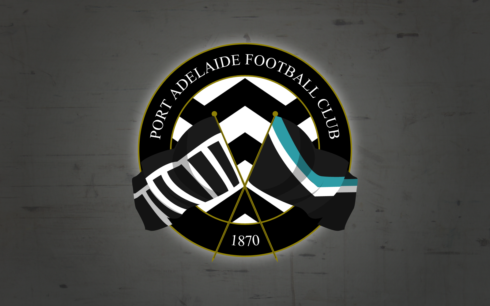
 I based it off the Magpies' logo and included a few things. I used Stormy's idea of the flags because I thought that would be a great idea on the logo (I hope you don't mind!) and I tried to put lightning in the middle instead of the magpie so it would still symbolise the Power while not having the text anywhere in the logo. I also used Port Magpies' font, Arial bold (not that it matters too much..)
Thanks, yeah, it's hard not to fall into the trap of having "too much" with Port Adelaide IMO. With all the history in the SANFL.Way to detailed, the lightning definitely needs to be stylised. I also think the flags are too much. Good effort though.
