Remove this Banner Ad

Discussion Logo Discussion Thread

  • Thread starter Thread starter akkaps
  • Start date Start date
  • Tagged users Tagged users None

🥰 Love BigFooty? Join now for free.

It's the 150 year logo. Will revert to the old logo next year (at least that is what they are saying atm)


Please no.

New logo forever please.
 

Log in to remove this Banner Ad

I can tell you for certain the current line is that they will revert back. It's a good logo, especially for an in house job.

Port ran with the same line, while simultaneously installing 3m high signage at Alberton and removing all traces of the old logo.

They had no intention of going back. They just needed to manage the change.
 
Port ran with the same line, while simultaneously installing 3m high signage at Alberton and removing all traces of the old logo.

They had no intention of going back. They just needed to manage the change.
Lol. Essendon have the old logo on the new expansion they opened late last year. Once the app is opened the new logo is used, other then that its the old logo on pretty much everything else. It will be interesting to see what they do.
 
Lol. Essendon have the old logo on the new expansion they opened late last year. Once the app is opened the new logo is used, other then that its the old logo on pretty much everything else. It will be interesting to see what they do.
Collingwood and Port Adelaide's anniversary logo was used for graphics on broadcasts however Essendon's old logo is still being used. Same thing happened when North had an anniversary logo
 
300


300


Generic is the name of the Sporcle game now.
 
Collingwood and Port Adelaide's anniversary logo was used for graphics on broadcasts however Essendon's old logo is still being used. Same thing happened when North had an anniversary logo
This coupled with the fact that the anniversary EFC logo is illegible in many settings (ie impossible to read on a kit) - whereas the Port one was designed to be modern and work in multiple settings
 
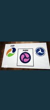
First one is obviously a Windows redesign.

But the second one is like, what if I mixed the Network 10 logo with the Google Chrome logo


And grabbed some of GO!'s branding.
 

Remove this Banner Ad

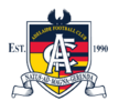
Spotted this Crows logo on the SANFL website. Is this commonly used?
 

Attachments

  • 1832DA37-2824-4556-9F75-7F5968B651C0.jpeg
    1832DA37-2824-4556-9F75-7F5968B651C0.jpeg
    24.1 KB · Views: 93
Spotted this Crows logo on the SANFL website. Is this commonly used?
It's the top of the Crows' SANFL logo, just recoloured. I think it's actually a copy of the official piping shrike on the SA flag, which is kinda ironic.
 

🥰 Love BigFooty? Join now for free.

Remove this Banner Ad

🥰 Love BigFooty? Join now for free.

Back
Top