Remove this Banner Ad

Discussion Logo Discussion Thread

🥰 Love BigFooty? Join now for free.

Jeez, I think it's great. A lot more marketable than a random rainbow circle which could be applied to any corporate plan document. This is unique, recognisable and fits the sporting brief.

It reminds me a lot of the F1 brand when it first came out and how people were freaking out by it.
 

Log in to remove this Banner Ad

Apologies if this has already been posted:
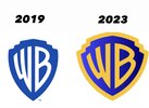
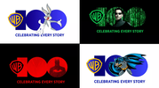
Warner Bros 100 year logo - the new shield is being adopted as the logo for all of WB's brands starting this month, replacing the skinny blue and white one after only 4 years.
View attachment 1680631

The 2019 was a clean logo. The new one with its gradient and outline looks messier and to change logo again after only a few years...
Make your mind up, WB

And bring back Ducktales already
 
I never got into the movies, but I get what you're saying. Bullet time was in everything during the noughties
Bullet time, the green code, all black leather coat… but also more notably introduced mainstream audiences into concepts like simulation theory, ai, digital world at a time when computers and the internet were really becoming an ingrained part of life.
 
It's a long time between drinks for me.

225


latest
 

Remove this Banner Ad

The 2026 FIFA World Cup logo will be unveiled tomorrow at 7:30 LA Time which will be 12:30pm AEST. Looking forward to finding out tomorrow afternoon. Also here is the 2023(in 2024) Asian Cup Logo:
1200px-2023_AFC_Asian_Cup_logo.svg.png
 
I could make that on ms paint. Seriously, what the hell. That is the most pathetic logo in the history of sport.
 

🥰 Love BigFooty? Join now for free.

I'm reserving judgement on the WC26 logo until I see some applications, which is where I am guessing it's going to either blow it out of the water or completely collapse.
 
Is the matrix franchise really that iconic?
It's probably up there as the most iconic in that conspiracy-genre of films. I never got into them as much but it's iconic enough that blue pill/red pill are household terms, the slo-mo bullet time scene and general aesthetic of the films are quite recognisable in pop-culture
 
Honestly I dig this a lot.
It feels like a revival of when design identity was established in print media, rather than on websites and apps and all other cheapening modern phenomena.
It's like something you'd see flipping through a magazine - taking up a whole page, nothing else on it, no little text or gradients or unnecessary shaders - no f***ing around.
 

Remove this Banner Ad

Discussion Logo Discussion Thread

🥰 Love BigFooty? Join now for free.

Back
Top