Navigation
Install the app
How to install the app on iOS
Follow along with the video below to see how to install our site as a web app on your home screen.
Note: This feature may not be available in some browsers.
More options


You are using an out of date browser. It may not display this or other websites correctly.
You should upgrade or use an alternative browser.
You should upgrade or use an alternative browser.
Portfolio NBL 19/20
- Thread starter muggsy26
- Start date
- Tagged users None


- May 25, 2009
- 4,014
- 2,765
- AFL Club
- Port Adelaide
Simple yet effective!
- Oct 27, 2016
- 5,949
- 10,676
- AFL Club
- Collingwood

- Other Teams
- Packers, Raptors, Renegades
Good stuff, can't wait to see more
- Jun 18, 2016
- 51,683
- 99,060
- AFL Club
- West Coast
- Other Teams
- Perth Scorchers
Solid start. Hope to see you have a crack at the new team as well.
muggsy26
Senior List
- Jan 14, 2013
- 294
- 832
- AFL Club
- West Coast
- Thread starter
- #7
Next Up is the South East Melbourne Phoenix. Seeing as they are the new franchise I had a bit of fun with this design and went with a more crazy design based off the wings in the logo. I loved their colours and can't wait to see what they actually run out in. From Left to Right: Away, Home, Alternate
I'm also trying to improve on my presentation of the designs, so any feedback in regards to the designs and the presentation would be much appreciated.
I'm also trying to improve on my presentation of the designs, so any feedback in regards to the designs and the presentation would be much appreciated.


muggsy26
Senior List
- Jan 14, 2013
- 294
- 832
- AFL Club
- West Coast
- Thread starter
- #9
Up next are the Illawarra Hawks. Although I like the simplicity of their uniforms this year the Hawks have had no consistency to their uniforms in the last 5 years. Switching from Red at Home to Black and drastically changing their designs. I've taken inspiration from their previous uniforms and think their horizontal chest stripe can become iconic to Illawarra, and a design element that can be altered year in year out to keep the fans happy. The Uniforms are from Left to Right: Away, Home, Alternate

The red looks too orangy to me.Up next are the Illawarra Hawks. Although I like the simplicity of their uniforms this year the Hawks have had no consistency to their uniforms in the last 5 years. Switching from Red at Home to Black and drastically changing their designs. I've taken inspiration from their previous uniforms and think their horizontal chest stripe can become iconic to Illawarra, and a design element that can be altered year in year out to keep the fans happy. The Uniforms are from Left to Right: Away, Home, AlternateView attachment 608078
muggsy26
Senior List
- Jan 14, 2013
- 294
- 832
- AFL Club
- West Coast
- Thread starter
- #12
Next Up are Perth. I found it really difficult to design for Perth, but I really like the Sunset design that Utah use and Freight Train's city jersey used.
For the Home and Away they maintain the Wildcats recent look with a subtle gradient. With the Alternate I tried to do something a little different, taking inspiration from Virginia Tech, for the Cats and use a darker red/maroon with Red elements.
For the Home and Away they maintain the Wildcats recent look with a subtle gradient. With the Alternate I tried to do something a little different, taking inspiration from Virginia Tech, for the Cats and use a darker red/maroon with Red elements.

muggsy26
Senior List
- Jan 14, 2013
- 294
- 832
- AFL Club
- West Coast
- Thread starter
- #13
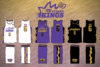
Next Up the Sydney Kings. I reverted back to the Purple, Black and Gold. For some reason I am not a fan of the Lakers look they are going for in the past few years. The design down the side panel is based off the top of the crown and is something unique to the Kings.

Attachments
muggsy26
Senior List
- Jan 14, 2013
- 294
- 832
- AFL Club
- West Coast
- Thread starter
- #14
Next up the Cairns Taipans. I think their Home uniform this year is arguably the best out of the lot and could easily be untouched. Nonetheless, with this set I have decided to go with a fangs design from the Taipan. I've also brought back the diamonds from their old logo, as I think they add a unique element to their uniforms.

muggsy26
Senior List
- Jan 14, 2013
- 294
- 832
- AFL Club
- West Coast
- Thread starter
- #15
Next up are the NZ Breakers. I really like what the Breakers have done by incorporating the Maori design into their uniforms in the past few years. I also think minimising the white on their Home uniforms will create a more powerful look. The alternate is an NZ inspired uniform that could be worn in Home games outside of Auckland. (The Maori design element has been traced from their uniform from this season).

- May 25, 2009
- 4,014
- 2,765
- AFL Club
- Port Adelaide
I like the Taipans set especially the fangs on the sides. Im not a fan of the curvy Taipans logos on the jerseys though. I realize this comes from the logo but its just not doing it for me.
Ive only looked at the Breakers on Tapatalk so I cant see all the details but I loove it!! I wonder sometimes what Port would have looked like if they had have gone with the black, white and blue.
Sent from my SM-G930F using Tapatalk
Ive only looked at the Breakers on Tapatalk so I cant see all the details but I loove it!! I wonder sometimes what Port would have looked like if they had have gone with the black, white and blue.
Sent from my SM-G930F using Tapatalk
muggsy26
Senior List
- Jan 14, 2013
- 294
- 832
- AFL Club
- West Coast
- Thread starter
- #17
Finally, Adelaide 36ers. I think Adelaide has one of the better uniforms from First Ever. Although I'm not a fan of their rebrand the Bullets have kind of stolen their colours now, so I decided to keep them as Navy Gold and Red. I also don't like the unnecessary addition of white on the Home uniforms and I think they look much better when they stick to their key colours. A red alternate is something a bit different and out there for the 36ers and I have used a wing design that is similar to the one on their City Edition Uniforms.

fancyscum
Radical Crommunist
Orange? also the lack of Swoop City disappoints me.Finally, Adelaide 36ers. I think Adelaide has one of the better uniforms from First Ever. Although I'm not a fan of their rebrand the Bullets have kind of stolen their colours now, so I decided to keep them as Navy Gold and Red. I also don't like the unnecessary addition of white on the Home uniforms and I think they look much better when they stick to their key colours. A red alternate is something a bit different and out there for the 36ers and I have used a wing design that is similar to the one on their City Edition Uniforms. View attachment 610058
muggsy26
Senior List
- Jan 14, 2013
- 294
- 832
- AFL Club
- West Coast
- Thread starter
- #19
All the colours I've used have come from the team logos, to me that looks Red, but maybe my computer is playing tricks on me. Also, I really dislike the Swoop City jersey, for some reason the name just seems really corny and a knock off attempt of an NBA City concept.Orange? also the lack of Swoop City disappoints me.
fancyscum
Radical Crommunist
looks to me like a completely different red from the one that is seen in the logo that you have above it. Also, it's understandable that you don't get the whole swoop city thing, it's supposed to be a term that is only used by South Australians to other South Australians back in the day to identify who was a free settler and not some filthy convict, I don't know why the 36er's decided it was a good idea to let the secret out...All the colours I've used have come from the team logos, to me that looks Red, but maybe my computer is playing tricks on me. Also, I hate the Swoop City jersey, for some reason the name just seems really corny and a knock off attempt of an NBA City concept.
muggsy26
Senior List
- Jan 14, 2013
- 294
- 832
- AFL Club
- West Coast
- Thread starter
- #21
looks to me like a completely different red from the one that is seen in the logo that you have above it. Also, it's understandable that you don't get the whole swoop city thing, it's supposed to be a term that is only used by South Australians to other South Australians back in the day to identify who was a free settler and not some filthy convict, I don't know why the 36er's decided it was a good idea to let the secret out...
Ahh cool that's interesting to know. Would be nice if they let out a little bit more information behind each team's Jerseys.
My computer might be playing up but I just checked and that was the red that I got from the logo

fancyscum
Radical Crommunist
I was taking the piss, Swoop City is not a thing at all and simply a cringy NBA knockoff like you said.Ahh cool that's interesting to know. Would be nice if they let out a little bit more information behind each team's Jerseys.
I think that POTY title is getting to your headI was taking the piss, Swoop City is not a thing at all and simply a cringy NBA knockoff like you said.
")
fancyscum
Radical Crommunist
Now it has, and I haven't even got the badge yet 


Similar threads
- Replies
- 3
- Views
- 610
- Replies
- 0
- Views
- 505
- Replies
- 4
- Views
- 745
