


Dylan8
Bar Up
This thought crosses my mind nearly every day. What's the advantage of coins?I also think we should have $1 and $2 notes. Too many coins atm and weigh down my wallet.
PS I love this

Follow along with the video below to see how to install our site as a web app on your home screen.
Note: This feature may not be available in some browsers.

Due to a number of factors, support for the current BigFooty mobile app has been discontinued. Your BigFooty login will no longer work on the Tapatalk or the BigFooty App - which is based on Tapatalk.
Apologies for any inconvenience. We will try to find a replacement.
This thought crosses my mind nearly every day. What's the advantage of coins?I also think we should have $1 and $2 notes. Too many coins atm and weigh down my wallet.
The $100 can get a packed Etihad, as that's as rare as the note itself.Alright, fine! If the $5 gets the MCG, the $10 gets Adelaide Oval
Log in to remove this Banner Ad
Now you just need to change the royal blue bits into navy...
Main issue with this design is the value of the note would be instantly doubled by Pridda's presenceNow you just need to change the royal blue bits into navy...
Needs more tripanel
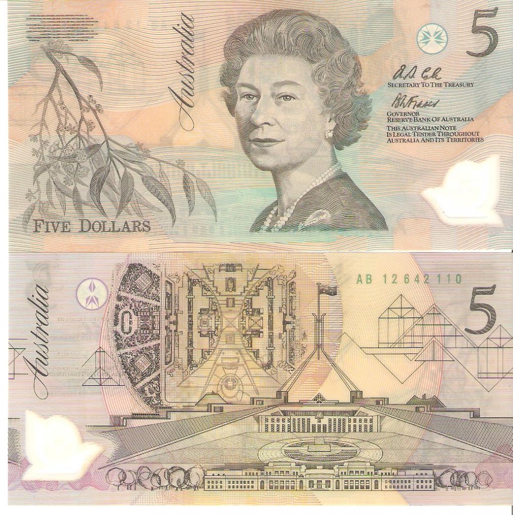
The very first lot of polymer $5 notes were crap and wore out really quick. I remember handing one over at a counter and when they grabbed it it just ripped in half, also a couple of kids at school rubbing the queen's face off it against a brick wall.At work tonight some pensioner used a $5 note so old that I nearly called it out as a fake. It had a different number font and was really washed out.
Early batch of polymer 5 dollar notes were also a less vibrant colour. People complained they couldn't pick it apart from a 10 dollar in low light (which at the time was an orange colour from what I've researched).At work tonight some pensioner used a $5 note so old that I nearly called it out as a fake. It had a different number font and was really washed out.
FWIW Billy ray and Dylan, there's been talk previously about making a $5 coin to replace the note. Argument being coins are more durable.
Also, why are we bothering to do this know when the Queen will be dead within a year or two.
And as I said, it will somehow end up costing millions.
I have 4 of those. Looked like this:At work tonight some pensioner used a $5 note so old that I nearly called it out as a fake. It had a different number font and was really washed out.
FWIW Billy ray and Dylan, there's been talk previously about making a $5 coin to replace the note. Argument being coins are more durable.
FWIW Billy ray and Dylan, there's been talk previously about making a $5 coin to replace the note. Argument being coins are more durable.
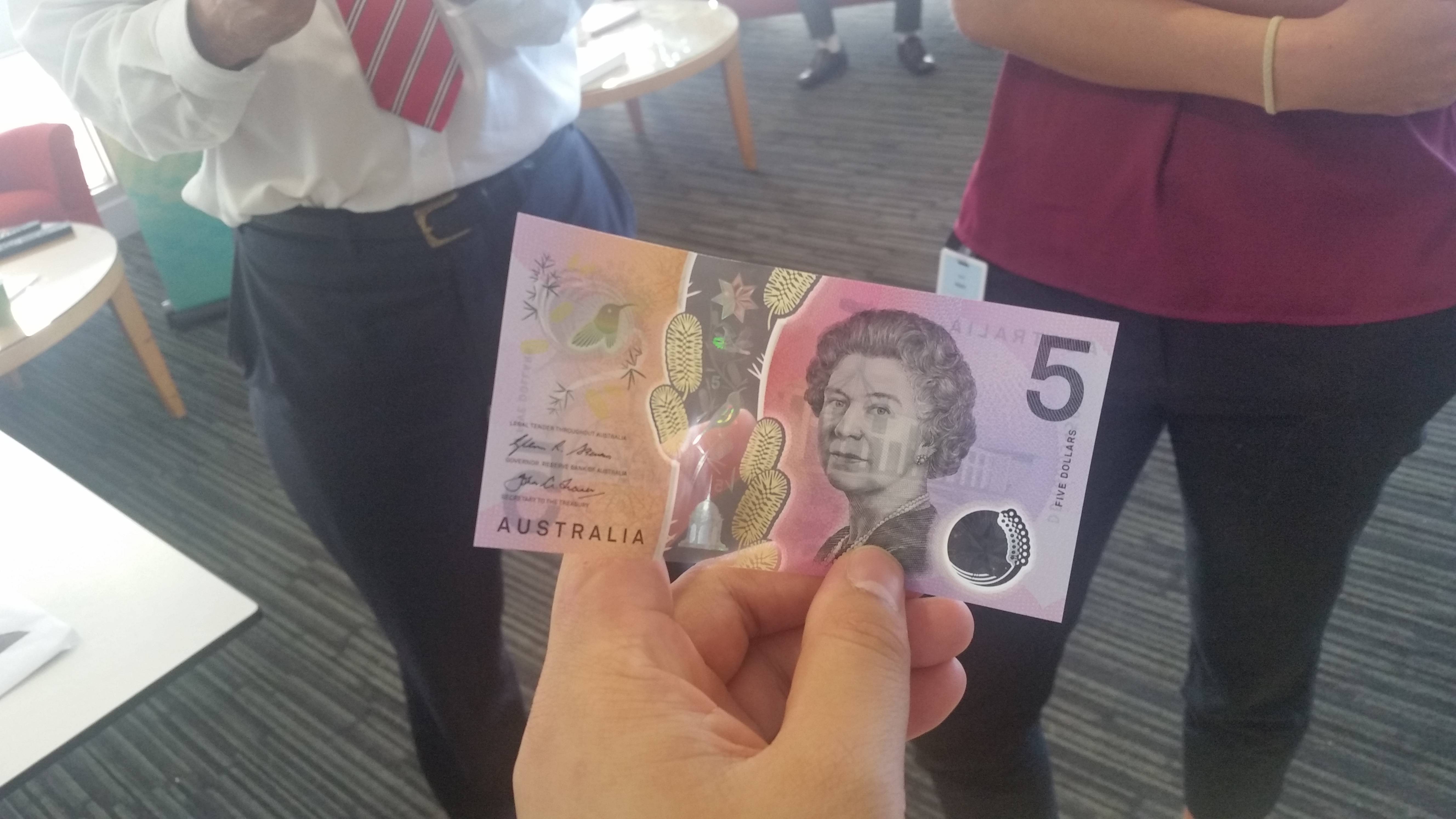
The original image made it obvious that the blue was the table it was placed on, however a lot of media outlets have cropped it and made it look like the blue was part of the design, increasing the outrage.I did know it was see through, but now I've seen it without the blue background, I like it a lot more. Why didn't they publish the example with the transparent background checkers? I reckon the reaction would have been a lot better.
Yeah even when it was shown fully and it was clear that it was clear, it darkened the whole thing, so it looked shit. Now I've seen it in the flesh, I like it more, and so will most people I reckon.The original image made it obvious that the blue was the table it was placed on, however a lot of media outlets have cropped it and made it look like the blue was part of the design, increasing the outrage.
