Navigation
Install the app
How to install the app on iOS
Follow along with the video below to see how to install our site as a web app on your home screen.
Note: This feature may not be available in some browsers.
More options
-
Mobile App Discontinued
Due to a number of factors, support for the current BigFooty mobile app has been discontinued. Your BigFooty login will no longer work on the Tapatalk or the BigFooty App - which is based on Tapatalk.
Apologies for any inconvenience. We will try to find a replacement.
You are using an out of date browser. It may not display this or other websites correctly.
You should upgrade or use an alternative browser.
You should upgrade or use an alternative browser.
News New Jumpers For 2025
- Thread starter Boyohboywowwee
- Start date
- Tagged users None
🥰 Love BigFooty? Join now for free.
- Status
- Not open for further replies.
Heardy_101
MAGA - Make Albo Go Away
I wonder if Collingwood are testing the waters for a potential change?
dondolla
Cancelled
- Nov 1, 2024
- 90
- 112
- AFL Club
- Essendon
I hope if they did this they’d review the kit rules. It’d be horrible if most weeks it’s Collingwood in a white jumper/black shorts against a team wearing white shorts and a dark jumper. Let them wear white with black shorts too and not like how Geelong wear full white all the time.Hopefully. All the feedback seemed pretty positive towards the concept of the kit, just the little executions were off (mismatched eras of logos)
Log in to remove this Banner Ad
Gibbsy
Moderator
- Moderator
- #2,855
I hope if they did this they’d review the kit rules. It’d be horrible if most weeks it’s Collingwood in a white jumper/black shorts against a team wearing white shorts and a dark jumper. Let them wear white with black shorts too and not like how Geelong wear full white all the time.
I agree, can’t be rules for one and not the other. But we have seen the AFL bend to North’s demands to wear a white jumper with royal blue shorts even when that seems counterproductive. So who knows what we’re going to get, really.
Supercheapgiants
I'm Blue
It's a pretty simple few fixes to ensure Collingwood, Geelong and North can all wear coloured shorts at all home games. Few clubs expand their guernsey options but mainly, NEW SHORTS!!
Collingwood Home:
Adelaide - Red Clash/Red Shorts
Brisbane - Fitzroy/Blue
Carlton - Baby blue
Essendon - Clash/black or Home/Red
Freo - Lavender or Lilac (or maybe current home)
Geelong - Geelong navy clash (collingwood white shorts)
GC - Home
GWS - Clash/Grey or Orange (white may still be ok here)
Hawthorn - Home or a yellow clash jumper w/brown shorts
Melbourne - Clash/royal or a red clash jumper
North - Centenary or other full blue kit
Port - Teal
Syd - Home
StK - Hot Cross Bun/red shorts
WC - Peril/Blue or Home/Blue
Western - Home
Geelong Home:
Adelaide - Red Clash/Red Shorts
Brisbane - Fitzroy/Red or blue
Carlton - Baby blue
Essendon - Clash/black or Home/Red
Freo - Lavender or Lilac (or maybe current home)
Collingwood - Black clash (geelong all white)
GC - Home
GWS - Clash/Grey or Orange (white may still be ok here)
Hawthorn - Home or a yellow clash jumper w/brown shorts
Melbourne - Clash/royal or a red clash jumper
North - Centenary or other full blue kit
Port - Teal
Syd - Home
StK - Hot Cross Bun/Red shorts
WC - Peril/Blue or Home/Blue
Western - Home (with red shorts maybe)
North Home:
Adelaide - Red Clash/Red Shorts or Home
Brisbane - Home or Fitzroy/red (bears/maroon could work too)
Carlton - Home
Essendon - Home (Home/red works too)
Freo - Home
Collingwood - Black clash (North still in blue shorts)
GC - Home
GWS - Home or NS
Hawthorn - Home
Melbourne - Home or a red clash jumper
Geelong- Navy Clash (north in white shorts)
Port - Home
Syd - Home
StK - Home
WC - Peril/Blue (or home with North in white shorts)
Western - Red Clash (or home with North in white shorts)
dondolla
Cancelled
- Nov 1, 2024
- 90
- 112
- AFL Club
- Essendon
Majority of these are easily solved because they just need different shorts. Most teams don’t sell playing shorts so they could surely make a set in a different colour. They should treat North Melbourne’s blue like they treat Sydney/GCS red and let teams wear coloured shorts against them. I’d say the same about WCE and WB but I think they wear a darker shade of blue?It's a pretty simple few fixes to ensure Collingwood, Geelong and North can all wear coloured shorts at all home games. Few clubs expand their guernsey options but mainly, NEW SHORTS!!
Collingwood Home:
Adelaide - Red Clash/Red Shorts
Brisbane - Fitzroy/Blue
Carlton - Baby blue
Essendon - Clash/black or Home/Red
Freo - Lavender or Lilac (or maybe current home)
Geelong - Geelong navy clash (collingwood white shorts)
GC - Home
GWS - Clash/Grey or Orange (white may still be ok here)
Hawthorn - Home or a yellow clash jumper w/brown shorts
Melbourne - Clash/royal or a red clash jumper
North - Centenary or other full blue kit
Port - Teal
Syd - Home
StK - Hot Cross Bun/red shorts
WC - Peril/Blue or Home/Blue
Western - Home
Geelong Home:
Adelaide - Red Clash/Red Shorts
Brisbane - Fitzroy/Red or blue
Carlton - Baby blue
Essendon - Clash/black or Home/Red
Freo - Lavender or Lilac (or maybe current home)
Collingwood - Black clash (geelong all white)
GC - Home
GWS - Clash/Grey or Orange (white may still be ok here)
Hawthorn - Home or a yellow clash jumper w/brown shorts
Melbourne - Clash/royal or a red clash jumper
North - Centenary or other full blue kit
Port - Teal
Syd - Home
StK - Hot Cross Bun/Red shorts
WC - Peril/Blue or Home/Blue
Western - Home (with red shorts maybe)
North Home:
Adelaide - Red Clash/Red Shorts or Home
Brisbane - Home or Fitzroy/red (bears/maroon could work too)
Carlton - Home
Essendon - Home (Home/red works too)
Freo - Home
Collingwood - Black clash (North still in blue shorts)
GC - Home
GWS - Home or NS
Hawthorn - Home
Melbourne - Home or a red clash jumper
Geelong- Navy Clash (north in white shorts)
Port - Home
Syd - Home
StK - Home
WC - Peril/Blue (or home with North in white shorts)
Western - Red Clash (or home with North in white shorts)
Supercheapgiants
I'm Blue
WC and WB do wear a darker shade, not by much but it is a little darker. Dogs do look nice with white shorts so they could get away with that against some clubs but WC shouldn't ever wear white shorts imoMajority of these are easily solved because they just need different shorts. Most teams don’t sell playing shorts so they could surely make a set in a different colour. They should treat North Melbourne’s blue like they treat Sydney/GCS red and let teams wear coloured shorts against them. I’d say the same about WCE and WB but I think they wear a darker shade of blue?
- Aug 17, 2006
- 24,451
- 23,844
- AFL Club
- Geelong
Thats a shame, the local club logos was what made them last year.
I missed the auction last year, spewing. Would have loved to get one of the Irish boys' MW/PI.
- Aug 17, 2006
- 24,451
- 23,844
- AFL Club
- Geelong
View attachment 2383439
Kits for Pies vs Lions tomorrow night.
Confirmed Pies are wearing retro kit, Brisbane indicating they are wearing their normal away kit.
I'm a sucker for these quirky one-offs and throwbacks, but apart from the old AFL logo, there just wasn't enough different about it, or enough that screamed "retro" for me. Should have done full length stripes and a full collar for a start. And with it being a bit of a hodgepodge of eras already, probably could have considered those weird mid-80s block numbers.
- Jan 16, 2019
- 1,140
- 1,466
- AFL Club
- West Coast
this purple is way too light imo
Mr Eagle
Bird-brain
No way, I think it's much better when it is clearly purple.this purple is way too light imo
Shorts are a bit odd with the side design.
- Jul 19, 2020
- 988
- 1,760
- AFL Club
- North Melbourne
the shade of purple looks brilliant and really vibrant, better then the purple they have now for their regular home jumper.No way, I think it's much better when it is clearly purple.
Shorts are a bit odd with the side design.
I know we’ve had a darker purple since 2010ish but it’s crazy just how different it is when you put this retro jumper side by side with our recent home jumpers.the shade of purple looks brilliant and really vibrant, better then the purple they have now for their regular home jumper.
- Jul 19, 2020
- 988
- 1,760
- AFL Club
- North Melbourne
i’d be making this the home jumper full time next year if this is the jumper we are gonna get. the anchor could be a little bit thicker though.I know we’ve had a darker purple since 2010ish but it’s crazy just how different it is when you put this retro jumper side by side with our recent home jumpers.
I really like their shade of purple today. Looks like Utah Jazz.
- Sep 30, 2015
- 4,435
- 6,404
- AFL Club
- West Coast
They had a prototype one a few years back all haze that had the best anchor design, was thicker.the anchor could be a little bit thicker though.
- Sep 30, 2015
- 4,435
- 6,404
- AFL Club
- West Coast
- Sep 30, 2015
- 4,435
- 6,404
- AFL Club
- West Coast
Far superior, they should wear that forever.I recall they had an un-released training/pre-season with the OG anchor design a couple of seasons ago. Had the inverse white version also.
View attachment 2373753View attachment 2373755
🥰 Love BigFooty? Join now for free.
Matele
Premium Platinum
Agreed, I much prefer the 90’s anchor design.Far superior, they should wear that forever.
- Jun 12, 2012
- 21,636
- 69,184
- AFL Club
- Port Adelaide
I’m probably in the minority here but the anchor design looks way better in its original form with the red and green. The all purple version looks incomplete to me.
I'd also prefer it with the red and green, but I'd go for this "Purple Haze" variation over the chevrons as their Main going forward. Having said this, I like the chevron design as well and would be happy to see it pop up regularly as retro/special occasion guernseys too.I’m probably in the minority here but the anchor design looks way better in its original form with the red and green. The all purple version looks incomplete to me.
Gibbsy
Moderator
- Moderator
- #2,873
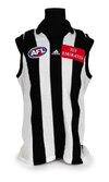
Something feels off with the stripes not totally covering the guernsey like the top tier 2000 one.
View attachment 2385308
This is easily the best Collingwood uniform.
I bought a Sekem replica of this exact jumper off eBay the other week and it was too small. Shattering. Gonna clean it up and resell; it had a busted old felt number on the back that I've been trying to remove.
Shipping Report
Senior List
- May 3, 2025
- 225
- 421
- AFL Club
- Fremantle
- Other Teams
- South Fremantle
The long, ‘polyester era’ anchor looks shit, whereas the old seagull looking original one actually works far better with the modern fit of jumpers and amount of sponsors.
The 2000s anchor just dominates the entire strip too much, the tighter and smaller one has a nicer balance to it
The 2000s anchor just dominates the entire strip too much, the tighter and smaller one has a nicer balance to it
This was my attempt at blending the 90s anchor with the 2000s version, best of both worlds sort of thing.The long, ‘polyester era’ anchor looks shit, whereas the old seagull looking original one actually works far better with the modern fit of jumpers and amount of sponsors.
The 2000s anchor just dominates the entire strip too much, the tighter and smaller one has a nicer balance to it

- Status
- Not open for further replies.
Similar threads
- Replies
- 66
- Views
- 9K
- Replies
- 150
- Views
- 9K


