Discussion North Melbourne's home jumper going forward

Remove this Banner Ad

The bounding roo has grown on me so much that I believe it should be our new away jumper, and the club hinted as much on Twitter on the weekend (not sure if that tweet has been shown on here. If not let me know and I'll dig it up). Really undecided on whether we should wear blue or white as home, as I love both equally. But I just thought of something which could work:

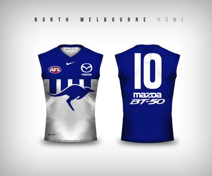
Home: Blue with white stripes (worn in home matches against Adelaide, Brisbane, Fremantle, Geelong, Gold Coast, GWS, Hawthorn, Melbourne, Port Adelaide, Richmond, St Kilda, Sydney, West Coast & Western Bulldogs)

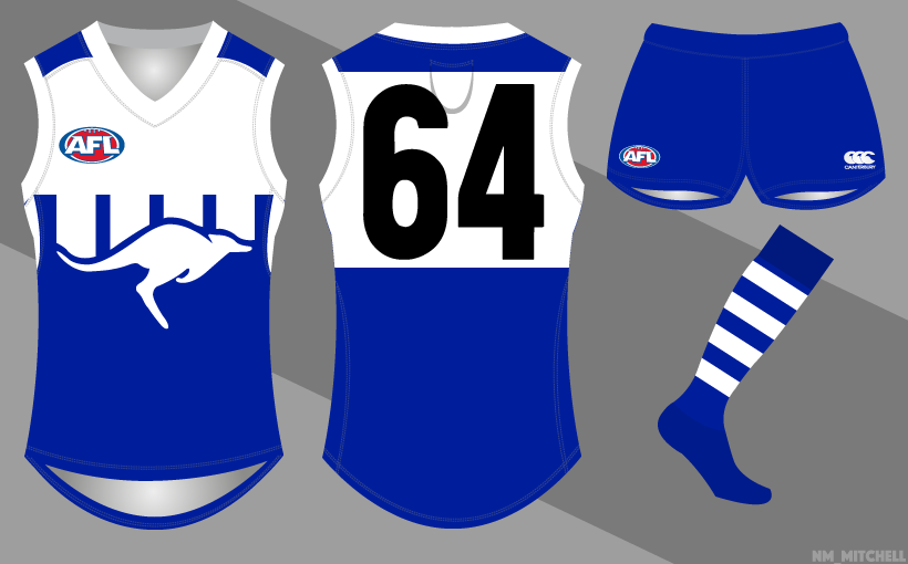
Away: Bounding roo (worn in away matches against Adelaide, Brisbane, Fremantle, Gold Coast, GWS, Hawthorn, Melbourne, Port Adelaide, Richmond, St Kilda, Sydney, West Coast & Western Bulldogs)

Special: To preserve the significance of the white with blue stripes, this jumper worn in all games against Carlton, Collingwood & Essendon

The tweet hasn't been posted here.

Don't get me wrong, I do love the clash guernsey probably more so than the home in terms of aesthetic, two of the last three guernseys I've bought have been the clash, but I would be filthy if the current home was dropped.
4/4 Premierships in it, and I see it as a far stronger kit than the clash, especially when in the blue shorts.
 

Log in to remove this ad.

NAFL thread is that way... :arrowsmalldown:
tumblr_mclj5cKnmu1rg1ucro1_500.jpg
 

(Log in to remove this ad.)


This version has the Sydney/GWS/St Kilda problem of having different dominant colours front and back. Having the number panel might not be quite so clean, but I think it moves it towards a better colour balance when seen on-field.

The white version is better in the sense that it avoids this.
 
What would the home and away look like if the colours were reversed? As in the blue was white and the white was blue for home and visa versa for away.

Edit: I'm talking about the front of the Guernsey
Mocked this up a while ago, but pretty much this:
D7j4d8g.png
 
Amazing how some clubs can have a big logo slapped in the middle of a jumper and it looks beautiful and classy and on others it looks so daft and pointless.

But for the conversation at hand, keep the white jumper for the home and use a variation of this roo for an away.
It's something you could happily wear in a Grand Final if you clashed.
It really depends, I think the jumpers where the design work with or incorporates the logo into the design just look more natural. GC logo will never look natural for instance, as the design doesn't highlight it or work with it at all. Where as the roo has the stripes coming down from the yoke which work around the form of the roo.
 
I really agree with El_Scorcho. The home jumper, and most home jumpers, are sacrosanct.

Obviously the quicker something is done about the Gold Coast and Giants, the better. And the exceptions of Freo and Port are obvious because, as much as I think most fans have some love for the old jumpers, the new ones represent something much prouder. The Dockers' also have a bit of a historical link with theirs. But most are also jumpers replacing only 10-20 year old strips, so it doesn't really matter.

The Kangaroos and Saints abandoned their traditional designs and ended up going back. Of course the reception to the late 90s/2000s switch ups is big enough – great designs, unique, and both represent fairly good eras for both teams, and you're also dealing with people 17-35 who are the vocal ones online, who are getting a nostalgia kick.

The new buzz word for small clubs is 'boutique,' and I don't think it's much surprise that Melbourne, Western Bulldogs, North, and St Kilda are putting effort into their image. Of course those middle two much need decent logos but they all put effort and care into their jumpers; whether it's fan opinion or doing one-offs that generally look cool, or recall some sort of era. I still can't believe St Kilda chose the Hot Cross Bun – weird on all levels, but they knew it would hit a chord and it worked. You can't imagine the Swooping Magpie back at the Pies.

There is room for these jumpers that embody the club so well, but I think the home jumper is a home jumper. In a few years people would rally for it back. North Melbourne have an ardent history of resilience, and they've won all their flags in blue and white stripes.

I think the best option – and they are so lucky to have it – is wearing the Bounding Roo as a permanent away, and St Kilda also trotting out the Hot Cross Bun a few times a year. these jumpers embody their clubs more than any clash possibly could. The Kangas and Sainters will essentially have a home and away that are equally as identifiable and equally as relevant.

Now, can we all finally get the one remaining holy grail of one-offs petitioned for? The Fitzroy Lion is back. The Weagles have the wings. The Sains and North Melbourne have gone back to the 90s, Port's worn Prison Bars and SBS a fair bit, the Bombers and Tiges have clash jumpers they always should have, and all that remains is...

ef493fa6edf773765d081c768cfa3564

(Annoys me how that absolute flog of a bloke Spider Burton is in every green jumper photo on the internet)
 
It's not set in stone, but fills me with great hope.
I think this is why Friday night's jumper had gold cuffs. They were testing the waters a bit with it, and they'll most likely have sold a s**t load of jumpers. Next year, they'll roll out with the unadulterated version with blue cuffs, and fans will buy it too.
 
I think this is why Friday night's jumper had gold cuffs. They were testing the waters a bit with it, and they'll most likely have sold a s**t load of jumpers. Next year, they'll roll out with the unadulterated version with blue cuffs, and fans will buy it too.
A bit like the Carlton one a few years back with the silver Mars logo and tramp stamp cups.

Man, imagine buying that one as a cool throwback for the classic monogram on the front, copping the tacky back as a compromise, then the club releasing the perfect version a year later...

I think as good as the blue North away is, it's run its course. Bring back the 90s Roo and then in another six years, whip out the chevron for just as long. That cycle shits all over the Hawthorn one. It keeps things fresh but classy. I imagine in a few more years, when their 'new/old' image has been bedded down completely, we'll see the Bullies don red cuffs again and alternate those.
 

Remove this Banner Ad

Back
Top