Andonis1997
Sporting masochist
As have I.But not an uncommon convention. Definitely seen similar silliness in other sports.
Either have the De in lowercase to make it highlight the BOER or have it in uppercase to have it like every other surname.
Follow along with the video below to see how to install our site as a web app on your home screen.
Note: This feature may not be available in some browsers.

Due to a number of factors, support for the current BigFooty mobile app has been discontinued. Your BigFooty login will no longer work on the Tapatalk or the BigFooty App - which is based on Tapatalk.
Apologies for any inconvenience. We will try to find a replacement.
As have I.But not an uncommon convention. Definitely seen similar silliness in other sports.
Then what's the point of that?It could have been planned abit better. Wouldn't mind if they tried initials above the AFL logo instead.
It could have been planned abit better. Wouldn't mind if they tried initials above the AFL logo instead.
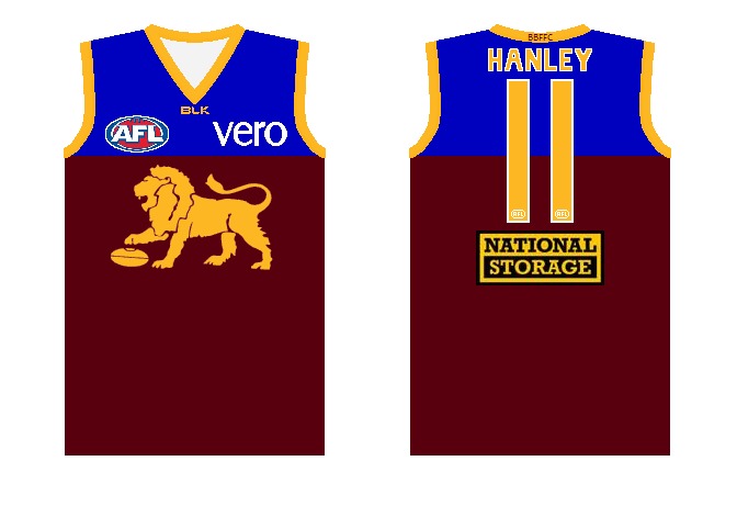
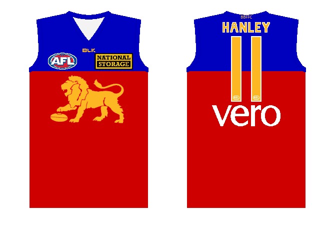
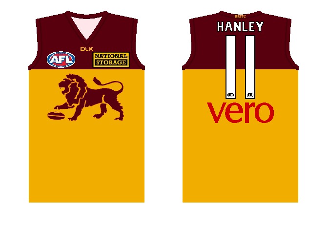
The font sizing, the position and lettering was hopeless imo.
No. + its looked like some letters stuck out cause from the GPS pouch.Yeah it's almost an instant failure IMO. Did any club/manufacturer factor in the shape and size of the gps each player wears?
Log in to remove this Banner Ad
It's easier to make out two letters over full names.Then what's the point of that?
Won't be able to see it let alone read what it says.
Not a fan. Would rather have numbers on the front instead.It could have been planned abit better. Wouldn't mind if they tried initials above the AFL logo instead.
WAFL style?Not a fan. Would rather have numbers on the front instead.
Would be the best place imo.WAFL style?
Or in a different placement?


Third one best. But switch places. Patch on left and letters on right.Just trying out some more ideas from my post earlier with NMFC on the front.....On a flat base
#1 This is what I was wanting to achieve using the smaller AFL tag and NMFC on the side.
View attachment 52275
#2 Half and half. Half on a stripe, half off, and positioning the tag like a soccer kit and off a stripe
View attachment 52276
#3 Making a square with the initials, probably the same size as the current AFL tag.
View attachment 52277
Cheers Mero for the ever glorious FootyJumpers design.
But it's not going inside the stripe.Third one best. But switch places. Patch on left and letters on right.
I was more thinking for the use of names, but if numbers work better.Not a fan. Would rather have numbers on the front instead.
First one,because not all teams have four letter abbreviations.Just trying out some more ideas from my post earlier with NMFC on the front.....On a flat base
#1 This is what I was wanting to achieve using the smaller AFL tag and NMFC on the side.
View attachment 52275
#2 Half and half. Half on a stripe, half off, and positioning the tag like a soccer kit and off a stripe
View attachment 52276
#3 Making a square with the initials, probably the same size as the current AFL tag.
View attachment 52277
Cheers Mero for the ever glorious FootyJumpers design.
Good point.First one,because not all teams have four letter abbreviations.
The numbers are like three quarters of their actual size now! I've just about gone full circle with these names on backs. I initially hated them, then when I saw the photo shoot I warmed to them, now I've seen them in action, I hate them again
All they need to do is get rid of anything between the name and the collar "canberra" for example. Make the font bigger. And it'll be fine.
They need to get rid of strokes on numbers/names imo.


