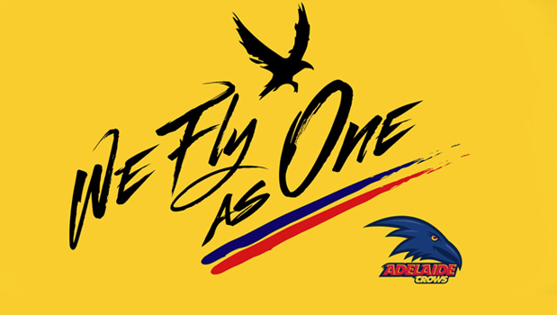
I have no doubt that the new crow on the training gear and stationery and now another on the WFAO stuff suggests that there is a new logo coming.
Possibly just held off to nor make too many changes in one season like some sort of panic.
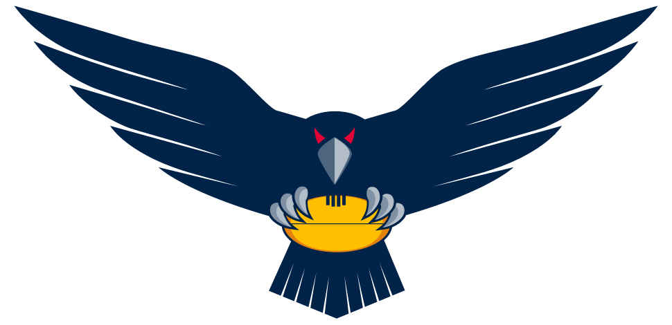
But with the crest being used to advertise the SANFL side, the WFAO logo around the ground, the original shield for the 25th year and the new crow on merch it's obvious that the raptor head has been parked. I'd prefer a AFC logo like on the hats over raptor head.
Possibly just held off to nor make too many changes in one season like some sort of panic.
But with the crest being used to advertise the SANFL side, the WFAO logo around the ground, the original shield for the 25th year and the new crow on merch it's obvious that the raptor head has been parked. I'd prefer a AFC logo like on the hats over raptor head.