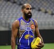
I hate it too. The Eagle looks shocking. They've done some great jumpers for indigenous round (the original ones with the Eagles were my favourite) and this is not one of them.Hate it
Navigation
Install the app
How to install the app on iOS
Follow along with the video below to see how to install our site as a web app on your home screen.
Note: This feature may not be available in some browsers.
More options
-


LIVE: Port Adelaide v Carlton - 7:30PM Thu
Squiggle tips Port at 63% chance -- What's your tip? -- Team line-ups »
You are using an out of date browser. It may not display this or other websites correctly.
You should upgrade or use an alternative browser.
You should upgrade or use an alternative browser.
The Jumper Thread
- Thread starter Monocle
- Start date
- Tagged users None
Art is subjective, and that applies to these too.
You don’t have to like it, but the artist, Loretta Egan, has put her heart and soul into designing these and seeing our boys run out wearing their artwork on the national will be a huge moment for her.
You don’t have to like it, but the artist, Loretta Egan, has put her heart and soul into designing these and seeing our boys run out wearing their artwork on the national will be a huge moment for her.
Last edited:
MeltMan
With The Power To MELT!
- Mar 22, 2021
- 1,112
- 1,887
- AFL Club
- West Coast
I wouldn't say its my favourite, but we have had some crackers.
Perhaps the new jagged eagle logo makes how smooth this one is a little jarring, but love the colour flip, to primary yellow, love the state background, we can include freo on our jumper!
The southern cross / premierships are dope.
Wish the tracks popped more, but being limited with the colour scheme of team colours probably makes that a tough critique.
Yeah not for me. Looks like a fishing shirt for bogans.
Bender_
X
Yeah not for me. Looks like a fishing shirt for bogans.
Straight off the rack at the servo!
I love the colour scheme but the picture layout leaves a bit to be desired. Massive fan of the gold.
- Oct 9, 2009
- 11,506
- 12,366
- AFL Club
- West Coast
I love the new Eagle head and the outline of the state.
One of the better ones. If you look at the detail, it’s really well thought out in my view.
- Jan 9, 2013
- 3,253
- 5,362
- AFL Club
- West Coast
- Other Teams
- Perth Scorchers, South Fremantle
Maybe that's why I like it.Yeah not for me. Looks like a fishing shirt for bogans.
- Jan 9, 2013
- 3,253
- 5,362
- AFL Club
- West Coast
- Other Teams
- Perth Scorchers, South Fremantle
Ernie Dingo's niece designed it.
Yeah not a fan of this year’s guernsey. It’s the big Eagle head that ruins it. Way too busy.
The fishing shirt call is bang on; particularly with Flyin’ modelling the long sleeve version.
The fishing shirt call is bang on; particularly with Flyin’ modelling the long sleeve version.
- Sep 28, 2009
- 23,276
- 32,809
- AFL Club
- West Coast
- Other Teams
- Reading FC
I dont mind it. Kind of looks like an Adelaide jumper though.
- Jan 13, 2013
- 23,219
- 45,759
- AFL Club
- West Coast
Yeah, way too much going on imo, if you took out either the eagles head or the wa emblem it might look better I reckon.Yeah not a fan of this year’s guernsey. It’s the big Eagle head that ruins it. Way too busy.
The fishing shirt call is bang on; particularly with Flyin’ modelling the long sleeve version.
Pwani Magharibi
Debutant
We've had some great indigenous/first nations guernseys over the years but this one is my favourite. Got to get myself one of those long sleeve ones. Go Waalitj Marawar!
I might be the only one that thinks our Indigenous guernseys have been pretty average (until this year).
It's only been the last couple of years since we've really embraced it too. They've rehashed the same designs in the past too many times.
The snake head one was the worst though.
It's only been the last couple of years since we've really embraced it too. They've rehashed the same designs in the past too many times.
The snake head one was the worst though.
Works so well with the gold AFL logoThe 2019 one is the GOAT in my books. Maybe I’m just influenced by Jetta’s old man trim though. View attachment 1982733
- Sep 8, 2011
- 11,073
- 11,143
- AFL Club
- West Coast
New eagle head is a bit of a throwback to the late 90s BGC preseason guernsey
Bender_
X
New eagle head is a bit of a throwback to the late 90s BGC preseason guernsey
The original tripe angel!
Still have mine I got in year 11. Can squeeze into it but look a bit like a bratwurst.
- Moderator
- #1,100
THISAlmost ochre in colour. Just bring back the ochre.
Similar threads
- Replies
- 3K
- Views
- 180K
- Replies
- 209
- Views
- 11K


