Remove this Banner Ad

Portfolio The NRL by ISC

🥰 Love BigFooty? Join now for free.

Aug 8, 2008
7,985
8,701
Campbelltown
AFL Club
Sydney
Other Teams
Macarthur FC
Portfolio%20logo_zpsmggslh7p.png

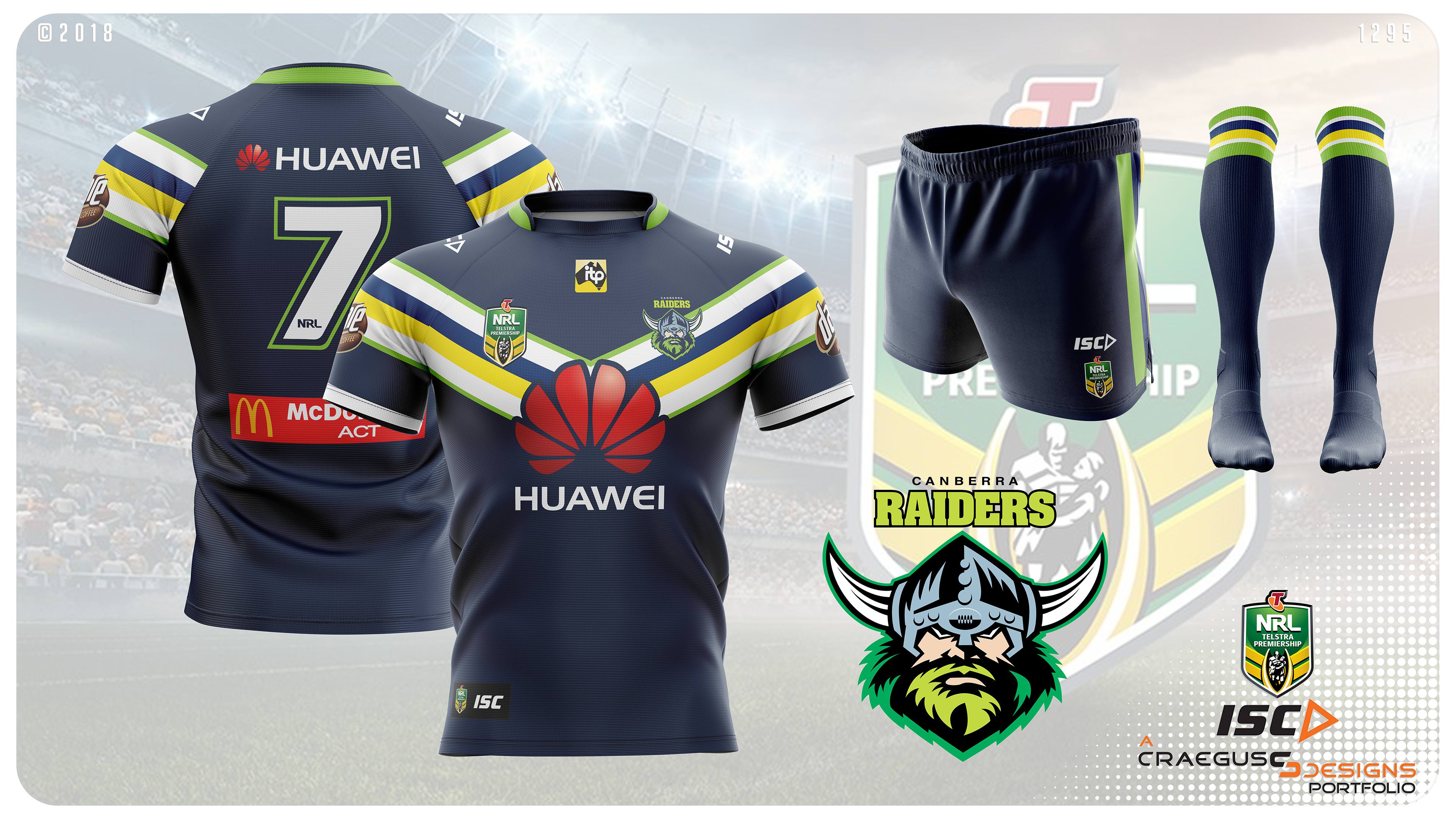
The NRL is currently outfitted by multiple companies, however ISC holds the contract to the majority of teams. This portfolio makes ISC the sole supplier of all 16 NRL teams. Unlike my previous A-League By Nike portfolio, I am not going to present what I think ISC would produce, but rather what I would like to see them produce. Each team will have a home and away uniform and for each team I will try and make sure that with either design no clashes would occur across the league. Many designs will be recognisable as either remakes of previous designs or variations on them, but there will also be new designs.

Teams will be released in random order (or as more commonly known, the order I design them in), and will have each kit released in separate posts (to add some suspense about the looks).

Oh and one more thing, there will be NO side panels, they are gone, never to return.

So with that, lets begin...
 
First up are the South Sydney Rabbitohs.

Gone are the side panels and shoulders, with a return to the full cardinal and myrtle hoops. The Jersey is accompanied by plain white shorts and hooped socks.

9Fvxu5Vh.jpg


But with the lack of black and white on this kit, the ability to have a similar looking away kit is removed, so what will the away look like?

Stay tuned to find out.
 
Excellent stuff man, can't wait to see how this one goes!

Thanks, it may not mean much, but I am currently 6 teams in, and there is not a design that I am unhappy about (though there is 1 that is not great, but I had little to work with going the way I did).
 

Log in to remove this Banner Ad

South Sydney continued...

Many fans of the game know of the famous "Minties Wrapper" jersey worn by the club in the 80's and successfully brought back as heritage designs in recent years. But what is far less known was that an alternate version was created for the 1980 mid week cup. However this is likely because the design was never worn.

past_jerseys_1980_2.jpg


The away design in this portfolio takes inspiration from this design. The kit features black shorts and socks that resemble the original jersey.

FBaNv3vh.jpg


The next team will march in tomorrow.
 
Next up is St. George-Illawarra.

For the home there is not much that can be done as the design is historic and a classic. So that is what I stuck with, the red V that goes across the shoulders, white shorts with red around the base and striped socks.

b8nGDcsh.jpg


But what about the away?

A retro?

Something new?

An inverse?

Feel free to have a guess, and stay tuned to find out.
 
St. George Illawarra continued...

The away for St. George-Illawarra is always a contentious issue. Even though the team is a merger, it is really more of a takeover with slight concessions to keep those in the Illawarra happy so that St. George can get hold of their juniors. But for me the representation of the Steelers is an important part of keeping league history. So for the away design I have created a modified version of the traditional Illawarra Steelers kit.

The design features the traditional red with double white stripes on the sleeve, but I have added it to the chest as well to make the jersey a little less plain. The shorts and socks are also red with the double white stripes running down the side of the shorts and appearing on the middle of the socks.

9dQSiTGh.jpg


Have a good knight, the next team will be released tomorrow.
Just having a guess for this one... is the next team the Newcastle Knights?
 
And now for the next team........the Newcastle Knights.

The home kit for me is a no-brainer. It was the first ever jersey I owned, and is still a whale for me to this day. The classic Henny Penny jersey is accompanied by blue shorts with double red stripes down the sides and hooped socks.

PgTo3su.jpg


The question that has to be asked is what about the away? There was never an inverse of the original kit, so did I give it a true partner or will it be the current vertical stripes, or one of the grey numbers that the Knights have worn, or something completely different?

Stay tuned to find out.
 
Newcastle Knights continued...

The away was something that I did have some trouble coming up with. I had a few ideas but it was only when changing the colours on the template that the following design came to me. It is a variation of the home but with white replacing the blue which becomes an accent colour. The shorts are white with red and blue stripes down the side and the socks have a white base with red and blue hoops.

MwtDcG5.jpg


No real hints towards the next team, but this happy NSW supporter will present the next designs tomorrow and I am sure things will be a little more Cleary.
 

Remove this Banner Ad

And now for the.......... Penrith Panthers.

This design was never in doubt for me. The design screams Penrith, is unique and just works. If you haven't guessed yet, it is the Licorice Allsorts. The only change I made to the original was to alter the sleeve stripes to make them more simple and to change the original red numbers to white. The shorts and socks feature the three coloured stripes on plain black.

5x2viba.jpg


But what about the away? What did I do for that? Something completely out of the box is on its way.

Stay tuned to see what I did....


And we are back....

Really? Something different? Did you really think that?


Nope, the perfect away for the Panthers is the inverse, simple.

gKbSIs7.jpg


If you are thinking "What's the matta with me?" Find out tomorrow with the next team.
 
And next we have....the Parramatta Eels.

Parramatta have had some classic designs over the years and I have stuck with that theme for their home kit. I have gone with the 1986-94 kit but in the current darker blue which I think gives a stronger colour balance between the blue and yellow. The shorts and socks are also in the darker blue with the 4 yellow stripes on them.

vlwRca5.jpg


And again I have to ask, what about the away?

Every team so far has had at least 1 white kit, will that continue? Will the design be another throwback, or a modified version like I did with the Knights?

Stay tuned to find out...
 

🥰 Love BigFooty? Join now for free.

On a side note, is there any way you can put next season's Arsenal home kit onto one of these rugby league templates? I just wonder if that jersey design might look better on a more muscular shape.
 
On a side note, is there any way you can put next season's Arsenal home kit onto one of these rugby league templates? I just wonder if that jersey design might look better on a more muscular shape.

Not at this time, I am trying to make good looking designs, that kit is an abomination.
 
And now for the next team....the Canberra Raiders

There is little doubt that Canberra has a jersey design that should not be tampered with. That is why I have stuck with a very traditional look for the team. The only differences is that I have kept the current lime colour rather than reverting to the original lighter version. This is also the first kit that I have not used the current teams logo on the jersey. Instead I have used the recoloured version (the current is used as the team logo in the presentation for reference) that I foresee the club switching to, possibly as early as next year (though I kept the lighter lime colour for the word Raiders). The number also reverts to white from the current blue, but I have given it a blue inner section to make it a bit more visible.

XP8DNDS.jpg


The question now becomes what happens for the away? Canberra has no real history when it comes to away kits, having worn white, yellow, blue, and black, with many different designs. So I have had to come up with something new for the team.

Stay tuned for the unveiling...
 
Canberra Raiders continued....

At first I had very little idea of what to do for this away kit. In reality the only thing I knew that I wanted was that the base colour was going to be the darker blue that the club has been using. So when I changed the base colour of the design to that colour this design came to me as the sleeves began to pop a little, so I thought why not continue it onto the chest and make a wide low V. The addition of the lime green on the outside of the stripes completed the look.

0655Pqi.jpg


More designs tomorrow. I promise I won't dog you and not post anything...
 
And now for the.......... Penrith Panthers.

This design was never in doubt for me. The design screams Penrith, is unique and just works. If you haven't guessed yet, it is the Licorice Allsorts. The only change I made to the original was to alter the sleeve stripes to make them more simple and to change the original red numbers to white. The shorts and socks feature the three coloured stripes on plain black.

5x2viba.jpg


But what about the away? What did I do for that? Something completely out of the box is on its way.

Stay tuned to see what I did....


And we are back....

Really? Something different? Did you really think that?


Nope, the perfect away for the Panthers is the inverse, simple.

gKbSIs7.jpg


If you are thinking "What's the matta with me?" Find out tomorrow with the next team.
I don't watch a lot of NRL so can someone tell me why Penrith uses colours on their jumper that isn't on their logo? Also what do they represent?
 
I don't watch a lot of NRL so can someone tell me why Penrith uses colours on their jumper that isn't on their logo? Also what do they represent?

The logos colours are a holdover from their previous colours which were black, teal and white.

The club has had a bit of an identity crisis when it comes to colours since their beginning.

When they were founded they wanted to wear blue and white, but Cronulla announced their colours first and with Newtown, Canterbury, Parramatta and the Roosters all wearing blue led Penrith to adopt brown and white. Then in 1991 they switched to the licorice allsorts jersey and colours of black, red, green, yellow, and white. They dropped the yellow in 1997 and then changed to black, white, teal and rust in 2000, then they dropped the rust officially in 2010, and finally have since switched back to the allsorts colours in 2017, but the logo which was released the year before the switch back has yet to change to the current colours.

As for meaning, there really isn't any that I am aware of.
 

Remove this Banner Ad

Portfolio The NRL by ISC

🥰 Love BigFooty? Join now for free.

Back
Top