Western Kelpies
Debutant
- Aug 22, 2013
- 72
- 128
- AFL Club
- Western Bulldogs
- Other Teams
- Roma, Man Utd, Celtics
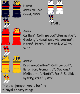
Tbh it's basically the same design as the doggies. Your current jumper is okay, but I think it should change in the near future. Preferably not two hoopsI think this is a much cleaner design for the Crows, and gives opportunity to make a set of guernseys using the same design but different base colours:

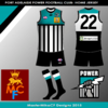
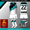
Usual deal with my stuff - IDC about manufacturer or sponsor logos, they're secondary.