- Feb 25, 2013
- 51,216
- 58,269
- AFL Club
- Brisbane Lions
You're kidding surelyAbout time. Those turn of the 90's ones are ugly.
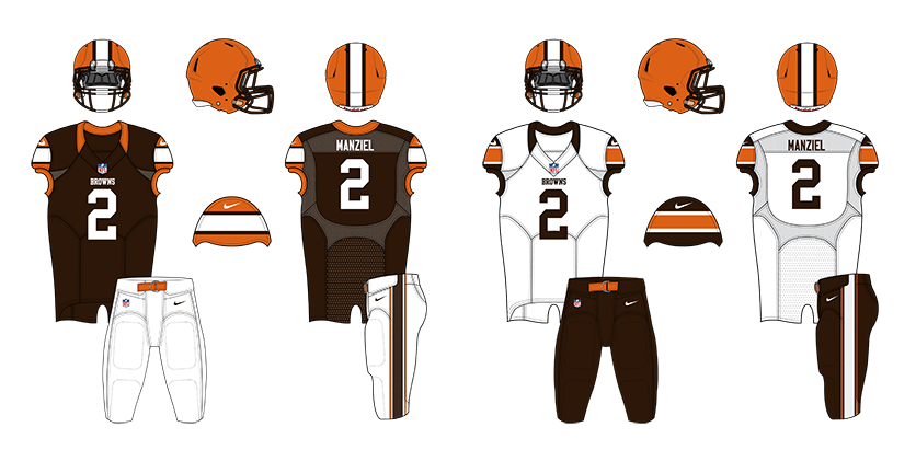
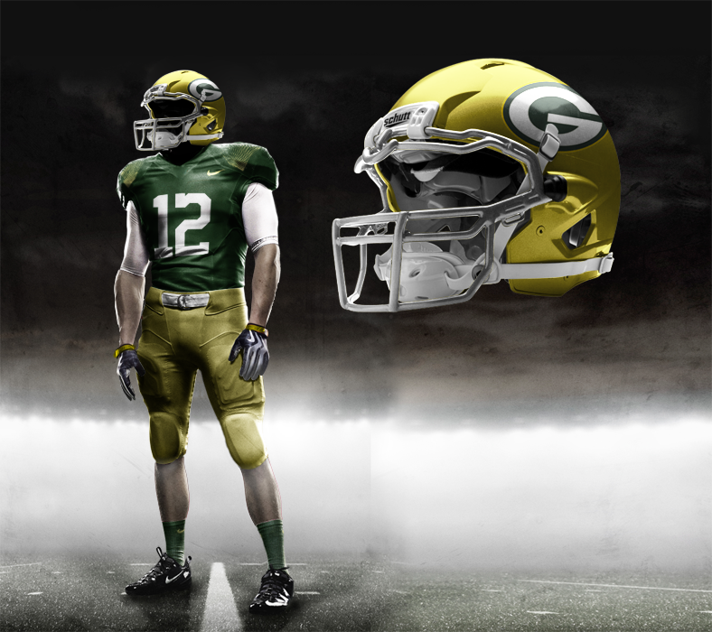
The guy who has leaked has said that this mock up looks "really, really close"
http://imgur.com/a/KVklY#0
Follow along with the video below to see how to install our site as a web app on your home screen.
Note: This feature may not be available in some browsers.
You're kidding surelyAbout time. Those turn of the 90's ones are ugly.

The guy said the blue alternate is nothing like it, and the home/away have orange numbers, shoulders, on helmetThose Denver mocks are atrocious. What the * is wrong with Nike? The "Rocky Gray" ones and "Unique White Out" ones are okay at least. But the last two blue ones are too similar to Buffalo.


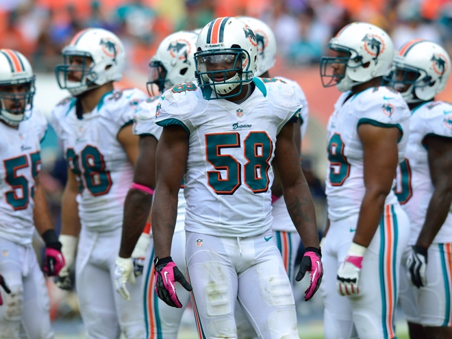
Most 'new' designs date so quickly. Designers over-do it. Less is often more. Dolphins one the only recent (imo) one that could last 20+ years. Vikings not bad either. Tho the little spikey part doesn't really add anything, just there to complicate/over-do/over-think, make it seem "modern".That's such a simple and classic design, one could say timeless. Something these new designs don't have.
All we're going to see is a wave of new uniforms that teams will end up changing in 10 to 20 years to shake off the outdated 2010's look. Like the Bills did recently.
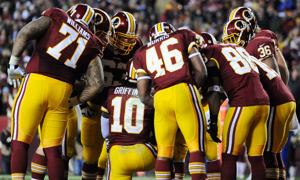
Shouldn't have. But the change made at least agreeable. Tho the logo is silly.Dolphins should never have changed
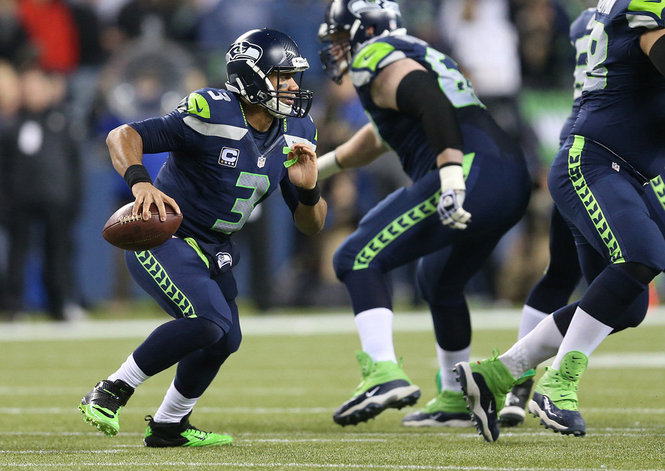
Really? Imo it's horrendous. Not saying you're wrong to have your opinion. But, you're wrongI think the Seahawks are the only modern design Nike has got right so far.
Shouldn't have. But the change made at least agreeable. Tho the logo is silly.

C'mon man.My dinner just came up
You and me, brother.As a dolphins fan, overall what Nike did with us was an enormous upgrade. I don't love the new logo but overall the new uniforms are awesome.
Really? Imo it's horrendous. Not saying you're wrong to have your opinion. But, you're wrong