Our Icon

Remove this Banner Ad

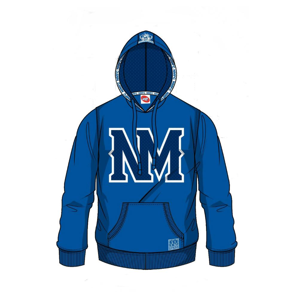
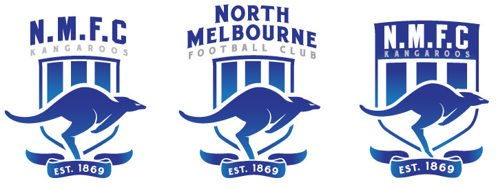
What's the difference between an icon and a logo?


Sent from beneath the blue and white using Tapatalk
 
Looks like right & left roo prints side by side. Doubt we'd try and "rebrand" halfway through the season with a new logo, or for that matter, remove an actual kangaroo from the logo at any point, still, I like what I see so far. Something that, say one was to get a North tattoo, would be a bit more appealing than the blue and white logo that gets changed every decade or so anyway.
 

Log in to remove this ad.

nm%20hoody.JPG


Big fan of that logo.

Simple and effective.
 
"Icon" could mean kangaroo. It could mean a player if they were closely enough identified with the club, like Arch or Boomer.

Doubt it's a logo change, as welcome as that would be. My guess is just that it's something kangaroo-related that is coming soon and possibly related to indigenous round.
 
I'm not big on our current logo because the best logo's are easily reproduced by anyone, the current one is not.

I would prefer a shift back towards simplicity like we saw with this:

NorthMelbourneLogoBanner.png


as long as we can modernise it in a way that is still marketable.

At the moment our logo is a bit soulless IMO.
 
The difference between icon and logo is the branding.

Logo represents the company, organisation, club, it is a trademark, a brand. It is scalable.

Icon on the other hand is graphic represents the idea, concept or even operation. It is not scalable as the design is within the visual space. More importantly, the icon is usually just image, with no words. Most of the time a logo require words to represent the brand.

Looks like they are not introducing a new logo. Rather they are introducing a new visualisation, operation perhaps for NMFC.

That is something new, I can't think of any sporting club introducing an icon alongside logo/branding. Corporates/companies do it all the time. Apple has a brand logo but they also have several icons (think iTunes, Apps store, images). NMFC seem to follow that. I wonder how that would turn out.

Could be a good marketing move, especially to get more members. However I agree with above posters that our logo needs a facelift, something simple that is immortalised, timeless. As much as I liked the 90s one, I don't like the shield outline. The previous logo looks good but I rather have no gold; only royal blue and white, and not just the head of the Kangaroo. Why not use the same kangaroo from the 90s and have stripes along the tail. Simple and very clean.
 
Different logo and possibly guernsey for indigenous round?. Other then that have absolutely no idea, hope they dont leave us hanging for too long.

Yeah this is what i'm expecting. Probably a one-off guernsey for Indigenous round that focuses on 'our icon' the Kangaroo, being iconic of both our club, and Australia.
 

(Log in to remove this ad.)

I feel like the movement in the old logo and the ones above makes a much stronger statement about the club. The current one has a bit of "humm whats going on over here" sort of look on its face. I guess it's fitting as that's what most of our midfielders looked like in 2013 when the ball was being whipped up the field.
 
I feel like the movement in the old logo and the ones above makes a much stronger statement about the club. The current one has a bit of "humm whats going on over here" sort of look on its face. I guess it's fitting as that's what most of our midfielders looked like in 2013 when the ball was being whipped up the field.
It's also fitting because that's what the club was about when it was created. Pretty sure it's from around the time of the agreement to move games from Canberra to the Eat s**t Coast and probably deserves to die by association.

Of those 3 at the top I think the right one stands out the most but prefer the full North Melbourne text of the middle.

P.S. Where be the swear jar / filter?
 

Remove this Banner Ad

Back
Top