The Crows Logo Thread

What should be done regarding our logo?


  • Total voters
    235

Remove this Banner Ad

Any chance they would change it?
I do hate our logo atm.....

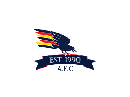
I did love the emblem/shield we had on our strip a few seasons ago that incorporated all the sanfl colours on one side too. Know it wasnt our logo but just really liked it.
 
They really have to involve the fans more when changing things.. fans know what we want and like. im sick of people making decsions that make us fans look like crap and cause us to be laughed at and crap thrown at us by port scum.
next time let the fans decide on a guernsey and a logo. let us vote!
 
They really have to involve the fans more when changing things.. fans know what we want and like. im sick of people making decsions that make us fans look like crap and cause us to be laughed at and crap thrown at us by port scum.
next time let the fans decide on a guernsey and a logo. let us vote!

They DID let us vote on the last guernsey and they let fans create the SANFL guernsey.
 

Log in to remove this ad.

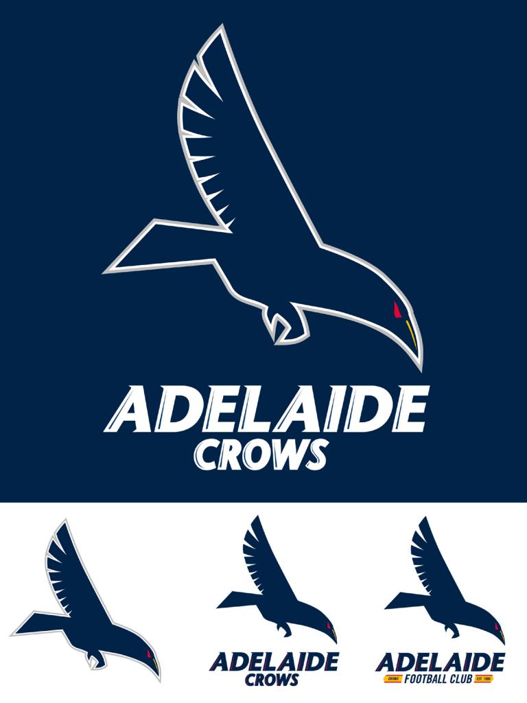
NewCrowsLogoshrunk-2.jpg

Edit: Obviously not my design. From the message to Fagan thread.
I really like this, from the bird to the font it is all miles ahead of what we have at the moment. Something like this on our white away guenrsey would be awesome.
 
I really like this, from the bird to the font it is all miles ahead of what we have at the moment. Something like this on our white away guenrsey would be awesome.

As a logo maybe, but please not on a clash guernsey. The guernsey should be traditional and elegant eg. The designs floating around of a white guernsey with a single red, gold and blue hoop on the front are the best choice for the image of the club AND would sell the best. The most popular and best looking clash guernseys are always the simple traditional white ones eg. Freo, Port, Bulldogs.
 
They DID let us vote on the last guernsey and they let fans create the SANFL guernsey.
They did.. and then completely ignored the results of the vote, going with the guernsey that finished dead last in the popular vote.
 

(Log in to remove this ad.)

Current logo is the worst in the AFL, an abomination, and I can't wait for it to go.

NewCrowsLogoshrunk-2.jpg

Edit: Obviously not my design. From the message to Fagan thread.

This crow looks like it has a prolapsed anus. Possibly from playing Hawthorn. Prefer the horizontal yellow ball design.
 
Must be black. Must have a body and wings and claws in flight. We are not the Baltimore Ravens.
I like the side on one posted by Hank93 and like he said change the font. It has a more realistic crow.
The first symmetrical design has too many curves and reminds me of an ink blot test.
The other 2 front on ones are sharper which I prefer but would like a more realistic figure.
I guess I prefer asymmetric design over symmetric.
 
Here's an example of an update of the old logo:

n0toHMt.png

(Courtesy of lmach, who made a copy of the logo found on the GPS patch of our Adidas guernseys, as shown below)
I actually think the old logo was dreadful. The current one far more professional looking. I know I'm one of few.
 
I'm interested to know how many people are aware that our current logo is based on the Baltimore Ravens NFL team logo. I'm getting the feeling that some people think we made it up ourselves.
 
I actually think the old logo was dreadful. The current one far more professional looking. I know I'm one of few.

I agree, I don't like the old one even though we won premierships under it.

The current one to me is too kids-y

Need something strong. I like the front on designs people here have done/rejigged
 
I'm interested to know how many people are aware that our current logo is based on the Baltimore Ravens NFL team logo. I'm getting the feeling that some people think we made it up ourselves.

That makes it even WORSE!!!! Bad enough if some idiot had designed it misguidedly thinking it looked good ... to rip off another team's horrible design with same thinking ... is there any hope at all?!?!?!
 
That makes it even WORSE!!!! Bad enough if some idiot had designed it misguidedly thinking it looked good ... to rip off another team's horrible design with same thinking ... is there any hope at all?!?!?!

The logo is not as bad as you're making it out to be. Maybe it's not the right fit for our club, and that's fine, but the Baltimore Ravens do not have a horrible design.
 
The logo is not as bad as you're making it out to be. Maybe it's not the right fit for our club, and that's fine, but the Baltimore Ravens do not have a horrible design.
The Ravens design is good, because they had a professional do it, as opposed to the half-arsed cheap knock off design team we went with.
 
I'm interested to know how many people are aware that our current logo is based on the Baltimore Ravens NFL team logo. I'm getting the feeling that some people think we made it up ourselves.

And the front on one with the red footy is from the Austin Crows so we can't use it as is I don't think. Though I would be a lot more comfortable ripping off a USAFL side that is based on us ("We're the pride of Austin Texas, we're the mighty Austin Crows") rather than an NFL side

shield.png


EDIT: Sry didn't realise it was going to be ENORMOUS
 
Back
Top