The Crows Logo Thread

What should be done regarding our logo?


  • Total voters
    235

Remove this Banner Ad

86545_9bc26401d3921f446d841e14a0c8545a.jpg


This is great but black might look better and maybe put modern home hoops on the crow's chest and incorporate it within a shield or border.
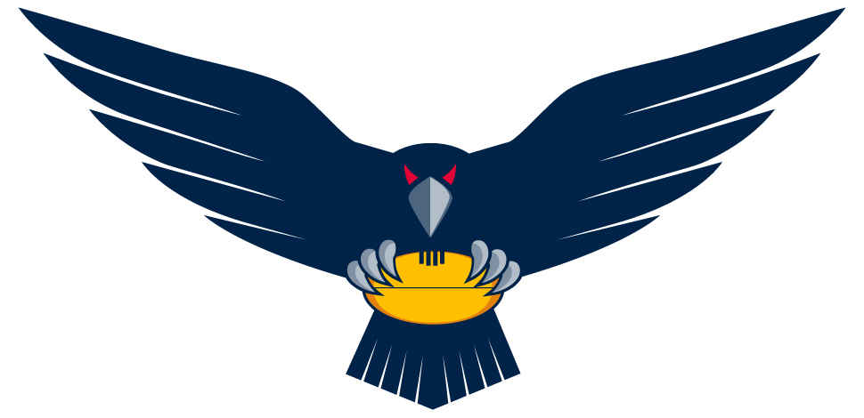
Really like this. It's fierce, simple, mean and modern. Something along these lines would be perfect!
 
Sadly, when you go to the 2015 BLK Range in our shop its still the old logo.....
Not a good sign but I do hope it gets replaced!

I see, disappointing.

However, when you go to the shop you can see the new crow on the homepage, on the top banner in the BLK section, and on these 3 garments (unfortunately all 3 also feature our current logo):


https://shopdesq.imgstg.com/index.cfm?fuseaction=Product&CategoryID=5238&ProductID=46312&OrgID=1743

https://shopdesq.imgstg.com/index.cfm?fuseaction=Product&CategoryID=5238&ProductID=46313&OrgID=1743

https://shopdesq.imgstg.com/index.cfm?fuseaction=Product&CategoryID=5238&ProductID=46326&OrgID=1743


It's a handsome crow, perhaps a bit too complicated and not quite logo material, but I'd gladly take it.


Browsing through the rest of the shop, I am blown away by the amount of cheap looking, ugly crap they are selling. It's seems to have gotten worse in the 18 months or so since I've been there.
 
Last edited:
While the club might have only intended for it to be an alternative design, I see no reason why we can't get on their backs and tell them how much we like it all the same. If our new administration wants to listen to us, let's give them something to listen to...
 

Log in to remove this ad.

The current floating head logo...dare I say...mediocre?

I think a new logo is in order for the new direction the club is heading, one with no connection to the last forgettable years. Its a new era now. New home ground, new constitution, new CEO, new coach, Roo. A new logo just makes sense. Start fresh.
 
Has anyone asked Fagan a question about the logo directly in any interview so far? Would be interesting to see how he answers the question, especially if he views it as a problem or not!
 
So as it stands, 91.6% of users who have voted in this poll would prefer something other than our current logo.

People can come up with statistics to prove anything, forfty percent of all people know that.
 
It reminds of of the Hawks clash guernsey actually. We both use similar style birds head logos and both of these secondary graphics are similar in shape, not sure either would make a great logo though.

View attachment 90533
This is one of the worst logos in footy.
This is worse than some of those old logos teams used to have in the 60s.
It's actually four different designs mashed into one.
The head is one size, the wings another.
The feet are another size, and in the wrong place, and then the tail feather another size again, and far too small for the rest of the bird.
As for the body, it doesn't have one.
Each of the design elements are very well done.
The head is excellent for example, but when combined with everything else it's absolutely horrible.
 
I know a few people wouldn't mind the training shirt crow as our official logo and with some time on my hands I had a go at turning it in to a shield type logo. Personally I like keeping the crow blue to stick with our colours but I know a lot of people would like a black crow so I've included both :)
Adelaide Logos.png
 
Last edited:

(Log in to remove this ad.)

Call me hyperbolic if you must, but the current crows design is the worst thing humanity has ever created. It's worse than the atomic bomb and auto-tune combined. If the new CEO wants to instantly win over fans all he has to do is get rid of it, and restore the proper lyrics to our ******* club song while he's at it.

Mighty >>>>>>> Known as

Trigg, you flog.
 
I know a few people wouldn't mind the training shirt crow as our official logo and with some time on my hands I had a go at turning it in to a shield type logo. Personally I like keeping the crow blue to stick with our colours but I know a lot of people would like a black crow so I've included both :)
View attachment 95019

Not bad. Personally not sure about the banners but agree it needs something across there to break uo the head from the bottom of the shield. Perhaps a tweak of the sizing of those banners and just having the club name rather than slogan would work better


I think that "new" head is far better than the other one.

I like how the club is introducing the new crow all over the place even though it hasn't replaced the current logo.

I hope this is a phase out where they are testing the reception of this new version (as introducing a new logo that is again unpopular would be a disaster) and if it is well received the next phase will be to remove the current raptor head completely.

Only problem i see is the new crow is not really great for a logo on shirts, etc. Developing it into a shield version like above would be a good solution for that. We then have the shield version for official documents and when it needs to be more condensed and the full crow version for other uses like it is currently being done.
 
I received my membership renewal in the post today. The logo from the orange training guernsey was watermarked on the envelope and letter. Looks a lot better than the raptor head.

Updated: Here it is. CrowsLogo0001.jpg
 
Last edited:
I received my membership renewal in the post today. The logo from the orange training guernsey was watermarked on the envelope and letter. Looks a lot better than the raptor head.

Glad to hear it. Solid progress

Well done Fages
 
Back
Top